Revisions
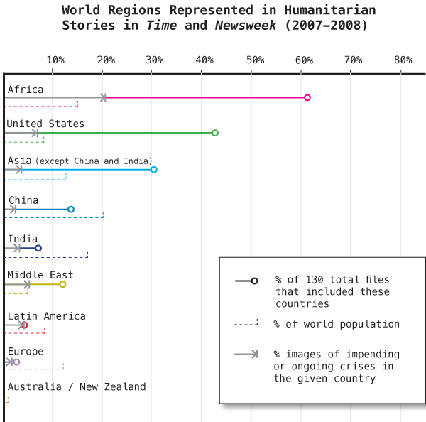
I realized after I posted this that I had forgotten to include Australia and New Zealand. Big oops. I forgot them because they were not represented in any of photos in the humanitarian articles in Time or Newsweek during 2007-2008. This does not mean there were no humanitarian crises in Australia or New Zealand during those years, just that Time and Newsweek could not or did not cover those stories with photography (if at all).
I had also not had time to include one more layer of information which is the percentage of images that were ‘crisis’ images. The best way I can think to explain this goes like this: In any humanitarian crisis there are victims so victims appear in just about all the images but some images also include people trying to help. So, for instance, if Latin American countries ever made it into the news weeklies (and those countries are under-covered as it is) 86% of the time they were depicted as facing an impending or ongoing crisis. They weren’t depicted as helping themselves or anyone else. In the US, only 16% of the figures in the images were depicted as victims of impending or ongoing crises. The US, and developed countries in general, were more often depicted as helping out than as being victims.

Comments 1
Time and Newsweek circulation figures for 2007 » Graphic Sociology — August 11, 2010
[...] graphics accompany the graphic in my previous post about the counts of humanitarian images in Time and Newsweek. They are meant to give context to the methods section which describes these [...]