What works
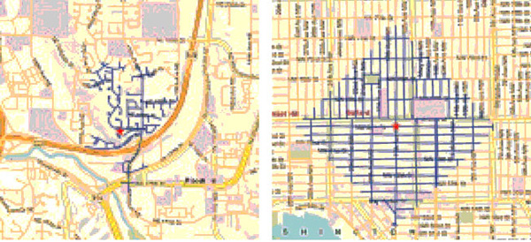
This side by side comparison is meant to show the length of all possible paths from a given point, assuming a person walks for five minutes. (Or maybe it’s ten minutes, but you get the idea.) Because the grid goes on forever – remember calculus? a line is defined by two points in space but continues for infinite length – the length of linear X-minute walking paths is longer than the more ‘organic’ length of cul-de-sacs. Of course, in cities, we are not talking about the ideal typical infinite lines found in calculus nor are cul-de-sacs some naturally determined path based on where deer walked down to the stream to get water before developers plopped a suburb down in the same spot. Both the grid and the cul-de-sac based suburb are planned developments. The question has become (see references below for a small sample of the people who are asking it): is the grid better than cul-de-sacs?
The folks who constructed the graphic above are interested in fit cities. They want you to see that because cul-de-sacs make it much harder to walk (or bike) around the neighborhood, they might be contributing to car culture and, in the end, making us fat. Fit cities are the antidote to fat cities and there is much urban design being driven by our collective (and towering) BMI. Lawrence Frank, Bombardier Chair in Sustainable Transportation at the University of British Columbia gets his hands dirty researching this question and he found that, “neighborhoods in King County, Washington: Residents in areas with the most interconnected streets travel 26% fewer vehicle miles than those in areas with many cul-de-sacs.” Furthermore, “Recent studies by Frank and others show that as a neighborhood’s overall walkability increases, so does the amount of walking and biking—while per capita, air pollution and body mass index decrease.”

What needs work
Collective fitness has only recently hit the urban planning scene as a concern foremost in designers’ minds. Back in the 1980s when crime rates tended to be higher, for example, there was a great deal of concern about safety. Shane Johnson and Kate Bowers did a similar comparison also setting cul-de-sacs up against the grid (sadly, without generating any infographics) but this time they were wondering if cul-de-sacs experienced fewer burglaries than linear streets. Before you get your panties in a snit about demographic issues like income that could impact both burglary rates and the likelihood of living in a cul-de-sac neighborhood, I’m telling you that Johnson and Bowers controlled for income. They also controlled for ethnic heterogeneity. They were not able to measure whether or not cul-de-sac neighbors were more likely to have home security systems. What did they find? Cul-de-sacs are safer – fewer burglaries. They point out that there could still be elements of cul-de-sac neighborhoods that have nothing to do with urban design that they weren’t able to fit in their statistical model. Feel free to read the paper and make your own decision, but I was compelled by the fact that even the presence of foot paths connecting cul-de-sac hoods tended to increase the incidence of burglaries.
Johnson and Bowers sum it up thus:
For this study area at least, the policy implications would seem to be quite clear; permeability should be limited to that necessary to facilitate local journeys and sustainable transportation. Additional connectivity may lead to elevated burglary risk and so should be avoided. Cul-de-sacs, in particular, would appear to be a beneficial design feature of urban areas and so should be encouraged.
Overall, then, I think the jury is still out on the question of cul-de-sacs. Perhaps the most important point is to note that like many other things – fashion, food, sport – scholarship has trends. The trend in urban design now focuses on public health, especially fitness. It used to be crime. Before that one might remember that fears of nuclear annihilation influenced design. I’m not picking on urban designers for being faddish. Trends flow through all disciplines with which I am familiar.
References
Johnson, Shane and Bowers, Kate. (Online | December 2009, Print | March 2010) Permeability and Burglary Risk: Are Cul-de-Sacs Safer? . Journal of Quantitative Criminology Vol. 26 (1).
Popken, Ben. (23 June 2010) Cul-de-sacs are making us fat at Consumerist.
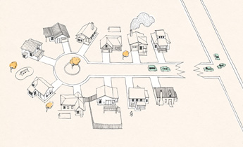
New York Times Magazine. (2009) “Ninth Annual Year in Ideas: The Cul-de-Sac Ban”. [above illustration by Lauren Nassef].
New York Chapter of the American Institute of Architects. (2010) Fit City 5: Promoting Physical Activity Through Design” Architecture Lab.
Wieckowski, Ania. (May 2010) Back to the City in Harvard Business Review.

Comments 7
jen — June 28, 2010
'Cul-de-sacs make us unfit' would have been a better title than 'Cul-de-sacs make us fat'. Walking more (all other things being equal) would make almost anyone fitter and healthier, but in most people's cases it wouldn't lead to weight loss. The trope 'losing weight = getting healthier' is both untrue, and rather dangerous.
Kelly Holden — June 28, 2010
The addition of foot/bike paths can make cul-de-sac developments more grid-like for walkers and cyclists, while still reducing through-traffic. However, unless there's something worth going to in that five-ten minutes a person is willing to walk, they're still not going to walk anywhere much.
Laura Norén — June 28, 2010
Jen: I believe that walking more, all other things being equal, would lead to weight loss over time. Here's my reasoning: if a given person consumes X calories and expends Y calories they will lose weight if Y is greater than X. Now, if, as you suggest, "all other things are equal" and the given person walks more then they will be expending more calories after they start walking more than before. We are assuming they don't eat more to compensate or stop going to the gym. I do agree, however, that walking isn't going to burn tons of calories or result in a noticeable weight loss right away. In fact, if a person is consuming far more calories than they expend, even if they start walking, they may not lose weight, they may just gain it more slowly.
John Bailo — July 7, 2010
Cul de sacs essentially create the thing that Liburb planners have been whining about for years -- carfree streets, or rather car minimized streets.
It's simple topology. At the end nodes, only those cars that need to be in the cul de sac, travel the cul de sac (like searching in a b-tree, for you geeks).
The grid system is like a simple sort. You drive by every house to get to the house you want to get to. Highly inefficient, and it puts far more cars on your street than you would ever want.
This is just one reason why cul de sacs are superior to grids.
How hard is it to get a job in the Graphic Design field?cheap coach | cheap coach — July 8, 2010
[...] Cul-de-sacs make us fat; cul-de-sacs keep us safe. » Graphic Sociology [...]
Kelly Holden — July 8, 2010
'liburb'?
As for cul-de-sacs 'keeping cars off the roads', no, they don't. Less traffic will drive past a typical dwelling, but since, as illustrated, people have to walk further to get places, it follows that in order to get places in a cul-de-sac development you'd have to drive more kilometres (using more petrol, etc, etc).
The grid system allows drivers to take a more direct route to their destinations, though more cars will drive past a typical dwelling.
(and uh, Flaneuse, Jen's statement reads like standard fat acceptance stuff to me, and they don't usually accept a simple calories in/calories out equation of weight loss/gain, as you're clearly using.)
john bailo — July 8, 2010
You assume a model of poorly designed streets (an archaic 18th century grid style) will force people to walk. However, in a suburban model of superior culs-de-sac, people walk inside the shopping mall, not on dangerous urban streets.