Background
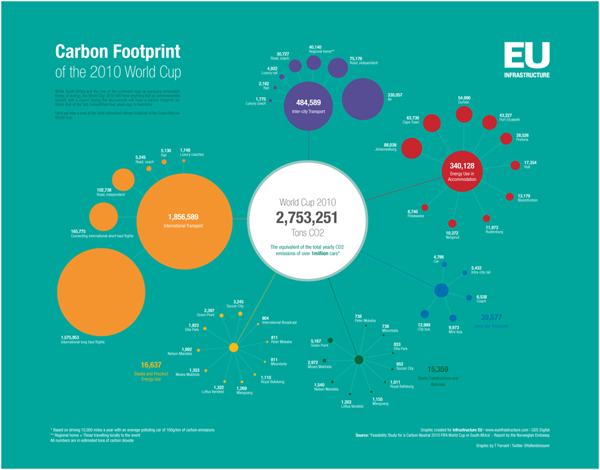
Timon Singh at EU infrastructure looked at the travel distance of the fans, the efficiency of the hotels, all the concrete used to build the new venues, and a bit of a credit for intra-venue mass-transit to create the graphic above. By way of comparison, the previous World Cup in Germany released far less carbon because the fans didn’t travel as far and they used existing venues instead of building new ones. So perhaps that isn’t even the relevant comparison, you’re thinking. Singh predicted that response and notes that this World Cup will release more carbon than the Beijing Olympics. Before I believe that claim, I’d like to see the numbers in more detail. No matter which one was worse, the point is that large-scale one-off events in which hundreds of thousands of people travel great distances come with environmental costs.
What works
I like these flower chain graphs, sort of. They are colorful and allow information of the same sort to be broken into categories; it is all about carbon emissions but we get to see all the different sources that funnel into the big pot in the middle. There’s plenty of space for labels and numbers to appear with the circles, which is critical.
What needs work
What do you think, readers? Is this kind of circle comparison easy on your eyes? I mentally struggle when circles get close in size and when I am trying to sort of visually add the area of two or more circles. Personally, I think a more linear version would have been easier for me to handle. The longest line would be the biggest carbon contributor, the color codes could have stayed, the labels could have stayed, and I would have had an easier time mentally adding one segment to the next. (I really wanted to try to mentally add all the ‘flight’ components together but I couldn’t do it visually so I ended up just doing it mathematically. But I could have done that more easily in a table.)
Reference
Singh, Timon. (June 2010) The carbon footprint of the World Cup. EU Infrastructure.

Comments 3
What is the difference between Human Services and Sociology? | SEM顾问 — June 23, 2010
[...] Carbon footprint of the world cup » Graphic Sociology [...]
jodi — June 25, 2010
this is shittt
Green Supply Chain An introduction — August 8, 2010
[...] introduction January 7, 2010 by HITESH PATEL NYC Carbon Footprint with style | HoboFashion.ComCarbon footprint of the world cup Graphic Sociology Posted in: Corporate Tags: aware consumers, carbon footprint, chain executives, record [...]