
What works
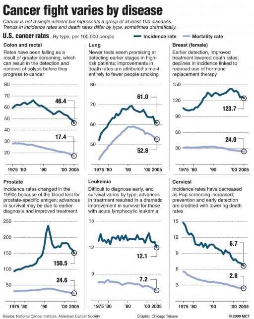
Cancer is not a single disease, as this graphic’s text reads, it is a collection of at least 100 diseases. This does a good job of showing how rates of infection and mortality vary from one kind to the next. The text explains cancer types for which targeted treatments have constituted a large part of the explained change in the rate of infection and mortality for particular kinds of cancer.
What needs work
Cancer sucks.
I don’t have more to say about this right now. I chose this set of graphs because it is of personal relevance. Don’t feel like being critical just now.