What works
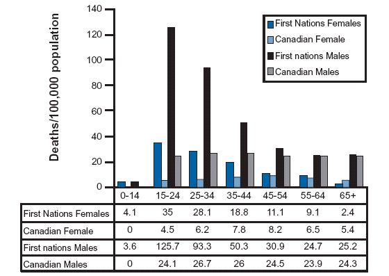
What do you all think of the bar graph/table combination? I’m liking it. It’s not elegant, but it shows both trends and granular data. Furthermore, it would be easy for someone without much training in graphic design (ahem, most social scientists) to recreate this double-up style.
What needs work
Of course, of course, the biggest and most relevant criticism one could levy against this table + bar graph combo is that one or the other should suffice. If one needs to add a table to explain the bar graph based on the table, something isn’t jiving, right? Well, maybe.
Adding one to the other doesn’t actually add any new information and takes up space which used to be under a great deal of pressure but got somewhat cheaper online, especially in the vertical dimension.
The bar graph shows trends in a way that enters your mind on EZ mode. No thinking required – just cast a glance and you can immediately tell something is decreasing and one bar is a lot taller than the rest in most cases. A table, on the other hand, always requires thinking. Lest it sound like I am against thinking, the reason I approve of this doubling up is that tables contain enough information for inquiring minds to concoct even more patterns than the graphic alone. Coming up with new patterns does require some thinking, but I support it. Thinking is fine, it’s just that mindlessness is a nice fallback, a solid no-frills default. Suicide is highest among the young (though the very young are nearly exempt) and decreases with age. First Nations males have the highest rates just about all the time and they are dramatically higher than other males and higher than First Nations females. [By the way, the Canadian trends shown here are also true for males living on American Indian reservations in the US.]
The other issues I have concern the construction of this sort of graphic. The line weights here are all even. Simply making the ones defining the bar graph different than the ones defining the table would help pull the two elements apart visually, even if the spacing remains the same.
On spacing: I would have put an empty line after the line containing the age range labels and before the first line of observations in the table. Otherwise, the eye has some difficultly figuring out if the labels are labels or if they are observations.
I would have chosen two dramatically different colors for males and females. Blue and gray are different, but not dramatically so. What about purple and green or blue and gold? There’s some drama there which would help mentally divide each of the clusters of four bars into halves (the male half and the female half).
While we are making a table, I would have either included cells showing the difference in male and female First Nations people or between female/male non-First Nations Canadians and female/male First Nations Canadians. The most interesting part about the graph, to me, is not that suicide declines with age but that the First Nations folks have much higher rates. It used to be taught in Intro to Sociology textbooks that American Indians had lower suicide rates, but at least in the past decade, the reverse has been true: American Indians have higher suicide rates, especially among the young.
The graphic remains agnostic about the causes of the differences in suicide rates across the population. I will do the same.
References
Community Health Programs Directorate, First Nations and Inuit Health Branch (2001), Citing: Health Canada (1996), using Health Canada in-house statistics.

Comments 2
MeToo — June 17, 2010
Good coments on this graph. The table underneath is fine.
I agree that the rule lines are not quite optimal. They are too heavy, and too uniform.
A main distractor is that the lines are sawtoothed. On a graph like this, where trends are mainly consistent between groups across time, I think it looks better, and is more easy to interpret, if the lines for each cluster, here age groups, are from shortest to tallest, or tallest to shortest.
A line graph portrays this more naturally.
Beverley Phillips — October 29, 2010
This graph can possibly be accurate. According to Stats Can, the suicide rates for Canadians are way higher in the age groups of 25-55 than they are for 15-24. The only way this makes sense is if the graph controls for population within each sub-category, but this isn't explicitly mentioned.