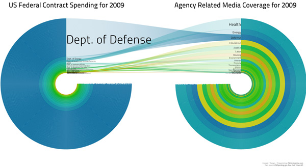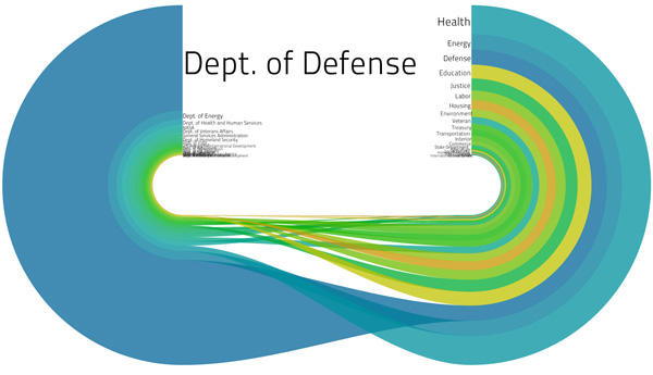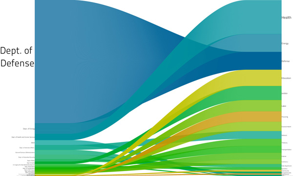


What works
What I especially like about the full blog post describing the development of this graphic is that it presents multiple iterations of the same design as the designers respond to difficulties they uncovered along the way as well as criticisms from the blogging world.
The third one, that loses the circle concept, works best for me. The labels are legible and I understand how contract spending and the media coverage (they used the New York Times, so that’s how you should interpret the term ‘media coverage’ here) of contract spending are related more clearly than in the circular version where the implication that the flow is not a simple one-way deal gets lost. And confuses things.
What needs work
Honestly, there have been plenty of criticisms of this graphic already. Rather than repeat what others have said, I’m going to introduce you to Matthias Shapiro at Political Math (a stranger to me) who has provided an intelligent critique of the above visualization series. He says,
Pitch Interactive has gotten beaten up a great deal over this visualization and they have been nothing but gracious throughout. So I just want to take a moment to say that I think their work is remarkable and that the problems with this graph are a series of very honest mistakes.
But one of the things my blog does is point out mistakes to increase understanding.
My biggest problem with the image is that it still perpetuates the stereotype that the federal government spends most of its money on defense. This image in particular drives that point home by ranking the spending areas according to their “media coverage” ranking where we can see the extent of media coverage each department saw (based on the New York Times API). “Defense” reporting is clearly out of proportion to Defense spending.
The first problem has been addressed elsewhere… it’s the issue of scaling the radius instead of the area of the circles. If the numbers were a correct representation of federal spending (more on that later), the circle visualization commits this “radius is not equal to area” visual error that really bugs me. I even gave it a couple pages in my book chapter (now available online for the low, low price of free) and mentioned it in my Microsoft talk on visualization because it is such a common mistake.
But I encourage you to click through and read his entire post. And read the entire post that Pitch Interactive wrote, too. I figure with all that reading you won’t care to slog through my opinion.
The general question, I would say, is whether or not this kind of graphic works for displaying relational data – Pitch Interactive is trying to show how fiscal data measured in dollars relates to media coverage measured in mentions in a particular newspaper. What do you think? Does it work for them? Is it a relationship we should care about? And is this kind of depiction something that will work for relating other sets of data that use different measurement scales?
References
Pitch Interactive original blog about the graphics, updated. (1 June 2010) US Federal Contract Spending in 2009 vs. Agency Related Media Coverage.
Shapiro, Matthias. (28 May 2010) Government Spending Visualization Misses the Mark at Political Math: Political Information Visualization and other Math-y Things.
Sunlight Labs Design for America contest.
