What works
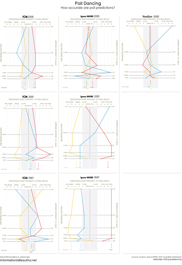
In the words of the creator of this graphic, the point here is that “there is no pattern”. The YouGov pollsters seemed to be a little more accurate, but then, as was also pointed out by the graphic’s creator, they only had one year to give it a go. Low N on that group, but maybe we can call them ‘one to watch’.
There is always a tendency in science – bench science, social science, any kind of science – to show positive results. It sort of sounds like: “Look! I found something!” Or, more likely, “After controlling for everything I could think of, including maternal grandmother’s underwear size, I have found a statistically significant correlation in the predicted direction.” But there is almost no support for saying, more or less, “I was looking for something but I found nothing.” In this particular case, a non-finding is of interest because it suggests action. We can stop paying attention to prediction polls (or chance it and continue to pay attention to YouGov, with a grain of salt). What works best here is the rigorous reporting of no pattern. Multiple polling companies, multiple elections, still no pattern.
What needs work
Seriously needs a key. Red and blue are always political colors, yellow not necessarily so, and the meanings of each cannot be assumed.
Love the title ‘poll dancing’ but wish it would mention ‘UK’ and ‘elections’ somewhere. We can deduce from the listing of the Guardian as a source that it probably has something to do with the UK, but information is global now, and we cannot assume national origins anymore. I often make this mistake myself, easy to forget to mention the nation-state. The good news is that our audiences are no longer only our neighbors. Or at least that’s how I like to think of it.
References
Suggestion from
Momin, a young fellow who contacted me by email suggested I post this one.
Graphic
McCandless, David and Key, James. (2010) “Poll Dancing: How accurate are poll predictions?” from Information is Beautiful.
See also:
McCandless, David. (2010, May 6) General election 2010: Information is Beautiful goes poll dancing at The Guardian, Data Blog.

Comments 3
cim — June 3, 2010
I'd disagreed with that. There does seem to be a pattern of general improvement in the difference between the 1-day figures and the actual result, with the later elections doing better than the earlier ones (ICM, who were within the margin of error for the sample size on all three 1-day polls, are a slight exception). The polling companies have generally improved their performance over that time (if 1992's election was included this would be even more obvious)
Meanwhile, there's no reason you'd expect - even with a hypothetical perfectly accurate poll - the 1 year (or even 1 month) results to necessarily be close to the real results, because events can and do change people's minds, and the question asked by the pollsters is not "how will you vote at the next election?" but "how would you vote if the election was tomorrow?" (a question that only strictly makes sense for the 1-day polls) so the lack of pattern there doesn't necessarily mean a lot.
UK Polling Report - http://ukpollingreport.co.uk/blog/ has done a lot of good articles on the subject of polling accuracy.
selika — June 3, 2010
"Red and blue are always political colors"
How exactly are red and blue political colours anywhere but the US?
In Australia there is no correlation between the two major parties and any kind of colour as far as I have noticed.
So I agree the graphs need a key, but assuming everywhere is like the US, is as always, not an accurate assumption.
CJE — June 5, 2010
In the UK, yellow is a political color - the Liberal Democrats, who are now part of the governing coalition. Hopefully this graph was contextualized in a larger paper about UK polling/elections. otherwise the only hints are the choice of these three colors (red for labor, blue for conservative, and yellow for LD) and the "bang on" for the point of perfect accuracy.