What works
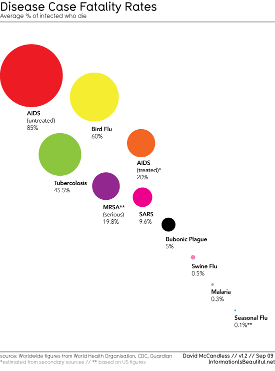
This graph is clean and balanced. Generally, it’s not good to abandon axes, and I don’t know if a social scientist could have gotten away with stripping them, but in this case, all the viewer needs to see is included next to each circle. The name of the disease is probably the most important element and that is easier to see right next to the dot than in some sort of axial label elsewhere. I’d also rather have the percentage values spelled out than have the circles simply plotted on a percentage continuum that I then have to mentally map. So it’s working for me. I’d also point out that if the axis had been a percentage continuum the flow of the cascade would not have been so elegant. Swine flu, malaria, and seasonal flu would have been more or less on top of each other. The way they’re presented here we can actually understand them a bit better than if they had been strictly plotted. The overall review is that relying on the principles of graphic design rather than relying on the principles of graph paper serves this particular data quite well.
What needs work
These colors strike me as being a bit too cheery for such a serious topic as disease fatality. While I am not the kind of graphics person who goes on and on about color theory, I do think that after sufficient cultural training (ie living in Western culture for a sufficient period of time or growing up here) will lead to a subconscious attachment of sentiment to particular colors. AIDS (untreated) and AIDS (treated) get the color tones more or less correct since orange and red are often correlated with anger, danger or aggression. AIDS is certainly an aggressive disease – any illness is experienced as an assault, in my opinion. Tuberculosis is also an angry, aggressive disease with a high fatality rate and yet it’s green. Green is related with invigoration, health, and the positive features of the natural order (that’s why all those bath products are green. Marketers like color theory.). Purple and magenta, especially when they are right next to each other as they are here, kind of look like carefree fun, the kind of fun associated with bubble gum, bike streamers, and pop rocks. So red and orange are working for me but green is a misstep. The colors for the rest could have been either shades of red or shades of gray and black. Yes, the graphic overall would have been more depressing, but that is the point.
Some information isn’t inherently beautiful and dressing it up as beautiful information may dilute the message. I think yesterday’s CO2 graphic was ‘beautiful information’ and yet it was only red, black and white.
References
McCandless, David. (September 2009) Fatal Infection at Information is Beautiful
For more on fatality rates
World Health Organization, CDC.
For more on circular graphics, see this newsletter [pdf]. I still dislike pie charts.
Few, Stephen. Our Fascination with all things Circular Perceptual Edge.

Comments 7
MeToo — May 24, 2010
As far as the degree that this is a successful graphical display of demographic phenomena:
1. Maybe I am missing something, but it seems to imply that there are two dimensions, x and y, to be considered, but there are not. That kind of leaves it like a figure/ground problem: what am I looking at? Is it a histogram or an x/y plot?
2. Tufte notes, based on perception psychology, not to use circles because we huamns cannot decently judge the relative area of two different-aera circles - i.e., we cannot tell when one has 50% greater area. Squares or rectangles are more intuitive.
3. The negative-slope lining gives these circles a bouncing-ball-type feeling that kind of accentuates the bigger circles by making them seem closer, as if the ball is bouncing right at me. So, AIDS seems very imposing. Not quite a dispassionate portrayal of data.
Disease Mortality Rates » Graphic Sociology | SEASONALFLU.INFO — May 24, 2010
[...] information‘ and yet it was only red, black and white. … See original here: Disease Mortality Rates » Graphic Sociology Posted in Seasonal Flu Info. Tags: been-strictly, bit-better, each-other, may-dilute, [...]
Disease Mortality Rates » Graphic Sociology | SEASONALFLU.US — May 24, 2010
[...] information ‘ and yet it was only red, black and white. … Read the original post: Disease Mortality Rates » Graphic Sociology Posted in Seasonal Flu Information. Tags: and-dressing, been-strictly, bit-better, may-dilute, [...]
ContentCentral.com » Disease Mortality Rates » Graphic Sociology — May 24, 2010
[...] Read the original here: Disease Mortality Rates » Graphic Sociology [...]
Esner — May 25, 2010
I agree with all points made by 'MeToo', but would like to add up on the argument that circles do not work well. What makes them especially difficult to interpret, is that no (proper) baseline is presented. We are almost forced to interpret all risks against that of untreated AIDS, but it's at 85% rather than 100%. I believe a basic barchart would show the information much more clearly (and perhaps even as pretty).
Also, unless we interpret 'average %' as a pleonasm, based on what is the average calculated?
Tips on Health « e377 — August 7, 2010
[...] | Crohn's DiseaseIf heart disease runs in your family should you often get a check …Disease Mortality Rates Graphic Sociologyi think i've got Crohns Disease? | Crohn's DiseaseNew Strain Of An Old Disease Jack [...]
What are some alternative treatments for Mesothelioma? | mesothelioma treatments — August 7, 2010
[...] Disease Mortality Rates » Graphic Sociology [...]