What works
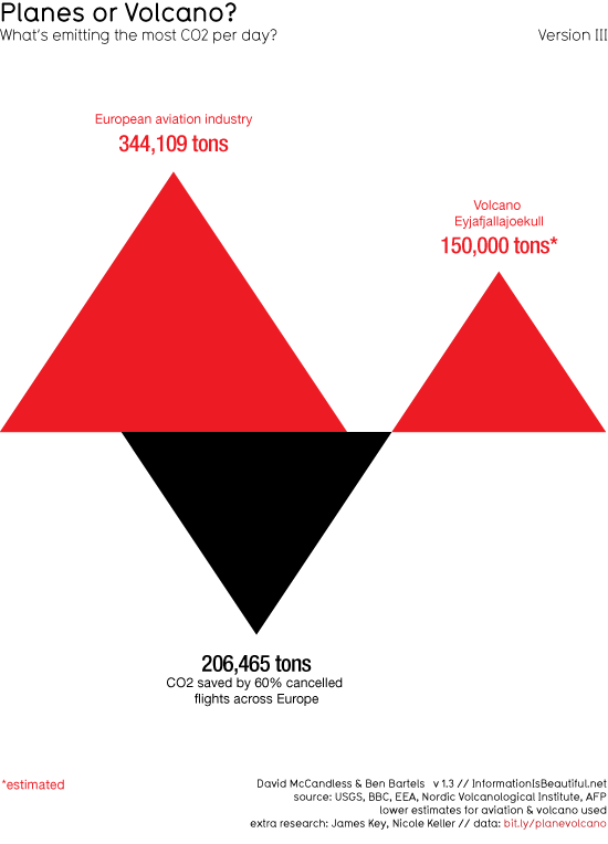
Volcano = triangle. Love it. Red is bad, black is good = kind of perfect. Being able to see that the volcanic eruptions are actually net benefit events because they release less CO2 than they prevent is great. I do wonder if the uptick in flights that inevitably follows any singular event could be mapped. Furthermore, when I was in Europe during the first major eruption event and I would say plenty of people were renting cars. I know that isn’t nearly as bad as flying, but it does contribute some CO2. I also wonder if this graphic could be expanded over time to see if the volcano ends up contributing or inhibiting contributions to global CO2 over time. Will people stay home or at least stay out of Europe, taking shorter flights (or no flights) because they are worried about the volcano?
What needs work
The volcano needs work. It needs to stop eating my luggage. That’s all I have to say. I know that if you are reading this and even moderately awake, you will point out that if I stopped flying I would not have a luggage problem and I would not be polluting your world with all my flight traffic. So maybe I’m the one who needs work.
References
The Graphic
McCandless, David and Bartels, Ben. (16 April 2010) Planes or Volcano? at Information is Beautiful.
The Data
USGS, BBC, EEA, Nordic Volcanological Institute, AFP [lower estimates used]

Comments 2
Is Eco-friendly web-hosting a scam or does it really help the world? | BingSite — May 24, 2010
[...] Air traffic, the volcano, the CO2 » Graphic Sociology [...]
Emily — May 26, 2010
In this graph, it's unclear whether the numbers are represented by the area of the triangles, or by the height. I don't know which (area or height) the brain picks up easier, but it depends on the depiction. For example, comparing the areas of two circles makes more sense than comparing the diameters. However, this plot is a little more ambiguous to me (although it's easy to figure out by looking at the numbers).