
What Works
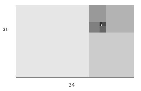
The above images are stills from a flash animation by textist. It is worth watching and blissfully silent. It does a great job of bringing dynamism to an online lesson. I have often thought about how Open Course Ware projects could be improved. Flash animations are one step above static content – here’s another that helps visually explain the sine curve. Good for teaching trigonometry.

What Needs Work
I realize that sociology doesn’t always lead itself to animations in the same ways that math and physics do. What needs work, in this case, is that I need to find a way to use animations to help understand social science teaching best practices, not math and engineering teaching best practices. Even though I wasn’t able to find something a bit more relevant to sociology, the increase in online and remote digital teaching is moving fast enough to warrant a post even though it’s not directly sociological yet.
References
Emerson and Talman. (1999) The Graph of the Sine Curve” at Mathematics Animated.
Allen, Dean (Texist). Fibonacci Sequence

Comments 3
Amy — May 20, 2010
Have you ever seen this brilliant (old) TED presentation from Hans Rosling about visualizing data on health & poverty? http://www.ted.com/talks/hans_rosling_shows_the_best_stats_you_ve_ever_seen.html He's not a sociologist, but data visualization can be a spectacular animated sociology lesson. Imagine if Durkheim had had some colored statistics bubbles to work with...
What is the most prestigious and elite university in Italy? | World University Information — May 26, 2010
[...] Animations as teaching tools » Graphic Sociology [...]
Links to free or open source online teaching software — July 16, 2010
[...] Animations аѕ teaching tools » Graphic Sociology [...]