What Works
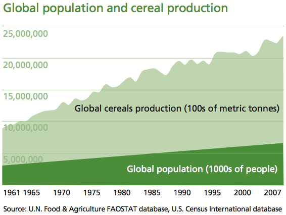
The strength of this graph is its simplicity. It shows two trends at once – neither would be all that interesting without the other, but in concert, they tell us something. It’s a simple move that most social scientists ought to consider because it isn’t all that much harder than creating two individual graphs and displaying them side by side. This simple move, contextualizing global cereals production with the growth in the global population, clearly summarizes the issue addressed in the multi-thousand word essay. That message is, as I am sure you can guess from looking at the infographic above, is that population growth is not driving the growth in world hunger. The production of cereals is outpacing the growth in overall population.
For the sake of cross-media comparison, what would that infographic look like in words?
“Scarcity is a compelling, common-sense perspective that dominates both popular perceptions and public policy. But while food concerns may start with limited supply, there’s much more to world hunger than that.
A good deal of thinking and research in sociology, building off the ideas of Nobel laureate economist Amartya Sen, suggests that world hunger has less to do with the shortage of food than with a shortage of affordable or accessible food.” –Stephen Scanlan, J. Craig Jenkins, and Lindsey Peterson, Contexts Vol. 9:1; Winter 2010, p. 34-39.
What Needs Work
The article also ran with a graphic that shows the increase in the number of calories available per capita. Personally, I would have combined this data with the rise in global population because it is a more intuitive combination, even though the y axis would no longer be quite the same (one of them would be population in millions and the other would be calories in thousands – both are absolute scales so there would be a relatively easy work around that would allow the trend lines to be compared, which is what we are aiming for in the end). The original graphic looks at cereal production next to global population growth which invites questions about what portion of caloric intake comes from cereal, how sensitive cereals are to market fluctuations, and so forth like that.
References
Scanlan, Stephen; Jenkins, J. Craig; and Peterson, Lindsey. (Winter 2010) The Scarcity Fallacy in Contexts Vol. 9:1; p. 34-39.
FAOSTAT. Food and Agriculture Organization of the United Nations.
Note: I highly recommend FAOSTAT.

Comments 3
aqr — May 16, 2010
"Food production increases, world hunger…also increases" - ironically, the graphs that go with the article show the exact opposite. Look at figs. 2 and 3, and note the time scales. Fig. 2 (% hungry) has data from 1996 to 2009, while Fig. 3 (calories per capita) has data from 1961 to 2003. What happens between 1996 and 2003, the only years for which the figures overlap? Caloric availability per capita increases slightly - from 2750 to 2800 - while the prevalence of hunger decreases slightly - from 14.4% to 13.7%.
To put these hunger rates in context: in "Algae Burgers for a Hungry World? The Rise and Fall of Chlorella Cuisine," Warren Belasco quotes the FAO as estimating a worldwide prevalence of hunger around 50% in the 1940s. (Technology and Culture, Vol. 38, No. 3 (Jul., 1997)).
Webzine Offers Stories On Food Production, Preparation, Consumption | BingSite — May 20, 2010
[...] Food production increases, world hunger…also increases » Graphic Sociology [...]
Im giving ten cents to world hunger for everybody who answers this question? | American Gold Coins — May 23, 2010
[...] Food production increases, world hunger…also increases » Graphic … [...]