Zoom in and it looks like poverty could be good for marriage
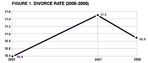
Philip N. Cohen from the Family Inequality blog (and the sociology department at UNC Chapel Hill) sent along the two line graphs in this post saying, “For the last week I’ve been steamed about these two figures from a report on marriage by W. Brad Wilcox.” [Note: W. Bradford Wilcox is the director of the National Marriage Project at the University of Virginia where he is also Associate Professor of Sociology.] The zoomed-in graph above was used in the main text to show that the divorce rate is going down during the current recession. Poverty must be great for marriage! No matter how folks feel about their spouses, they must feel more strongly about having enough money so they stay together. Or, to put it slightly differently: what unemployed person is about to leave the comforts of an intact home, even if that home is a disgruntled one?
Cohen goes on to point out that Mr. Wilcox’s strategy of zooming in on the data was also picked up by the media who are happy to run a story about the unexpected positive impact of the recession on lasting marriages.
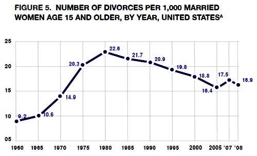
Mr. Wilcox did include a complete picture of the divorce rate since 1970 in his appendix which is copied below.

Zoom out and it just looks like the divorce rate hit a speedbump on the way down
As evidenced by this line graph, the divorce rate has been declining for years. The brief period of increasing divorce from 2005 to 2007 was more like a speedbump in a declining trend than the end of a trend of increasing divorce rates.
Read more about why this matters at Philip Cohen’s blog.
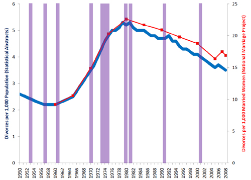
An improved graphic

My point is simply that all infographics tell richer stories the more data they depict. Zooming in is generally a bad idea because it reduces the context from which the reader can draw solid conclusions. If the recession were going to be part of the story about divorce, recessionary periods should be indicated on the graph, too. That would make it easier to tell if all recessions tend to decrease divorces or if somehow a decrease in divorce just happened to coincide with this current recession. It’s easy to ‘lie’ with info graphics by being overly selective. And lying just isn’t what we’re after.
References
Wilcox, W. Bradford. (2009, December 11) “Can the recession save marriage?” in The Wall Street Journal. Opinion Section.
Cohen, Philip. (2009) Recession, resilience, divorce?” in The Family Blog.

Comments 8
Divorce rate trends – selective framing » Graphic Sociology Divorce on Me — December 24, 2009
[...] original here: Divorce rate trends – selective framing » Graphic Sociology By admin | category: Uncategorized | tags: analyzing-the-visual, couple, laura, [...]
Divorce rate trends – selective framing » Graphic Sociology Rate Me — December 25, 2009
[...] more: Divorce rate trends – selective framing » Graphic Sociology By admin | category: Uncategorized | tags: after-investors, display, [...]
Tweets that mention Divorce rate trends – selective framing » Graphic Sociology -- Topsy.com — December 25, 2009
[...] This post was mentioned on Twitter by Sunnie, Courtney Brand. Courtney Brand said: Divorce rate trends – selective framing » Graphic Sociology: Analyzing the visual presentation of social data. .. http://bit.ly/5WVEQ5 [...]
Links: December 2009 « Consider the Evidence — January 5, 2010
[...] Divorce rate trends — selective framing, by Graphic Sociology [...]
The dangers of zooming in « Karl Bakeman — January 12, 2010
[...] dangers of zooming in January 12, 2010 I must have missed this post on Graphic Sociology over the holidays. Linking to a post by Philip Cohen on the Family Inequality blog, Graphic [...]
Roshni Muralidharan — February 3, 2010
I think it is very interesting that the recession is helping marriages in the United States. Along with this I think comes improvements also in work ethic. There are many employers who believe that the level of their employees' work has risen as a result of the recession. People work very hard in order to ensure that they will still have a job. Similarly I think people also work harder in their relationships. Having less money may force people to be more grateful for the relationships that they have with their spouses.
What percentage of divorced people get another divorce? — August 9, 2010
[...] Divorce rate trends – selective framing » Graphic Sociology [...]
Feminists Love Divorce, Says Schefly. [Insert Rolling Eyes Here] – Zelda Lily, Feminism in a Bra — February 28, 2011
[...] and by the way? Divorce has been on a downward trend since 1980. Which was about the time women finally started getting a little bit of respect. [...]