What works
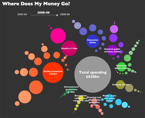
This visually arresting graphic does a great job of presenting data about national spending in an apolitical but altogether fascinating way. It’s interactive, by the way, but I’m not commenting on the interactive part, just the static graphic. I find that getting the static graphic clear is an important first step towards making a functional interactive graphic. If ever I hear someone say ‘but it’s interactive’ as an excuse for having a weak static graphic, I cringe. See my post about the USDA mypyramid food guide for a case study on the importance of a strong relationship between the static and interactive iterations of graphics as tools.
Each dot represents a different department or governmental program with the size corresponding to the funding level. Smart.
If you link through to the originating site, you’ll be able to follow blog posts that take readers through the development of the graphic. They ask for input and do their best to incorporate it. I like that approach. Good use of technology, OKF.
What needs work
I can’t quite tell why the circles are arranged the way they are or why their hues are the shades they are. Graphics, especially the beautiful ones, are the best when their simple clarity gives way to an elegant complexity. In other words, when I pose the question: “why does the hue vary within given funding types?” I’d like the graphic to lead me to an answer. I’m sure there is a reason for each hue, I just haven’t been able to figure it out.
One tiny, American-centric request: Add ‘UK’ to the page or the graphic somewhere. Maybe change “Total spending” to “Total UK spending”. Or “Where does my money go?” could be “Where do UK taxes go?”. These here interwebs are global. Yes, of course, the £ symbol tends to give it away. Maybe I’m just being too picky.
References
Open Knowledge Foundation. (2009) “Where does my money go?” United Kingdom. Data available

Comments 2
Paul — December 28, 2009
The arrangements are a bit wacky for a graph, but I think they were trying to make it look like a fractal which, while admirable, is not the most obvious approach I can think of for graph making.
The circles are arranged so that, as you read clockwise from about 9pm (or, "Social protection"), each circle (or, subsection) makes up a smaller and smaller portion of the overall spending. Then, for each of the 10 subsections, the same system of clockwise arrangement is used for the next level of disaggregation. From there, though, it becomes tricky and seems that, rather than being arranged circular as each subsection is broken down further, they begin to be arranged in a straight line. This is where the shades come into play.
In terms of hues chosen, I assume they don't matter; the shades seem to be more rich as they aggregate but only with the three levels of variation.
So, for example, we can see that "Social protection" (the most saturated) has 8 main types of spending, the largest being for "Old age." "Old age" itself is done in two main ways: "Pensions" and "Personal social services" (which are the least saturated).
This is, of course, how I made sense of the graph but it wasn't so obvious (especially since some of the smaller circles appeared to be less saturated but this was simply due to their size). I apologize if this is confusing in anyway. If so, I'll blame it on the fact that it's 3am :)
Sarah — January 29, 2010
This is quite an original graph ! I must say I’m shamelessly biased towards cute, which makes me like that graph. Prettiness aside, I’d have to agree with you about the circles’ arrangement – it really does sort of leaves you wondering as to what it’s supposed to stand for doesn’t it.
I appreciated your point about making it understandable from an international point of view too, this is so often overlooked.
This is the first time I visit your blog, and it's a pretty cool concept you have here. I'll be sure to come back !