What works
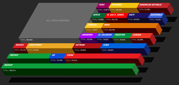
This is another graphic excerpt from GOOD magazine’s Transparency infographic collection. Note that I cropped out country-by-country break downs detailing how many people arrive as refugees and how many arrive as relatives of US citizens. Most immigrants to the US come as relatives of US citizens. That’s just how immigration law is set up, much to the disappointment of Bill Gates and other tech sector employers who used to frequently haul themselves to Washington to lobby for adding more visas for talented workers.
This graphic is clever, far more clever than many similar depictions of the same kind of data. I’ve seen pie charts where each piece of the pie represents a country. Bar graphs. Maps with a bunch of numbers and arrows. The concept here is both clean/easy to grasp at first glance and well executed. It would have taken me a minute to think of moving from a 2D flag to a 3D flag so that words and numbers could wrap the edges of the bars but I do think that helps present a cleaner image. Fewer characters on each bar.
Symbolically, it reminds us that America is constituted almost wholly by immigrants – this being the current numerical distribution of the countries of origin.
Though you cannot see it from the way I’ve cropped it, the text explains that these are LEGAL immigrants to the US. So, yes, Mexico sends the most legal immigrants to the US. That’s key. Americans tend to assume all immigrants from Mexico are illegal and that’s far from true.
Also, kudos for skipping flag textures on the bars. I’ve seen far too many similar graphics riddled with flags and that seems like a good idea but doesn’t work well because Americans just don’t know what the flags of other countries look like. Flags do not equal national icons, at least not in the eyes of Americans. Plus, if these bars had been wrapped in national flags it would have been symbolically interesting – America is made of all these different countries – but visually gross.
What needs work
I can’t tell from this graphic what the deal is with the “unknown” country category. I would have appreciated a little asterisk to clear that up (I know I cropped out a majority of the graphic so you can either take my word that there was no asterisk or you can click through to the full graphic above and check it out for yourself).
To emphasize the importance of Mexico as a sending country, I probably would have put it up in the shorter stripe area. Ditto for China. It looks like Mexico would have taken up two full short stripes and China would have taken a full shorty plus a little more.
I also would have found a way to group regions together. So El Salvador and Guatemala could have been close to Mexico and the Koreas and Russia could have been close to China.
References
Porostocky, Thomas. (2009, May 5) “Who is coming to America?” GOOD Magazine Transparency Infographic.
Migration Information Source clearinghouse for all sorts of information about US migration patterns, policies, and studies.

Comments 1
The Visual du Jour – Immigration in the US | The Global Sociology Blog — December 11, 2009
[...] here, you might want to subscribe to the RSS feed for updates on this topic.Powered by Greet BoxVia Graphic Sociology (click on the image for humongous [...]