What Works
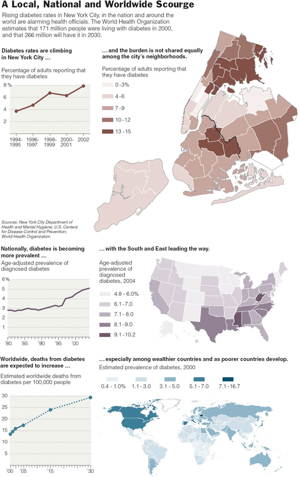
Contextualizing the story about diabetes in New York by including data at the national and global level is quite smart. Sticking with maps to tell the whole story lends consistency.
What Needs Work
Comparison maps like this are clearest when their scales are the same. I see no reason that they should be different or why the colors need to be different. In the sense that the scales, in fact, are different, I appreciate the choice to use different colors. At least there’s some visual indication that direct comparison between the maps is not a good idea.
With respect to the graphs, it appears that they are all the same, just different populations, but that is not the case. The city and national data shows prevalence rates but the global data shows mortality, not morbidity. Close readers can figure it out.
Relevant Resources
Kleinfield, N.R. (2006, 9 January) Diabetes and Its Awful Toll Quietly Emerge as a Crisis The New York Times.
