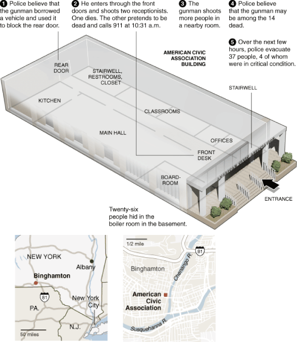
What Works
Not sure. The maps are helpful enough.
What Needs Work
First, the numbers 1-5 need to clearly relate to something. I was looking for them to relate to particular areas but then I realized they were more like time stamps. If that is the case, then it would be nice to have the actual time stamps or some kind of approximation. More importantly, I had to ask myself if this graphic helped me understand the “sequence of events” at all. And it didn’t. But maybe others see some value here?

Comments 1
post civil war Blog › Part 4 - Analyzing a Legacy Application with Altova UModel — May 7, 2009
[...] Graphic Sociology » Binghamton Shooting - A Sequence Diagram? [...]