What Works
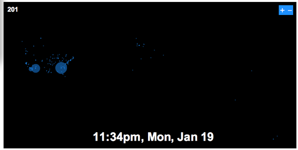
This is an animation based on twitter data from Obama’s inauguration day in the US – Inauguration was at noon. In case you weren’t a twitter user at the time, it is worthwhile to point out that twitter had partnered with Facebook for the day to increase usage. Both twitter and facebook were encouraging users to point their comments towards the topic of the inauguration.
I like it because its like watching fireworks from above and gives a tangible sense of the excitement amongst Obama fans that day. Best thought of as an emotional animation of political temperature than as any kind of quantitative data. I wouldn’t even call it an information graphic/animation. I would call it popcorn, animated.
What Needs Work
I have the same problem with this animation that I have with twitter which is that I really don’t know what good they do, even though I’m intrigued. I’ve been trying to figure twitter out by using it and I still don’t see the appeal. Thus, it is quite alright to think this animation is pretty, but dumb.
Relevant Resources
Flowing Data (2008) Worldwide Inauguration via Twitter

Comments 2
Graphic Sociology » Watching Twitter - Obama’s Inauguration Day « Obamabidenforchange.com — April 3, 2009
[...] Originally posted here: Graphic Sociology » Watching Twitter - Obama’s Inauguration Day [...]
Citizenparables — September 2, 2009
"I have the same problem with this animation that I have with twitter which is that I really don’t know what good they do, even though I’m intrigued."
To borrow from Stephen Fry, twitter doesn't especially do anything. It's not called 'rant' or 'enlighten' or 'discourse' - it's designed to be communication of a mindless disposable sort, hence, 'twitter'.
There's a danger in looking to hard for the 'good' it is meant to do. Overthinking it, you might say. It's OK that it serves no useful function. People don't use it functionally, they use it recreationally which, almost by definition, is purposeless, or an end unto itself, if you will.
As far as the animation goes, informationally it pales in comparison with many of your other graphics. However it does provide fairly concrete (rather than anecdotal) evidence of the degree of human interest in a particularly historic day.
If only there where similar animations on other historic days for comparison.
Fortunately, in the future, there will be!