What Works
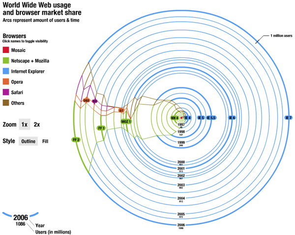
This is one amazing piece of advanced pie chart. The trouble with mapping browser market share is that the number of people online keeps growing so absolute numbers don’t mean anything for more than a minute – most figures with respect to market share are giving no more than a cross section, a snapshot in time. This goes way beyond that and breaks out of the cartesian coordinates, too.
This works by starting at T=1, a red dot in the middle of the graph when the internet was in its infancy. At that point Mosaic was king which got clobbered by Netscape. Then Internet Explorer grew and then took off when it started to be bundled with all Windows installations. Remember those lawsuits? Who can forget. Netscape became Mozilla, which is now known as Firefox to most of us. Safari and Opera have some share, but it’s negligible. The game now is between IE and FF with enough representation by the smaller browsers that we cannot ignore them.
The graphic is great as it shows how many total users are online over time and what proportion of those users log-on with IE, FF, Safari, Opera, and others. So smart. Even managing to capture the changing names and ownerships of the browsers without cluttering things up with text box descriptions.
What Needs Work
I’m so impressed by this that I can’t think what needs work. Here’s where readers come in. What is wrong with this graphic? Anything? It was just a class project, so it’s hard to fault him for anything, even little things, knowing that he wasn’t aiming for a professional audience.
Relevant Resources
Gimpl, M. (2006) Systems of Representation – Affective Map Exercise. Research Group at Media Lab Helsinki.

Comments 6
Infographic: WWW usage and browser market share — April 3, 2009
[...] Graphic Sociology. This entry was posted in Uncategorized. Bookmark the permalink. Post a comment or leave a [...]
Pages tagged "world wide web" — April 4, 2009
[...] bookmarks tagged world wide web Graphic Sociology » World Wide Web Usage - Browse... saved by 4 others Skaramine bookmarked on 04/04/09 | [...]
Jon Smajda — April 5, 2009
Hey, I gotta defend the WebKit browsers here as more than "negligible." Not just Safari (desktop and mobile), but Google Chrome, Epiphany (the default browser in GNOME, the most popular linux desktop), the new Palm Pre... WebKit's becoming the top choice for mobile browsers, which are just now taking off. In the next few years, their share of the ring will grow (as will Firefox's). IE, meanwhile, just succeeded by launching a new version that, on its release date, was already slower and less standards compliant than all the other major browsers.
But oh, that's not the main point. Cool graphic. :)
citrus spp » Blog Archive » Safari market share grows again in December — July 5, 2009
[...] Graphic Sociology » World Wide Web Usage - Browser Market Share [...]
dopo tanto navigare « dati e cifre trasformati in capolavori e orrori — April 5, 2010
[...] tanto navigare Archiviato in: Uncategorized — pastrano @ 22:02 Su Graphic Sociology c'è qualcuno entusiasta di questa "torta avanzata". Non vede proprio nulla che non [...]