Reader Note
It’s been nice to be away at a couple of conferences and a few days alone in Paris, but now I’m back and so is Graphic Sociology. I thought I might come across more material to discuss here. Much to my dismay, I saw hardly anything by way of charts, diagrams, or graphics used to support/illustrate sociological arguments. Tomorrow I have something from the Corporation for Public Broadcasting courtesy of a panel at the Eastern Sociological Association, but that really is about all I’ve got so far.
What Works
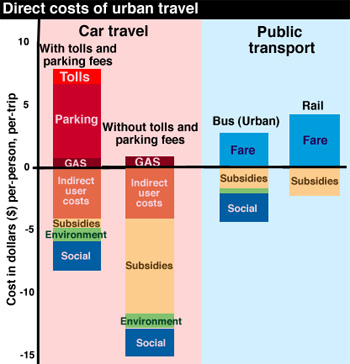
The above graphic is something I found on the interwebs though it was derived from a book that I admittedly have not read. With that in mind, I am not going to be able to comment on the veracity of the data. What I can comment on is the strategy employed to organize the information.
First, the use of color to split public transit from private car travel is quite helpful.
Second, I am pleased at the use of the zero line. The use of the zero line allows the graphic to establish a binary that quickly registers as a sort of good/bad moral binary. Often the zero line draws a distinction between good and bad where the good is growth and the bad is shrinkage (think financial graphics – they’re always sticking growth on the plus side of zero and shrinkage on the negative side). Values above the line mean one thing, things below the line mean a opposite, or at least directly opposed, worse thing. In this case, the good kind of transit expenditure is the expenditure that accrues to the individual and the amounts on the negative side of the zero line represent portions of transit that are paid for by larger collectives.
What Needs Work
I don’t understand the use of color beyond the blue/red division between public transit and car travel. It seems both arbitrary and not especially pleasing to my eye.
The category “environment” and “social” are not instantly legible but at least they’re better than “indirect user costs”. The use of precisely chosen language is critically important in graphics because it’s fairly easy to assume that many people are not going to read your text. Since I don’t have the book, I can’t even post the relevant text here to help clarify what those categories represent in detail.
My biggest concern with this graphic is one of the things I like about it: the use of the zero line. Generally speaking, using a zero line gives graphics greater dimensionality because of the greater symbolic value of zero compared to other numbers. In terms of absolute value, this graphic could have just showed us the net costs of transit options which then could have been represented as values where zero was a minimum value. In that depiction, rail would be the tallest bar and car travel without tolls and parking fees could have been set to equal zero. (what you would be looking at there would be the difference in cost between the modes of transit). Using the zero line here allows for a distinction between public and private expenditures on transit which is good.
BUT…the implication that the zero line divides the positive from the negative, the good from the bad, makes it look like public funding for transit is a bad thing while private expenditures are good. This is problematic. I can see what the author is trying to nudge us towards – that people who drive private cars pass a lot of the cost of that behavior on to collective populations. All the bus and subway riders are still breathing air polluted by passenger and delivery vehicles even as they spend more time out on the street walking to the subway and bus stop. However, this graph implies that all public funding or cost-bearing for transit is bad while private expenditures are good. This carries a decidedly pro-capitalist, up by your bootstraps kind of political implication. If you look closely, it isn’t that hard to see that imposing parking fees seems to decrease the amount of public subsidy to its lowest point.
I don’t know the overall message of the book where this graphic was derived but I imagine that it was pro-public transit. This graphic subtly disservices that message by indicating that all public expenditure on transit is bad. The strongest message I draw from this is that parking isn’t expensive enough and neither is gas. Also, that the social costs are incorrectly calculated – how can they be non-existent for rail and the same for cars with cheap parking, cars with expensive parking, and buses? Buses are louder and smellier than cars but I’m more likely to be killed by a car than a bus. Noise, smell and the potential for fatality seem to be social costs, but how can they be weighed against each other? Seems like a classic apples to oranges problem hidden in a little blue block. This is on top of the bigger problem that public subsidy is going to attend all transit options and is not necessarily a negative thing, neither is private payment for transit necessarily a positive thing. There are those who suggest that mobility should be considered a public good, something to which everyone should have equal access, thus private payment is necessarily a bad thing because it is regressive.
Flattening all the categories into the same kind of value – environmental costs are the same sort of thing as social and public subsidy costs – makes it possible to graph these things, but is troubling. Because I don’t know what is included in the environmental costs or how they are calculated, it’s hard for me to tell whether or not I would prefer to increase subsidies now (or increase fares and parking fees) to avoid environmental costs that could have significant long term consequences which will be even more costly in the future than they are at the moment. I mean, if the environmental costs include things like extremely high rates of asthma in poor communities that abut highways, I might think that’s too high a lifestyle price to pay even if the actual cost of treating the asthma is calculable and relatively low. (Maybe that “social” cost category includes things like monetizing lifestyles – what does a life riddled with asthma cost?)
Context
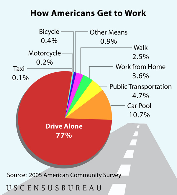
Just to contextualize this debate a little more, the following chart was derived from the American Community Survey of the US Census Bureau (2005) and shows just how people get to work. Commuting is the type of travel in which people are most likely to take public transportation – more so than taking one off trips to shop or visit friends and family. As you can see, public transit makes up a fairly small percentage of American’s transit behaviors. This is changing, public transit is experiencing growth in rider-ship, but chipping away at that three-quarters of the population whose experience of mobility is private and on-demand, is not going to happen overnight.

Relevant Resources
American Public Transportation Association
US Census Bureau. (2007 June 13) Most of Us Still Drive to Work – Alone from Public Transportation Commuters Concentrated in a Handful of Large Cities. Press Release, US Census Bureau News.
Vuchic, V. (1999) Transportation for Livable Cities. Rutgers: Center for Urban Policy Research.

Comments 5
Theresa — March 23, 2009
I have traveled to Central America where public transportation is THE way to get around, other than walking. I found this to be a great system for those who are not fortunate enough to have their own transportation. I was impressed with the possibilities I had of traveling from neighborhood to city, or from city to city for a great price and effectiveness. However, considering I am American and used to the convenience of my own car, I sometimes would be annoyed with the fact that I had to stcik to someone else's schedule. I feel that this is the problem with the US, we are just too wound up in our own lives and convenience that the public transportation system might not ever succeed here.
Topics about Climate » Archive » Graphic Sociology » American Public Transportation - Costs and Usage — March 23, 2009
[...] flaneuse at Graphic Sociology placed an interesting blog post on Graphic Sociology » American Public Transportation - Costs and UsageHere’s a brief overviewFlattening all the categories into the same kind of value - environmental costs are the same sort of thing as social and public subsidy costs - makes it possible to graph these things, but is troubling. Because I don’t know what is … [...]
discrepancy Blog » Blog Archive » Your Commuting Costs By Car Vs. Train? — May 9, 2009
[...] American Public Transportation - Costs and Usage [...]
discrepancy Blog » Blog Archive » Your Commuting Costs By Car Vs. Train? — May 10, 2009
[...] on this…I am very thankful for the very delightful posts from www.transportgooru.com, thesocietypages.org, carfreeamerica.org - all of them 3 helped me forming my [...]
Charging Stations for Electric Cars Being Installed Around the County | CarGalaxy.info — August 5, 2010
[...] American Public Transportation – Costs and Usage » Graphic Sociology [...]