
What Works
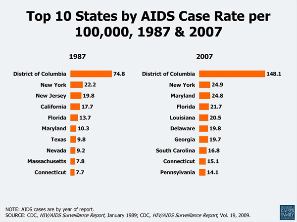
This data could easily have been thrown into a table – the bars make it a graphic. It is more visually interesting and instantly legible than a table, but are the bars enough?
What Needs Work
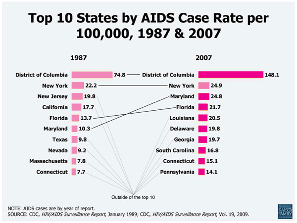
Most of the states on the top ten list in 1987 are not still on the list in 2007. That’s the most interesting part for me, and I would like the graphic to address that somehow — either by focusing on the four states that stayed on the list or by making sure it’s easy to see just how much movement there is on and off. What did the states at the top of the list in 1987 have in common? What about the states at the top in 2007? It appears that having a high percentage of the state living in urban areas makes some kind of difference but the graphic doesn’t give any clues at all about what is going on to get on or off the top ten list. Quite honestly, it doesn’t make sense to talk about the top ten states by HIV rate. It just doesn’t. That’s what the graph tells me.
I did try my hand at nudging the graphic in the right direction with the pink barred example. I don’t know if those converging lines pointing to somewhere outside the top ten help viewers to key into the large amount of movement on the list, but that is what I was thinking.
In the end, it would be better to go back to the data and come up with a more thoughtful analysis than to alter this graphic. The moral of the story is that the graphic can only be as helpful as the underlying data and the logic of the analysis.
Relevant Resources
Centers for Disease Control. (2008) HIV/AIDS in the US – Factsheet
Kaiser Family Foundation. Topic: HIV/AIDS Fast Facts – Slides
