What Works
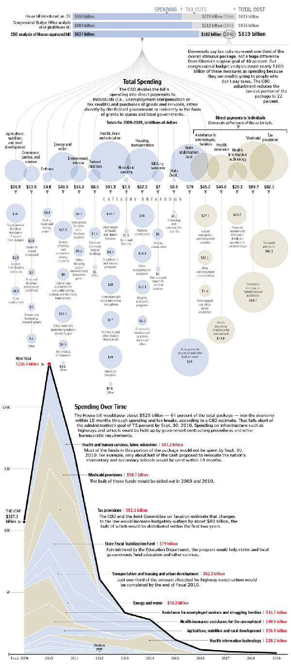
First, the paper allowed three different graphics to run – the overview provided by the bars at the top that show how the stimulus is divided by spending and tax cuts, the more granular breakdown of the pigeonholes for these dollars, and the time line that helps us understand when the money is going to hit the economy (and when we can expect all these transit programs to get going). Second, the main graphic does two things. It is both a fairly simple, readily understood cascading design that draws each category down to its constituent parts across the vertical access. It is also artful – when I look at this I see a sort of mobile hanging over head offering glassy baubles of funding to the madding crowds (ie the states). I’m not trying to insult the states here. In this economy, we’re all the madding crowds, but I really like the fact that the graphic incorporates mood and sensibility. Third, the timeline is a critical component of the stimulus package because there is so much anxiety about when this down turn will be ending. The stimulus money hitting the market is not a direct indicator that the downturn will end, but it is an indicator of when we can start looking for positive economic signs. Furthermore, the timeline could almost stand alone as both a timeline and a description of how the money was allotted. It is nice to be able to look at the package’s pigeon holes/piles of money in two different ways.
I also smiled when I didn’t see a map. Not every story can be visually summed up by the deployment of a shaded map.
What Needs Work
This blog isn’t wide enough to satisfactorily display the graphic so click through to get the whole story.
Relevant Resources
Congressional Budget Office
Stanton, L. (2009, 1 Feb.) Adding up the $819 Stimulus Package – Graphic. The Washington Post.
Yourish, K. (2009, 1 Feb.) Adding up the $819 stimulus package – Reporting The Washington Post
