Archive: Feb 2009

Problem Set at Princeton - Marriage Patterns in France from 1968 - 1987

What Works

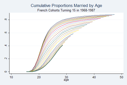
This example comes from a Princeton problem set in the Research Methods in Demography, a bit unexpectedly. What works is that the gently swooping shape is elegantly intriguing – an eye grabber that gets more interesting the harder you look at it. There is something to be said for beautiful forms, but unless there’s substance, info graphics that are only beautiful disappoint like vinyl siding. The fact that this one happens to generate such a fetching shape that it has been repeated throughout branded America is a real triumph.

Each line represents one cohort. The slope indicates the coherence within that cohort to age of first marriage – the steeper the line the more quickly the entire cohort goes from being single to being married. Later cohorts produce flatter slopes, indicating that there is a wider spread across ages of first marriage. It’s also easy to see that the age of first marriage slowly creeps up over time.

Note the popularity of this shape elsewhere:

New York Philharmonic Logo

What Needs Work

It’s not clear just which line goes with which cohort. Sure, demographers and pop culturists alike know that age of first marriage has been increasing over time and will assume that the cohorts who marry later are, in fact, the later cohorts, if we had different data that didn’t show such a smooth trend from year to year, it could be difficult to pick out which line represented just which cohort. Say there was suddenly a $10,000 incentive attached to getting married by age 22. Get married before your 22nd birthday and a giant $10,000 check arrives. That would push back the collective age at first marriage but in this chart, that line would just get buried among the earlier cohorts, or so I would predict. In this case, I might have recommended adding a year marker to every fifth line or so, just to reassure me that the pattern is smooth over time.

In 1900 the median age at first marriage was 21.9 for women and 25.9 for men and then these ages dropped til 1957 when they started rising again. Just saying. Age at marriage doesn’t have to keep going up.

Relevant Resources

German Rodriguez (2006) Office of Population Research, Princeton University. Problem Set 4: Marriage in France Research Methods in Demography.

US Census Bureau (2004) Estimated Median Age at First Marriage, by Sex: 1890 to Present in table format

USAID map of the area in and around Darfur
BBC map of Gaza 4 January 2009

What Works

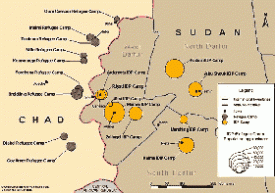
The best thing about the map of the camps around Darfur is that it exists at all. After looking at some of the elaborate maps that have been part of the news coverage of Gaza (see the one here, click through on the caption for a larger image) and earlier, of the bombings in Mumbai, I assumed I would be able to find something of similar quality related to the camps around Darfur to sate my curiosity about how big the camps are, where they are, how they are supplied, whether or not they are targets, and so on. But this map from USAID is one of the only things I could find around these interwebs that presented a basic map narrative of the camps in Darfur. Notably, I found many graphics promoting concerts that were fundraisers or awareness-raisers for the people in Darfur. Some of these concert posters and t-shirts got around the (apparently) tricky question of where Darfur is by just using an outline of the continent of Africa.

What Needs Work

The lack of a decent map-narrative around the problems in Sudan/Darfur indicates an uncomfortable fissure in the epistemology of crisis. I’m willing to conjecture that there may be an inverse relationship between perceived cultural differences and the production of ‘fact’ based information around crises. There isn’t an easy way to measure social/cultural difference, but it seems that the greater the degree of “otherness” of the people undergoing a crisis, the more likely the story is to be covered not with an onslaught of ‘hard facts’ that can be diagrammed, mapped, combed, regressed, permuted, computed, etc. but rather the story will be covered by emotive tools like first person narratives, photographs, and even awareness raising concerts, vigils, and that sort of thing.

I would love to hear what readers think about this theory of mine and I’ll continue to look for examples of differences in the use of information graphics across seemingly similar data sets.

Relevant Resources

BBC Map of Gaza Offensive – Week One (5 January 2009) with narrative time line.

NYTimes.com Israel and Hamas: Conflict in Gaza (4 January 2009) with narrative time line.

USAID map of camps in Sudan

USAID page on Sudan

The United States Holocaust Museum Mapping Initiatives Crisis in Darfur. This is a plug-in to googleEarth that layers photos, videos, quotes, and a bit of 2004 information about the camps on the googleEarth map of Sudan/Chad.

Piled Higher and Deeper - PhD Humor

What Works

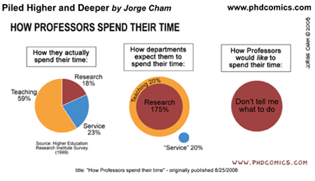
Humor is a slippery animal, indeed. I like to think of it as the pinnacle of culture, not in a high culture kind of way, but in a cultural development kind of way. Just think of trying to learn a foreign language. When you can intentionally, subtly be humorous in that language, you know you’re really getting somewhere. If you have never gotten to that point in a foreign language, just listen to kids try to tell jokes. They kind of suck. You end up laughing along because they’re kids and kids telling jokes is funny in itself, not because what they are saying is actually humorous. This is a fairly long winded way to point out that one indicator that telling stories with graphics is thick culture (thanks, Geertz) is that things like the above image are actually funny in a way that they couldn’t be funny in another format. If you had to say to someone, “man, professors spend lots of time on service activities, but the administration really doesn’t reward that or even notice” nobody would laugh. They might sigh and wish the economy were better so they could find a job that didn’t involve sitting on committees.

Bottom line: this works because we have been immersed in graphic storytelling. We get it. It doesn’t work in any other format.

Relevant Resources

Piled Higher and Deeper, a comic strip by Jorge Cham online. If you are a student or professor and haven’t discovered this, I’ll warn you that it could suck away an hour or two of your day if you click through right now.

Higher Education Research Institute at UCLA. The HERI Faculty Survey. There are fees associated with accessing the data but you can get an overview of how data about faculty time commitments is gathered.

This 2006 Obituary of Clifford Geertz in the New York Times does a good job of summarizing his life and work, for those who want to follow up on my parenthetical. His book “The Interpretation of Cultures” is a good place to start. If you want something shorter than a book, “Deep Play: Notes on a Balinese Cockfight” is worth a read.