What Works
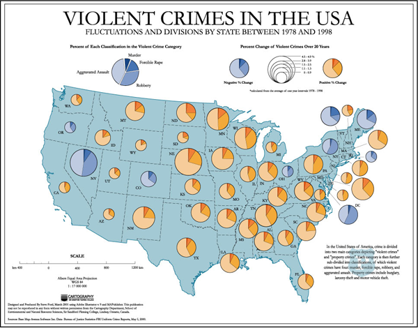
This map uses a two color pie chart scheme to represent increases and decreases in violent crime respectively. It also breaks the pie into pieces for added granularity of detail – one for murder, one for forcible rape, one for armed robbery, one for aggravated assault. (also known as mincemeat pie, right?)
What Needs Work
I still think there’s got to be a better way to represent gains and losses on a spectrum. Changing from one color pie to another at zero is a little arbitrary. Three dimensions might help – states with increases in crime could bulge while states with decreases could sink.
I included this graph not so much as a particularly good or bad example of building an info graphic but as a contrast to the previous post. This is a typical depiction of crime mapping. It depicts violent crime by victimization. Most crime coverage focuses on this salacious category – rapes and murders and beatings.
Relevant Resources
Ford, Steve. (2006) Map of Violent Crime in the USA 1978-1998
