
What Works
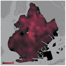
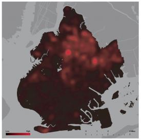
The beauty of these graphics is that, given their captions, they are instantly legible. On the left, the map shows where crimes are committed in 1998. It’s a diffuse pattern with a few warm spots. On the right, the map shows where the imprisoned population calls home (2003 data). It’s an image with vivid hot spots amidst a sea that’s mostly dark. In thirty seconds or less, viewers can see that while crimes are committed all over Brooklyn, the population in prison tends to come from a handful of very localized neighborhoods. It would have been easy, and easy on the eyes, to use two different colors for the different maps, but because this idea works as a comparison, it’s important to keep the color scale the same across both images.
These maps are used as tools of analysis and pattern recognition, helping to make data legible both for the public and for the researchers who use these tools not only as tools for publication but also as tools of analysis. They go further, augmenting these maps with finer grained maps as you’ll see if you keep reading.
What Needs Work
A stronger outline of Manhattan would help non-New Yorkers recognize the location immediately.
More Than Critique
This post reminds us that there are many victims of crime. The authors’/graphic designers write, “If crime maps succeeded dramatically in mobilizing public opinion, redefining the city as a mosaic of safe and unsafe spaces, and forcing the reallocation and targeting of police resources on specific neighborhoods, the gains were short-lived. The resulting crime prevention techniques, and the community-policing movement in general, soon reached the inevitable limits of any purely tactical approach. The city spaces that were targeted came safer, but too often crime incidents were simply displaced to other locations.”
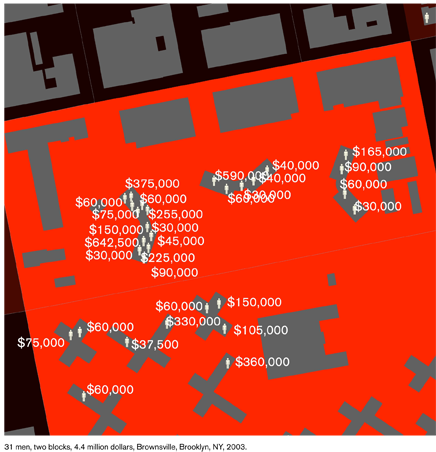
Nobody is denying that being mugged or raped or murdered is fun for the person who was mugged or raped or robbed or murdered. But the report by the Spatial Design Lab at Columbia University sponsored by The Architectural League that uses maps as a tool of analysis and discovery to suggest that because perpetrators live in areas with lots of other perpetrators, those entire communities are also the victims, not of the crimes per se, but of the impact of high concentrations of recurrent incarceration. Convicted people go away to prison leaving these neighborhoods with a gender imbalance (only 12% of the prison population is female). The money spent to imprison this largely male population is not being invested in developing these communities. This study finds a block where $4.4m has been spent to imprison its one-time residents. One block, $4.4m.

The authors pose the question their maps have helped make obvious: “What if we sought to undo this shift, to refocus public spending on community infrastructures that are the real foundation of everyday safety, rather than criminal justice institutes of prison migration?”
Relevant Resources
Spatial Information Design Lab at Columbia University (2006) Architecture and Justice sponsored by The Architectural League.

Comments 3
mike3550 — February 17, 2009
Great blog, I am really enjoying all of your posts!
I agree that these maps are helpful. Two things. First, I think that, even with Manhattan outlined, it might be difficult for a non-New Yorker to be oriented; possibly zooming out a little bit more or putting the city in a lighter gray than, say, New Jersey might help to orient observers.
But, intrigued by these maps, I clicked through the report that they are from. I think that it is instructive to compare these maps to those that of prison admissions by census tracts. These really highlight how concentrated, even within tracts, prison admissions are that would be glossed over by only using census definitions.
Laura Norén — February 17, 2009
Thanks for the comment - you are probably right that non-New Yorkers will need more than the outline of Manhattan to figure out where this is. Maybe a little thumbnail sized embedded site map with an outline of the state of New York would do the trick a la architectural master plans.
And you are also right that the concentration of prisoners' home addresses is remarkable and shows up even better on some of the other maps in the report.
Clarice — July 23, 2009
You have the sentence "Nobody is denying that being mugged or raped or murdered is fun for the person who was mugged or raped or robbed or murdered. " I'm guessing you meant
"Nobody is denying that being mugged or raped or murdered is NOT fun for the person who was mugged or raped or robbed or murdered. "