What Works
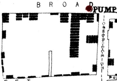
This is a combination of a map and a chart whose creation helped epidemiologists understand that cholera was not caused by a ‘miasma’ carried by the fog from the river, but rather was a germ carried in the water. It’s one of my personal favorite early examples of information graphics as a tool not of publication, but of analysis and discovery. Snow mapped the area around the Broad Street pump and then represented deaths with bars (not dots as some later cartographers have done when re-presenting Snow’s maps). The bars end up looking like stacked bodies, reinserting the gravity of the situation into the fairly sterile context of the map as info graphic.
The pattern is imperfect, but clear. Proximity to this well is directly proportional to mortality risk. The point of this entry it to encourage the use of information graphics not only in the publication stage of the research process, but also in the analysis stage. Granted, epidemiology isn’t a social science, but this is a classic example that sets the scene for contemporary examples of graphics as tools of analysis.
What Needs Work
There are other more comprehensive maps of the whole neighborhood that show the patterns even more clearly. What I have here is just a close up, probably a mistake on my part. The full version is here as a pdf. The romantic in me wanted to restrict this post to the original grainy, scanned map* drawn by Snow himself.
The realist in me notes that even though I believe the creation of information graphics can be used as analytic tools, the story in the John Snow case isn’t a perfect fit. An article by Brody et al in The Lancet points out that, “Snow developed and tested his hypothesis will before he drew his map. The map did not give rise to the insight, but rather it tended to confirm theories already held by the various investigators.” So Snow didn’t get his brilliant insight just by examining the map but he did use the map as an analytical tool later in the process to help confirm his hypothetical hunches. It wasn’t like he just threw the map/chart together to present at a conference or while he was writing up an article which is how I feel many social scientists end up using info graphics.
*This version is actually the second version though it’s main difference from the very first map is that the pump has moved just slightly off from the exact corner of Broad Street closer to the house of 18 deaths.
Relevant Resources
John Snow website at UCLA School of Public Health where I found many maps.
Brody, H., M. R. Pip, et al. <2000) “Map-making and myth-making in Broad street: The London Cholera epidemic, 1854.” The Lancet 356, (9223): p64-68.

Comments 1
Evolution of an Infographic | UNDP & César A. Hidalgo » Graphic Sociology — March 15, 2011
[...] for the promotion of public health. Illustrious crusaders from the yesteryear of public health like John Snow and Florence Nightingale developed some of the earliest ‘infographics’ in service of [...]