
What Works
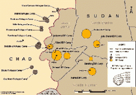
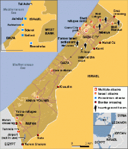
The best thing about the map of the camps around Darfur is that it exists at all. After looking at some of the elaborate maps that have been part of the news coverage of Gaza (see the one here, click through on the caption for a larger image) and earlier, of the bombings in Mumbai, I assumed I would be able to find something of similar quality related to the camps around Darfur to sate my curiosity about how big the camps are, where they are, how they are supplied, whether or not they are targets, and so on. But this map from USAID is one of the only things I could find around these interwebs that presented a basic map narrative of the camps in Darfur. Notably, I found many graphics promoting concerts that were fundraisers or awareness-raisers for the people in Darfur. Some of these concert posters and t-shirts got around the (apparently) tricky question of where Darfur is by just using an outline of the continent of Africa.
What Needs Work
The lack of a decent map-narrative around the problems in Sudan/Darfur indicates an uncomfortable fissure in the epistemology of crisis. I’m willing to conjecture that there may be an inverse relationship between perceived cultural differences and the production of ‘fact’ based information around crises. There isn’t an easy way to measure social/cultural difference, but it seems that the greater the degree of “otherness” of the people undergoing a crisis, the more likely the story is to be covered not with an onslaught of ‘hard facts’ that can be diagrammed, mapped, combed, regressed, permuted, computed, etc. but rather the story will be covered by emotive tools like first person narratives, photographs, and even awareness raising concerts, vigils, and that sort of thing.
I would love to hear what readers think about this theory of mine and I’ll continue to look for examples of differences in the use of information graphics across seemingly similar data sets.
Relevant Resources
BBC Map of Gaza Offensive – Week One (5 January 2009) with narrative time line.
NYTimes.com Israel and Hamas: Conflict in Gaza (4 January 2009) with narrative time line.
The United States Holocaust Museum Mapping Initiatives Crisis in Darfur. This is a plug-in to googleEarth that layers photos, videos, quotes, and a bit of 2004 information about the camps on the googleEarth map of Sudan/Chad.

Comments 3
Samia Babiher — February 4, 2009
Lack of first person narratives, and other appropriate forms of cultural expressions in the case of Darfur truely indicates a painful gap in the epistemology of crisis not only Darfourian but for all Sudanese. The more likely the story meant to be covered with hard mapped facts the more it seems effortless/safe to discuss the topic of 'otherness' and sociocultural difference. I hardly noticed any real theory on " Slogans and challenges of indigenous otherness" in Darfur as an entity, and about Darfur as part of an area of one million esq. miles the territory of Sudan! Yet, UN and others 'urge' Sudanese to solve their severe problems by themselves, and not to disturb neigbours and world security!
Mapping murder « A possie in Aussie — February 4, 2009
[...] blogger at Contexts Graphic Sociology noticed that there were plenty of detailed maps of the news coverage of Gaza. On searching for [...]
Laura Norén — February 5, 2009
Just wanted to post a little update on the issue of the lack of attempts to massage information coming out of Sudan into diagrammatic, orderly info graphic representations (as opposed to the evocative, emotional first person narratives and images of beautiful suffering).
I found additional maps of Sudan via the Internal Displacement Monitoring Centre but I must note that none were as richly detailed as I would have liked.