
What works
The World Resource Institute has partnered with Google to create an interactive portal for creating visualizations based on publicly available data. Google has been in the business of doing this sort of thing at least since the time they acquired Trendalyzer from Scottish-based gapminder.org in 2007. To be sure, gapminder.org is still a going concern of its own and IBM also offers free web-based visualization services through their Many Eyes program.
The focus of the trendalyzer is to show change over time and they succeed in making it quite easy to watch panel data change over time.
What needs work
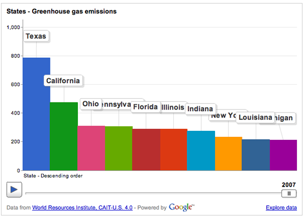
BUT…I find that this particular graphic is a great example of a misleading reliance on time as the key ‘context’ variable. So the graphic above breaks down greenhouse gas emissions by US state over the course of the year. If you have already clicked over to the World Resource Institute and watched the animation of these bars pumping up and down (more up than down) and trading places with each other over time, you will surely have been fascinated. I watched it three times in a row. But I was stuck wondering what the take away was meant to be. Clearly, there is the first order take away that the bars pretty much grow over time, they do not shrink. If I were the World Resource Institute, getting that message out would be important to me. But I would hope for more than just the bullhorn approach, “More is BAD! More is BAD!” which is kind of how this hits me at the moment.
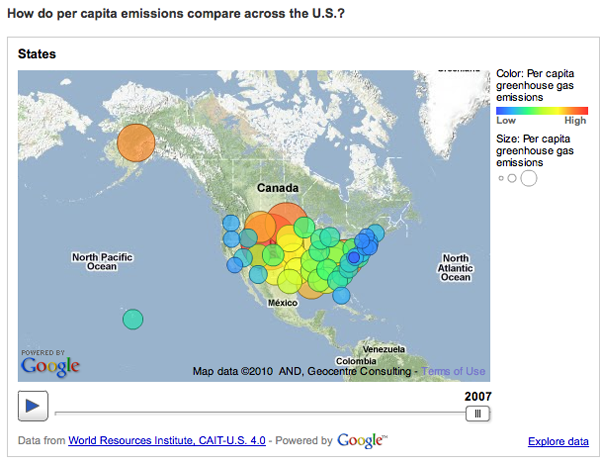
One of the biggest problems with this graphic is: not all US states are the same size. Of course Texas emits more greenhouse gases than most states – many more people live there than in, say, Kentucky, Iowa, Oregon, etc. But the World Resource Institute chose to display per capita emissions with the bubble approach (which has almost no redeeming value in my opinion because I cannot even see half of the bubbles. Maybe they all could have been reduced by half or more? And maybe instead of going with colors on a spectrum, the worst could have been red, the best could have been green, and most everyone else could have been some shade of grey? It’s just not possible to hold 50 changing variables in your active cognitive space at once. Reducing it to three variables – the good, the bad and the mediocre – could actually increase retention and pattern recognition.)
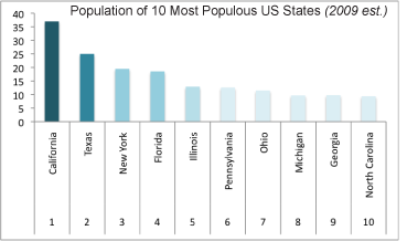
But back to the bar graph at the top. For the purposes of greenhouse gas emissions, it makes the most sense to interpret size as population not square miles, so that’s what I am going to do. In an attempt to be helpful, I threw together a bar graph of the top 10 most populous US states (using 2009 population estimates) in good old Excel. Note that our friend Texas is not the most populous state by about 12 million people – that is a lot of people. California is the biggest and they emit way less than Texas. New York is the third most populous state and we emit far less than our proportional share would suggest. Let’s hope it stays that way because I already find it unpleasant to breathe the air in Manhattan (admittedly, that could be due to many causes besides greenhouse gas emissions).
My suggestion here is clear: prepare a bar graph per state, per capita. And, yes, I would want to see how that changes over time. I would probably watch the animation six times instead of three times. My fantasy is that we could compare not necessarily by state, because that is in many ways arbitrary, but by personal habits. Say we get the most extreme environmentalists – vegan, freegan, won’t even take motorized public transportation, never flies, prefers candles to compact fluorescents, has a composting toilet – to the somewhat average person who has a car but not an SUV, eats meat but not every day, does not pay more for organic food – to the extreme non-environmentalist who owns three houses, drives in an Escalade or something of that nature, flies internationally at least four times a year, pays extra for organic food (but at restaurants), and sends clothes to the dry cleaners twice a week. But that would probably result in a graphic best described as “info-porn”, enticing and exciting but intellectually vacuous.
Summary
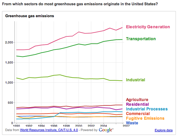
The WRI is on to something with their Google partnership. My favorite of their early work is this line graph that does a better job of telling the emissions story than any data broken down by state.
But the other great thing about the new partnership is that they ask for suggestions and set up a google group to manage the roll-out and incorporate nay-sayers like myself.
“By pairing [the Climate Analysis Indicators Tool] CAIT data with Google’s tools, there are new possibilities for people everywhere to take part in using sound data to tell stories that frame environmental problems and solutions. In the future, we hope to include additional data sets that can tell even more stories through Google’s visualization tools.
Suggestions for what you would like to see, or have a question about CAIT-U.S. data? Let us know here or join the conversation at http://groups.google.com/group/climate-analysis-indicators-tool.”