Giving Credit Where It Is Due
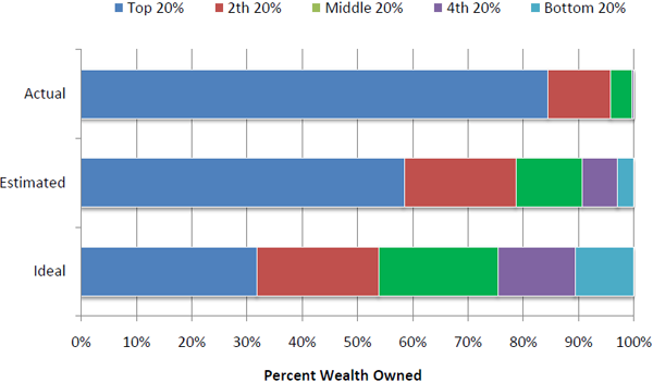
This graphic was created by Andrew Price for GOOD Magazine, inspired by a paper written by Dan Ariely (Duke University) and Daniel Norton (Harvard Business School) entitled “Building a Better America – One Wealth Quintile at a Time”.
What works
Wealth in America is heavily – extremely – concentrated among people in the top quintile. It’s not that wealthy people have a bit more than the middle class and a lot more than the lowest quintile. No. Wealthy Americans own almost 85% of assets in America. That should be surprising to you because when Ariely and Norton surveyed people to find out how much wealth folks *think* the top quintile owns, they estimate about 58%. Even that inequality is too much, the respondents think. In an ideal world, some inequality is acceptable, but the top quintile of earners should only hold about 32% of America’s wealth. And the bottom quintile would get a slice of the pie too, though at right about 10.5% it’s only one-third as big as the slice at the top. This would be a huge improvement over actual numbers where the bottom 40% owns less than 1% of America’s wealth.
What needs work
I would have put the wealthy people on the right since we usually order things from left to right. And if I were specifically trying to be polemical, I might have rotated the entire graphic and had the wealthy people on top, squeezing everyone else into the smallest possible space, kind of like a trash compactor. But, you know, I’m not trying to be polemical.
If I were trying to be polemical, I might say something along these lines: is it possible that because the bottom of our income distribution usually (though not always) has enough food to eat and a safe place to sleep, maybe even a television and a mobile phone, we have been lulled into thinking that extreme inequality is acceptable? Maybe even that extreme inequality keeps everyone pulling at their own bootstraps, trying to keep up with the Joneses, striving for some impossible future in which folks from the bottom four quintiles might make it into that top quintile? These are blunt numbers barely containing a moral question. In a wealthy society, is eradicating absolute poverty (food, shelter, safety, health care) the most morally responsible way to organize public funds? Is reducing inequality a moral imperative? Or just a bunch of belly-aching by people who should be happy that they can sit around and blog about these things?
Unfortunately, as a society we have not even been able to guarantee even an eradication of absolute poverty, let alone ushered in a debate about the moral implications of pronounced inequality. Morality is not the kind of thing social scientists are supposed to mention. The deep philosophical tenets of what it means to do the right thing are also usually absent from political debates, despite all of the overblown lamentations and soap operatic cases of individual hopes and despairs. There are still many many people who go hungry because they cannot afford to pay rent, buy food, and keep the lights on. There are still many people who cannot access basic preventive health care, either. Weren’t we all raised as children, as religious adherents or good humanists, to help those who cannot help themselves? Well. Americans aren’t so good at that. It’s easier to think that the poor aren’t really that poor (as this chart so bluntly demonstrates), that with food stamps and affordable housing vouchers they seem to be doing just fine. Maybe your neighbor tells you that they someone simultaneously holding a cardboard sign and a mobile phone. The gall of it! How can someone who so obviously has money – they are paying for that phone, aren’t they – be asking for money? When you hear that, think of this chart. Wonder about what it does to a social fabric to have such a vast difference between the wealth of the wealthiest and the poverty of the poorest (Which, by the way, includes many many people who are working. Full-time. Maybe even yourself).
It’s not my place to settle the moral debate about absolute poverty and relative poverty. But it is my place, and the point of this graphic, to raise the question and to make sure that we look at the whole graphic. It’s good to be shocked at how much the top quintile controls. But as Americans in this potpourri of a country together, we spend way too much time marveling at the monstrous wealth and not nearly enough time wondering what might be done about the dire straights of the bottom 40%-60% of us. If the graphic does nothing else, perhaps it shows you who your closest economic neighbors are – and they aren’t the folks to the left.
References
Ariely, Dan and Norton, Michael. (2010) “Building a Better America – One Wealth Quintile at a Time” forthcoming in Perspectives on Psychological Science.
Noren, Laura via Dalton Conley’s Intro to Soc text book: Champagne Glass Distribution of Wealth
