skyscraper

Skyscraper comparison diagram | Beau Daniels and Allen Daniels

What works

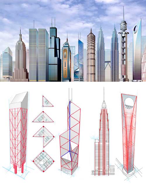
Following my post about Kate Ascher’s new book, “The Heights: Anatomy of a Skyscraper” I realized that one of the things I liked best about her take on skyscrapers was that she found a way to compare skyscrapers to their alternatives. Usually skyscrapers are just compared to one another, usually stripped of their urban contexts. So there will be a graph like the one below with skyscrapers from all over the world – different cities and climates and purposes – all lined up in height order.

Skyscraper Height Comparison | Unknown source

What I like about the graphic at the top (that originally appeared in Scientific American) is that it goes beyond the all-too-common height comparison and describes how weight and other architectural engineering concerns are handled.

What needs work

Given that the graphic by Beau and Allen Daniels was commissioned to appear alongside an article in a magazine that I have not read, I am qualified to discuss what is NOT working. I retrieved the image from their digital portfolio which did not mention the date or title (or author) of the Scientific American piece with which it ran.

References

Ascher, Kate. (2011) The Heights: Anatomy of a Skyscraper. New York: Penguin Press. [see my blog post about Ascher’s new book here]

Daniels, Beau. Skyscraper Construction and web-based portfolio.

Efficiency Diagram of a Skyscraper | Kate Ascher

What works

Kate Ascher has a new book coming out soon – The Heights: Anatomy of a Skyscraper – which is hopefully just as good as her previous book: The Works: Anatomy of a City. The Works dissected the infrastructure cities need – from solid waste to electricity to water mains – using information graphics and relatively brief textual discussions. In that book Ascher did an incredible job of answering questions everyone has – where does all the garbage go? – and adding information that we probably ought to know but would never think to worry about (like: how can we design cities to mitigate the threat of flash flooding which is exacerbated by all the hard surfaces and the relative dearth of water-absorbing terrain?)

This graphic is from her new book which, from the looks of it and the kind words in Wired Magazine, will be just as good as her previous work. What she does here is display the land-use efficiency of skyscrapers. One of the things skyscrapers do particularly well, their raison d’etre depending on who you ask, is to concentrate activity and resources in a very small footprint. Ascher shows us what that footprint would look like if it were spread out in a typical suburban density. The typical skyscraper in the diagram takes up 60% of a New York City block. Unstacked and spread in a typical suburban-style configuration it would take up 21+ blocks.

What needs work

Nothing needs work here. This is a clever diagram, easy to understand at first glance, easy enough to translate out of the New York City grid by using the number of square feet dedicated to each purpose that Ascher has listed. The colors are well used, the textual explanation provided is necessary but not too much, and the diagonal layout makes the image much more dynamic.

I would love to say more about the diagrams in the rest of the book but I haven’t yet seen it. Hopefully, they are all just as good as this one.

References

Ascher, Kate. (2011) The Heights: Anatomy of a skyscraper. New York: Penguin Books.

Roper, Caitlin. (2011, November) “Sky-High Efficiency” Wired Magazine, p. 36.