rural America

Increase and decrease in Hispanic population in the Dakotas, Minnesota, Iowa, Nebraska, Kansas, and Oklahoma | 2010 Census

What works

This is a quiet story, the kind of thing that may or may not be picked up by a major national newspaper like the New York Times. Rural America is often used as a political flag to wave by politicians, but there is not often too much coverage of day-to-day life. The 2010 Census clearly shows,

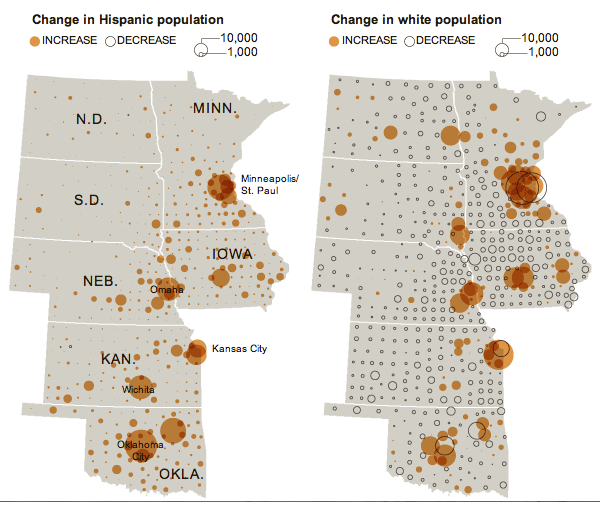
The Hispanic population in the seven Great Plains states shown below has increased 75 percent, while the overall population has increased just 7 percent.

What is equally odd is that this story is running two graphics – the set of maps above and the one below – that more or less depict the same thing. I salivate over things like this because it gives me a chance to compare two different graphical interpretations of the same dataset.

The two maps above includes a depiction of the change in the white population as a piece of contextual information to help explain where populations are growing or shrinking overall. These two maps show that 1) in many cases, cities/towns that have experienced a growth in their hispanic populations also received increases in their white populations (hence, there was overall population growth) but that 2) there are some smaller areas that are experiencing growth in the Hispanic populations and declines in the white populations.

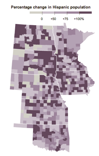
The second map shows only the growth in the Hispanic population without providing context about which cities are also experiencing growth in the white population. Looking at the purple map below, it’s hard to tell where cities are growing overall and where they are only seeing increases in the Hispanic population which is a fairly important piece of information.

Percent change in hispanic population in the Dakotas, Minnesota, Iowa, Nebraska, Kansas, Oklahoma

What needs work

For the side-by-side maps, the empty and colored circles work well in the rural areas but get confusing in the metropolitan areas. For instance, look at Minneapolis/St. Paul. Are the two central city counties – Hennepin and Ramsey – losing white populations to the suburbs? That is kind of what it looks like but the graphic is not clear enough to show that level of detail. But at least the two orange maps allow me to ask this question. The purple map is too general to even open up that line of critical analysis.

This next point is not a critique of the graphics, but a direction for new research. The graphics suggest, and the accompanying article affirms, that Hispanic newcomers are more likely to move into rural areas than are white people. Why is that? Is it easier to create a sense of community in a smaller area, something that newcomers to the area appreciate? If that is part of the reason new people might choose smaller communities over larger ones, for how many years can we expect the newcomers to stay in rural America? Will they start to move into metro areas over time for the same reason that their white colleagues do?

Are there any other minority groups moving into (or staying in) rural America? Here I am thinking about American black populations in southern states like Alabama, Mississippi, and Arkansas. Are those groups more likely to stay in rural places than their white neighbors? For that matter, what about white populations living in rural Appalachia. Are they staying put or are they moving into cities like Memphis, Nashville, and Lexington?

How do things like educational attainment and income levels work their way into the geographies of urban migration?

References

Queens College Department of Sociology. (13 November 2011) Changing Face of the Rural Plains [information map graphics] Queens College: New York.

Sulzberger, A.G. (13 November 2011) Hispanics Reviving Faded Towns on the Plains New York Times: New York.

The Growth of US Newspapers, 1690-2011 from Geoff McGhee on Vimeo.

This animation is taken from the interactive data visualization of the Library of Congress’ “Chronicling America” directory of US newspapers. It shows all newspapers in all languages in the US from 1690 to 2011. View the full visualization at http://ruralwest.stanford.edu/newspapers. Created by the Rural West Initiative of the Bill Lane Center for the American West, Stanford University. Visualization by Dan Chang, Krissy Clark, Yuankai Ge, Geoff McGhee, Yinfeng Qin and Jason Wang.

What works

This visualization of the rise and fall of newspapers in America is interactive and not to be missed. Click over to the interactive visualization (or open it in a new window) and then come back and read commentary. The folks at Stanford’s Bill Lane Center for the American West have used Library of Congress records to create what they say, “would be fairer to call a “database” visualization than an omniscient creator’s-eye view of the growth of American newspapers”.

The trick with any kind of database visualization is that there is often way more information in the database than can comfortably fit in the first graphic representation that comes to mind. The folks at Stanford have done a masterful job.

Here are all of the variables I could pick out that are built into this graphic without overwhelming viewers with too much information:

  • Time | They embed a timeline at the top and turn the whole image into snapshots across time. The time variable is critical to their message.
  • Location of newspapers | They used a map with dots on it to show where these newspapers were being written. I am not always a fan of maps, but in this case, they needed to use a map because another main part of their message is the geographical distribution of newspapers, especially in the American West.
  • Number of newspapers per city | Each city is marked with a dot that grows and shrinks over time as the number of newspapers in that location grows and shrinks.
  • Language in which newspapers were written | The color of the dots correspond to one of seven languages, plus an 8th color for “other” languages. There is also a gray dot that represents all of the newspapers of any language. The languages and the pan-language grey dot can be turned on an off so that it is possible to see, for instance, just the changes in Spanish language newspapers.
  • Publication frequency | This is a filter option that allows users to see only daily or only weekly/biweekly or only monthly+ publications.
  • Textual description | There is a narrative about newspapers that is important to the authors as well as to us as readers/viewers trying to understand this massive amount of data. They chose to use 3-4 sentences to describe major changes every 10 years or so, less often before 1900. I found this to be the right amount of text – brief enough so that it didn’t overshadow the infographic, but dense enough so that it contained substantive material. Instead of trying to display major historical events on the map somehow, they use the text to mention things like the Civil War and Great Depression which allows them to describe the impact of these events on newspapers in particular.
  • Actual titles of newspapers by city | If users click on a particular city at a given moment in the timeline, they can see a list of all the titles of the newspapers that were being printed at that place and time. The languages of the newspapers correspond to the color coding system for languages used throughout the graphic. If users want additional information about any of the titles, they can click on the title and be taken to the entry for that title in the Library of Congress database.

I couldn’t be more excited (or proud) of this project. [Full disclosure: I am not personally acquainted with anyone involved in the project.] Please go play around with it this weekend. Even if you are not interested in newspapers, it is impressive to see how they managed to create such a thorough graphic – a database visualized – without making it impenetrable.

More information about newspapers, the west, and rural America

For more on these issues, the team at Stanford has also released two written reports on this topic: Rural Newspapers Doing Better Than Their City Counterparts and did the West Make Newspapers or Did Newspapers Make the West?.

References

Bill Lane Center for the Study of the American West at Stanford University.

[Graphic: Data Visualization: Journalism’s Voyage West]

Library of Congress: Chronicling America Project