Mexico

Drug Cartel Areas in Mexico | Christian Science Monitor

Drug cartels cause social ills

Unless you’ve had your head in a bucket since 2007, you are at least vaguely aware that Mexican drug cartels trafficking their goods into the US have caused significant social illness in Mexico, especially in areas close to the US border. Social illness here can be measured in cartel-driven murders, but that captures only the most gruesome, sensational branches of the drug virus. Besides the deaths are fear, anxiety, mistrustfulness as well as poverty, corruption, and vast inequality.

Is mapping the right way to understand Mexico’s drug trafficking problem?

The graphics here try to pack all of the complexity and destruction of those social ills into maps. Maps are rational. They allow us to feel we have a handle on the components that make up a problem. In this case, I am sure they are not explaining the whole story. I’m also not sure they are trying to explain the whole story.

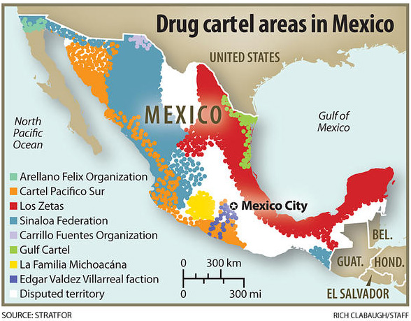
What I like about the first map is that the map makers lay out the obvious: which cartels are where. Then they go one step further and highlight the contested territory. In case the colors aren’t coming through clearly, the white areas are the disputed areas. There are a lot of white areas.

And yet…

One would expect most of the violence in a situation like this to be in the disputed areas. But that isn’t the case. Most of the violence is near the US border. The border is another kind of contested territory, one that is much more important than white areas as far as violence prevention is concerned. In fact, those areas aren’t governed by one cartel or another because those areas are not critically important to drug trafficking. None of the cartels much care.

So let’s take a look at another map because I’m thinking the first one implies that we should find violence in the middle of the country.

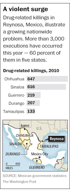
Drugs and deaths in Mexico

Drug-related crimes south of the US border | The National Post

This graphic shows not only traffic patterns – where do the drugs go? – but also maps of where the deaths have been. It quickly becomes clear that the drug-related deaths are up near the US border, not in the ‘disputed areas’ highlighted in the previous map. In this map, (thanks unnamed National Post graphic designer) that undisputed area is left unclaimed and unlabeled. That’s a more accurate way to understand those regions and the inset series of maps below the main map do a good job of visually locating cartel-related violence.

The other thing I love about this map is that it specifies *which* drugs are being trafficked. Call me crazy, but I have found it odd that there is a great deal of talk about ‘drugs’ in Mexico as if there is no good reason to talk about which drugs are being moved where. Why is it useful to know which drugs are going where? First, it’s nice to know which drugs because different drugs have different price points per volume and weight. Economics matter. If one drug has a higher profit margin than another because it retails for more per ounce but doesn’t cost much more to produce/transport, one could assume that it will become more popular. Then again, demand matters, too. Even if pot is easy to produce, doesn’t mean you can convince cocaine users to try weed. They probably already tried it and moved on.

Another reason it matters which drugs we’re talking about is that detection and apprehension vary from drug to drug. An easy example: a pot sniffing dog probably won’t lead authorities to a stash of ephedra. What’s more, being able to tell where things are coming from and going to means that it is easier for authorities to target weak points in the routes. We know from news stories (I recommend looking at the LATimes, see references below), we know that drug runners pour much energy into protecting the drug routes right at the US border. But they aren’t digging tunnels under all of Mexico. There are points in the chain of drug traffic that are more vulnerable. Some of those points are deep within Mexico where it might be difficult to get well-trained, cooperative authorities with the necessary tools and manpower to perform raids.

My main gripe about these graphics is that they display this problem as a Mexican problem. This is not a Mexican problem. It is a Mexico-US problem. The demand in the US is pulling all those drugs up from south of the border. Looking at it this way helps introduce conversations about economic imbalances. I imagine that one of the reasons drugs come from Mexico is the same reason that many large companies choose not to have large labor forces in the US: labor is cheaper in Mexico. Various instantiations of poverty also tend to encourage corruption; encouraging local police to fight the cartels is hard when they are out-gunned and out-manned by cartels who can afford to pay off whoever they want including witnesses, other cops, border agents, and whoever else is likely to become cooperative after the application of a bit of grease.

Conclusion

The drug-related social illness in Mexico is an unfolding problem, one that has been discussed with more complexity elsewhere. I hope to illustrate that while the rationality of mapping patterns is appealing, it also tends to obscure complexity. It’s easier to misinform than inform with a map. They are deceivingly neat, these maps.

References

LATimes “Mexico Under Siege” special section, US News.

Llana, Sara Miller. (13 January 2011) “Mexico drug war death toll up 60 percent in 2010. Why?” in The Christian Science Monitor, World/Americas section.

National Post Staff. (31 December 2010) Graphic: Drug Terror Just South of the Mexico Border in The National Post. [Graphic].

Annual change in U.S. GDP under different scenarios | 2009-2019

What Works

We are able to see the results of three hypothetical assumptions regarding the treatment of unauthorized immigrants and the impact that could have on the GDP of the US from 2009-2019. While I often advocate trend lines for showing changes over time, in this case, what we are interested in is not just a trend over time, but the difference between the three outcomes in each year. For that reason, the choice of bars works better than would the choice of trend lines. Seeing all the three options on the same graph neatly summarizes the overall findings of the report. If you are interested in learning more about just how these projections were made, all of that is detailed in the report [link below in references]. One important note that the report mentioned more than once is that the cost of the mass deportation scenario does not include the cost of deporting individuals (which would be legal and physical), it just represents the impact on the economy of removing unauthorized workers.

What Needs Work

I snipped this graphic out of a report, so the following critique is for me more than for the graphic creator. Because this kind of projection requires so many assumptions and simplifications, providing summaries of the most critical assumptions is necessary for the proper cognitive digestion of the infographic. The report contains sufficient discussion and references, but in a world where people like me clip graphics and stick them in other reports or on blogs, savvy designers will include longer captions [the original caption is included in the image file] or other explanatory text even if that same information is included in the formal text. Hyper text culture is spreading. It is far more common now to put together a little bit of this from here and a little bit of that from over there in search of just that bit of information that we think we want rather than reading/watching the full, originally constituted work. Love it or hate it, this hyperlink no place is the place where we have arrived.

References

Hinojosa-Ojeda, Raúl. (7 January 2010) “Raising the Floor for American Workers: The Economic Benefits of Comprehensive Immigration Reform”. Center for American Progress.

War on Drugs in Mexico (Civil war - Mexican cartels versus Mexicans)

What works

Throwing in a map is smart – most Americans do not know where all the Mexican states are. Breaking the murders down by location is also smart. A national total would obscure part of the point, which is that the drug wars in Mexico are not hitting the whole country equally. Some areas are much more important to the cartels and are getting walloped while others are relatively unscathed, at least in terms of murders and other violence. Including the map and breaking the graph down by geographical boundaries both communicate the geographical specificity of the murder problem.

What needs work

This graphic illustrates just one element, one metric, of a whole constellation of economic and social problems. In journalism, getting any graphics into an article on a tight deadlines is difficult. One could argue that since the troubles in Mexico are not so new, it might be worth putting some extra time into the production of a graphic that could display murders, kidnappings (of whom and for what purpose – money, political deals, revenge), the quantity and type of drugs trafficked from which areas, trafficked/processed through which locations, for distribution where and by which cartels.

Besides a comprenhensive narrative of the trade, which is probably nearly impossible to construct because if it were easy to get information about where drugs are grown, processed and distributed I would be amazed. However, there is at least one other way to demonstrate the violence in a more comprehensive fashion, just by making some assumptions about social/economic networks with respect to the people murdered. The information on kidnappings may not be available – the article mentioned that five journalists had been kidnapped but only one was reported to the police. So we are left with murders, and that is probably why the Washington Post ran the graphic that it did.

Widespread murder creates a terror society – one in which fears and suspicions impact daily life over a sustained period of time. But it can be quite difficult to quantify terror and many graphics rely on quantifiable data. The article is well written and its narrative does a good job of conveying the magnitude of the drug violence and its encroachment on the lives of everyday folks.

The spasm of killing, kidnapping and extortion in the northeastern states of Tamaulipas and Nuevo Leon — vital trade, energy and manufacturing centers on the Texas border — marks a serious escalation in the U.S.-backed drug war and comes with a 21st-century twist: Mexican officials struggle to calm what they call a mass psychosis of fear, stoked by social-media chatter and grisly YouTube videos, by using Twitter to post warnings about “situations of risk.” — William Booth

There is clearly good reason for graphics to accompany text – each play unique roles. That being said, I still think there may be a way to create a network graph that demonstrates the social span of the violence. It could look at one of the hard hit communities in which all people are assumed to be alive and unrelated to anyone who was murdered. Let’s imagine one dot for each person, colored green to show they are alive. Now, a person who is murdered will become a black X and all of their family members and close friends will become black dots (still alive, but severely impacted by violence since they lost friends or family). In a perfect world, more distant friends would become brown dots. But it would be difficult to make a map like that because it is difficult to identify looser friendships. Use guest books at funerals to gather data? Facebook? Hard to say. Kidnappings, where known, could be similarly mapped. After constructing a network map like this, it would be much easier to see that one murder impacts a much wider swath of a community. Once there are many murders, there will be very few people left as green dots. Widespread murder is like necrotic tissue.

Where the persons murdered and kidnapped were wage earners, it would also be possible to demonstrate the income lost by the community as compared to the estimated value of the trafficking activity over a given time period. Of course the value of human life should not be measured by the money they failed to earn because they were dead. It’s just as silly as reducing the value of a human life to the market value of the chemical components of the human body. The point of such a comparison would be to demonstrate the economic impact on the community rather than some sort of death calculus.

References

Booth, William. (21 April 2010) “Drug war violence appears in Mexico’s Northeast, near Texas border”. In The Washington Post, World, North America section.