Introducing Impure
I have waited too long to introduce you to Impure Blog which is a blog presenting visualizations from the free-of-charge and powerful data visualization tool: Impure. The tool was developed (and is still being developed) by Spanish start-up visualization firm Bestario. Many posts are in both English and Castellano (that’s Spain’s version of Spanish for those of you who aren’t sure what Castellano means).
The work they have done in developing the visualization tool as well as the work they have done to use the tool well is commendable. IBM’s Many Eyes visualization tool is powerful, but the developers seem to have left a bit too much to the crowd when it comes to using the tool well. The gentleman at Bestario (and I believe they are all men, at least this was true the last time I checked) seem to be deeply interested in using the tool, not just building it.
I’ll have another post on the tool and what it’s good for, but today I think it makes sense to take a look at one of the projects they’ve recently released that uses a number of graphics to describe changes in urban growth around the globe since 1950.
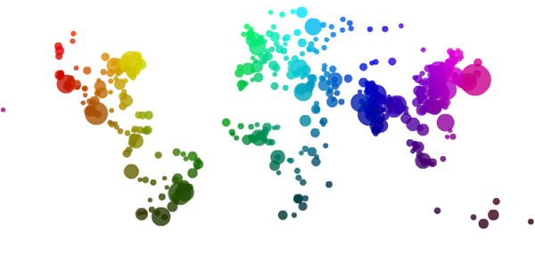
The map at the top here uses rules about latitude and longitude to assign color values to all cities. This is one step above the rule used at gapminder which is that each country is assigned a single color based on it’s continent of origin. The Impure visualization is more sensitive – colors are assigned by latitude and longitude values so there is a gradient across each continent. Maybe it’s better to let them explain how they used longitude and latitude to assign color values:
Colors in the visualization are applied according to cities geographic coordinates: Hue varies with longitude, Saturation is always 1 and Value varies with latitude, based on the HSV color model, as the following image shows (cirlces areas are proportional to cities population in 2010)
This map works not because it tells the story they are trying to tell, but because it acts as a key for the interactive graphic below, which uses ordered-stacks of cities linked to themselves over time to demonstrate how city size has varied over time for 590 world cities.
Interactive City data
Embedded below is an interactive graphic that should have year labels starting at 1950 and ending at 2010. As a whole, it’s overwhelming to look at…no sense can be made of this block of color…until you start mousing over. Go ahead, mouse over, you’ll like it. I believe I said, “Oh!” when I did it the first time.
<<Disclaimer: most of the graphic embedded just fine but because of some size constraints that I wasn't able to overcome, the top cities are chopped off. Click through to get the full version and see what happens to Tokyo and Mumbai.>>
What works
Interactive graphics are often better than static graphics because they are not merely presented to the viewer, the viewer has an opportunity to alter which information she sees. As a pedagogical tool, dialogues are generally better for retention and comprehension than monologues. It’s hard to get a dialogue out of a static graphic – much easier to get a dialogue going with an interactive graphic.
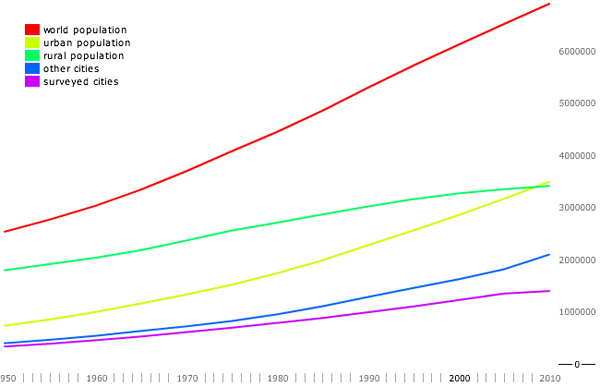
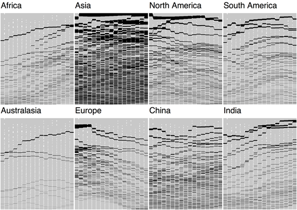
I also applaud the team for presenting not only the crowning achievement – the interactive graphic – but also the map that acts as a color decoder, the line graph that contextualizes the growth in urban areas by illustrating the decline in population’s in rural areas, and the versions of the interactive graphic that breaks the world into continents (more or less) so that we can start to see larger trends.


What needs work
My one major concern with the way the interactive graphic displays information is that it relies too heavily on rankings. It appears that the world population has remained the same since 1950, but people have just moved from one city to another, thereby changing the rank ordering of cities by population. That’s what happens when the size is constrained to a perfect rectangle. It would be nice if there were some way to show overall growth in population over time as well. I realize that would just look like a stacked, area-under-the-line graph. Not sure if that is an improvement or not. Quite sure that there is a creative way to solve the problem which hasn’t occurred to me yet.
