infrastructure

Deconstructing a Ford plant | The Atlantic

What works

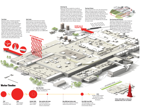
This diagram of the closure of a Ford plant identifies both physical and temporal processes that a marvel of modern manufacturing has to undergo in order to cease production in a rational way. Environmental damage has to be mitigated – the paint shop is especially toxic and it seems to take workers years to handle that. [Let me register my vote here for automotive paneling that can be modified without paint or other dreadfully toxic processes. Surely, there has to be a better way. Sandblasting?]

The diagram is very smart. It maintains the size of the Ford plant – the thing takes up most of the visual space. Clearly, it could have taken up less space and given over more space to various explanatory text blocks and additional-information diagrams in sidebars, but I think that approach would have diminished the gargantuan nature of both the plant itself and the processes of shutting it down.

Second, the integration of a timeline measured by number of workers employed is just the perfect layer of information to pull the rest of the text-boxes together as a narrative. The timeline makes the whole graphic complete.

Third, I don’t mind the length of the text in the text blocks. It seems about right to me.

What needs work

I could have used some additional information about the relative uniqueness or typical-ness of an automotive plant closure (or even various elements of the plant closure process). The New York Times article Developers Revive Closed Auto Plants notes that about half of the nation’s 263 closed auto plants have been revived one way or another. In one case, an old Ford transmission factory now houses a community college with a 4-year nursing program on one corner, an aluminum scrap processor on another, a mobile facilities manufacturer in a third location, but is still more than half vacant. I was curious while looking at this graphic: Would Ford have had to go through the same kind of process with a transmission factory (they don’t paint transmissions so it seems it should have been easier in that regard)? When a plant is going to be repurposed, does Ford still have to do all the same ‘closing time’ activities or do those become the responsibilities of the new owner? Is that a negotiable term?

While a graphic would have been hard-pressed to answer all of those questions, I was hoping it would be able to at least address the idea that plants are both closing altogether and being repurposed – two related but not synonymous occurrences. In some places where the plants are closing, municipalities demand that their former owners take them down to slabs under the assumption that a slab is more appealing to a new owner than a facility that may need to be torn down and rebuilt.

Overall, I think the graphic is successful but could be better with more contextual information. I know some of that was in the article, but I am only reviewing the graphic, which I think should be able to stand alone.

References

Peck, Don. (April 2009) Disassembly Line. The Atlantic.

Christie, Bryan. (2009) Disassembly Line [information graphic]. The Atlantic.

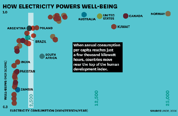
Human Development Index plotted against Electricity Consumption

What works

Infrastructure is a critical resource for supporting basic human life and this graphic does a good job of indicating the geometrical returns to electrical infrastructure in poor places. A little bit of electricity goes a long way.

Electricity doesn’t cause well-­being, of course. But it is a powerful enabler. When people have lights that allow them to study and work after dark, refrigeration to keep foods and medicine fresh, pumps and purifiers to irrigate farmland and produce safe drinking water, and cell phones and computers to connect them with commercial, educational, and health care resources, they can more fully participate in the social and economic activities that drive human development.–Arun Majumdar

What needs work

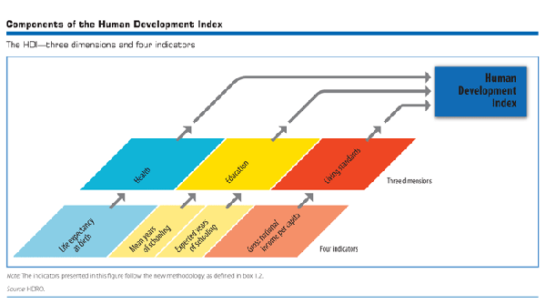
The Human Development Index should be spelled out a little in graphics like this until it is clear that the average person on the street knows what is represented by the Human Development Index. [To the author’s credit, he does outline the components of the HDI in the text.] It can be a very tricky metric. The Human Development Index used by the UN uses four measures: life expectancy at birth, mean years of schooling, expected years of schooling, and gross national income per capita to create the human development index for a country. They use two measures of education so that they can be more sensitive to changes as they happen. It takes a long time to change the mean educational attainment in a country even if that country has recently put in place policies and infrastructure to educate more children for a longer period of time. All of the measures are chosen because they are relatively easy to measure and because most countries have at least sort of reliable data for all four measures.

Human development index - UNDP

I also don’t like that all of the wealthier countries are labeled but only some of the poor countries in the lower left are labeled.

I assume the colors refer to continents. A key would have helped.

To help viewers understand kilowatt hours, I would have liked to see some comparison between something a typical person would be familiar with and this magical 2500 kilowatt hour/person/year threshold. How many days could I power my iMac at that rate? A month? Half a year? What about my refrigerator? I have no idea how much 2500 kilowatt hours might be.

References

Majumdar, Arun. (2012) Electrifying the bottom of the pyramid Harvard Business Review.

UNDP. (2011) Human Development Index.

Water Supply Infrastructure Schematic
Water Supply Infrastructure Schematic | Laura Norén

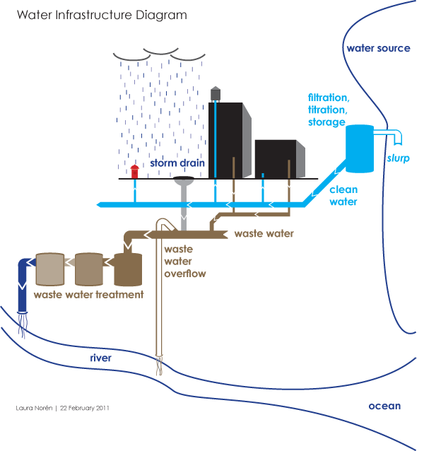
Water Infrastructure Schematic Diagram*

I put together the diagram above to help me explain how water is delivered and taken away from urban locations. The point I want to make with the diagram is that the infrastructure is designed to deliver water to ‘typical’ buildings and that this means people who are wandering around cities where buildings are all private also lack access to water. There is a political debate going on right now about whether or not access to water is a human right – the UN voted on this and decided water IS a human right but large countries like the US disagreed. When the US does not back UN resolutions, those UN resolutions tend not to mean as much.

So why would the US vote against this resolution? I am not altogether sure, but I believe it has something to do with the fact that many places have privatized their water. Privatization of water takes different faces. Sometimes a system like the one diagrammed above is privatized. Studies have shown that when this happens, the company that sets up a system like the one above delivers a poorer quality product – more sedimentation and other low level contaminants which are the typical results of choosing sources quite close to cities. The closer the source is to the delivery, the lower the expenditure for engineering and installation of water mains, monitoring stations along the route, and reservoirs. The other way in which water can be privatized is through bottling – bottled water in some parts of Africa is more expensive than Coca-Cola. And this in areas that may have no access to safe alternatives for drinking water. Nestle owns the Poland Springs brand and folks in Maine are scrambling to get hydrological studies performed that can prove Nestle’s water extractions are drawing down lake volumes on adjacent properties. The only way to fight Nestle, it seems, is to prove that they are damaging one’s own property and yet water sources – rivers, lakes, oceans, springs – technically do not belong to private individuals. The individuals or corporations can own the land surrounding them, but the water is a bit like air and cannot be owned. (Rights to the fish found in the water CAN be owned. As you can see this gets complicated quickly.)

The diagram above contains none of the politics of the discussion below. For me, it is important to attempt to create graphics that are not political, even when I am creating them for the express purpose of delivering a presentation that takes a side in a political fight. For me, the challenge is two-fold. First, I face the technical difficulty of creating any kind of complex diagram. I’ll leave questions about execution out of this particular discussion though feel free to comment on execution below. Second, when I know I have a political message that I want to keep out of my graphics, I am often too far into my own head to be able to step back and determine whether I have created something that is both comprehensive enough to tell a complete (but apolitical) story and one that does not drift into the political. As it is, this diagram seems to err on the side of being incomplete rather than being more fully detailed where the details start to carry politics with them. My larger point is that this is one way in which cities are exclusionary zones by design. It would be easy to find a way to provide the basic infrastructure to supply water outside of buildings – fire hydrants do just that. But maintaining the ‘last mile’ of infrastructure is almost always completely given over to the private sector. Individuals and companies maintain bathrooms with all of their fixtures, cleaning, and maintenance requirements. This is big business. Just about every shop and restaurant on the street in New York reserves the rights to the bathroom for customers only.

2nd Avenue "no bathroom" sign, East Village, New York City (2009)

One of Starbucks redeeming qualities is that their bathrooms tend to be open to all, proving that it is possible to continue to service a relatively affluent clientele no matter who is in the bathroom.

Obama on Water

The word on the political street is that even though Obama’s stimulus efforts contain plans to address infrastructure, water infrastructure has been taken off the table at this point. Our water infrastructure is ageing; most of the current infrastructure is due to age out of acceptable functionality in the next ten years. Already there are an average of 240,000 water main breaks. Just yesterday the New York Times reported that a dam outside of Bakersfield is uncomfortably close to catastrophic failure, threatening the lives and livelihoods of thousands of people. There are another 4400 dams in the US that require work in order to fall within comfortable safety ranges. Some are publicly owned, some are privately owned. In either case, it is unclear which entities can foot the bill (projected at $16 billion dollars over 12 years).

*This diagram uses New York City as a guide. Not all cities have overflow valves that risk the release of raw sewage due to increases in rain. What’s more, in New York there are some other systems in place to recapture some of the overflow at the point of release. But this is a different kind of political discussion, one that focuses on the other typical focus of water discussions – the environment.

References

Ascher, Kate. (2005) The Works: Anatomy of a City. New York: The Penguin Press.

Bone, Kevin, ed. and Gina Pollara, Associate Ed. (2006) Water-Works: The architecture and engineering of the New York City water Supply. The Cooper Union School of Architecture, New York: The Monacelli Press.

Bozzo, Sam. (2009) Blue Gold: World Water Wars [Documentary film, available streaming for free]

Davis, Mike. (2006) Planet of Slums. Brooklyn, NY: Verso Books.

Fountain, Henry. (2011) Danger Pent Up Behind Aging Dams. New York Times. 21 February 2011.