Human Development Index

Human Development Index plotted against Electricity Consumption

What works

Infrastructure is a critical resource for supporting basic human life and this graphic does a good job of indicating the geometrical returns to electrical infrastructure in poor places. A little bit of electricity goes a long way.

Electricity doesn’t cause well-­being, of course. But it is a powerful enabler. When people have lights that allow them to study and work after dark, refrigeration to keep foods and medicine fresh, pumps and purifiers to irrigate farmland and produce safe drinking water, and cell phones and computers to connect them with commercial, educational, and health care resources, they can more fully participate in the social and economic activities that drive human development.–Arun Majumdar

What needs work

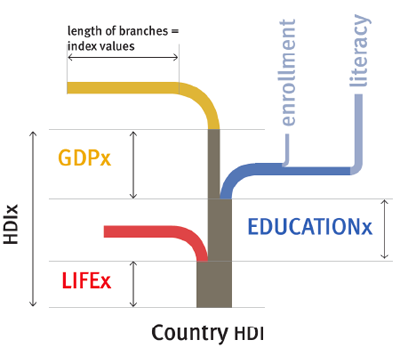
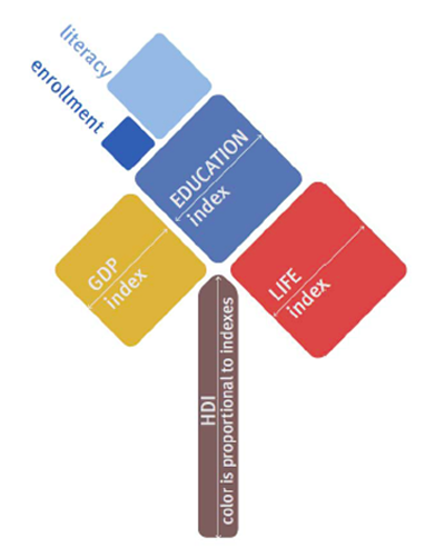
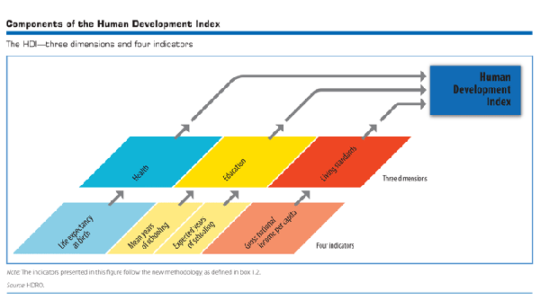
The Human Development Index should be spelled out a little in graphics like this until it is clear that the average person on the street knows what is represented by the Human Development Index. [To the author’s credit, he does outline the components of the HDI in the text.] It can be a very tricky metric. The Human Development Index used by the UN uses four measures: life expectancy at birth, mean years of schooling, expected years of schooling, and gross national income per capita to create the human development index for a country. They use two measures of education so that they can be more sensitive to changes as they happen. It takes a long time to change the mean educational attainment in a country even if that country has recently put in place policies and infrastructure to educate more children for a longer period of time. All of the measures are chosen because they are relatively easy to measure and because most countries have at least sort of reliable data for all four measures.

Human development index - UNDP

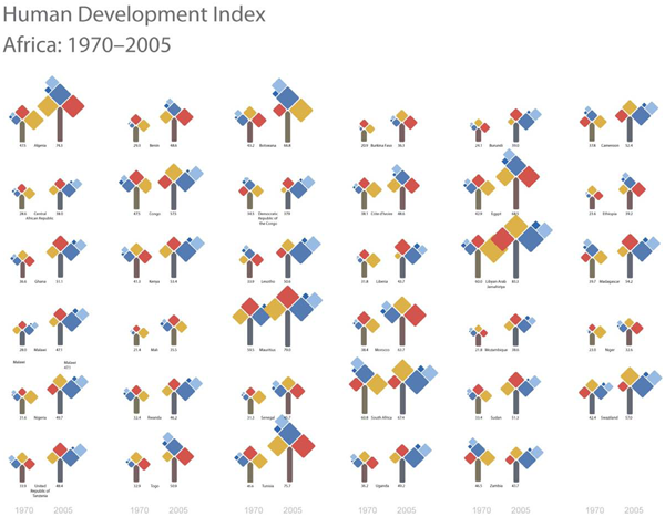
I also don’t like that all of the wealthier countries are labeled but only some of the poor countries in the lower left are labeled.

I assume the colors refer to continents. A key would have helped.

To help viewers understand kilowatt hours, I would have liked to see some comparison between something a typical person would be familiar with and this magical 2500 kilowatt hour/person/year threshold. How many days could I power my iMac at that rate? A month? Half a year? What about my refrigerator? I have no idea how much 2500 kilowatt hours might be.

References

Majumdar, Arun. (2012) Electrifying the bottom of the pyramid Harvard Business Review.

UNDP. (2011) Human Development Index.

A recent (well, 2010 so not *that* recent) report from the UNDP traces the history of information graphics as tools for the promotion of public health. Illustrious crusaders from the yesteryear of public health like John Snow and Florence Nightingale developed some of the earliest ‘infographics’ in service of their public health goals. I’ll post more on that portion of the report later this week. But for now, I’d like to discuss the bulk of the report which was dedicated to the decisions that César Hidalgo (Professor at MIT’s Media Lab, Student at Harvard’s Center for International Development, Associate Professor at Northeastern’s School of Art and Design) made as he developed an appropriate information graphic to represent country level data generated by the Human Development Index. (See also: Measure of America’s Human Development Index graphics for the US only and the Graphic Sociology post about them).

The graphic below this is not intended to be a graphic. It is the basic formula upon which the Human Development Index (HDI) is based. The HDI is a single number that represents a composite score that takes contributions from educational, income, and health measures (which are themselves composite scores). The authors first came up with a simple, almost graphical representation of the relationship between the contributing factors that’s a sort of formula/graphic hybrid. Many social scientists would stop here and move on to the writing of the report, content to let a table with country-level data do the reporting for them.

Basic Human Development Index Relationship | César Hidalgo

HDI Spline Tree

From this hybrid between a formula and a graphic, Hidalgo developed the spline tree you see below. It shares some aspects with the basic formula above, that much is visually clear, but already the lengths and colors of the components are taking on meaning, allowing each country/year combination to produce a tree that is distinct from other trees, but similar enough to be comparable.

The HDI Tree - Spline Design | César Hidalgo

One of designer’s common strengths/weaknesses is the inability to stop designing. Design is never done because the design has reached some obvious and agreed-upon level of perfection. Usually design is deemed ‘done’ when the deadline rolls around. It would appear that Hidalgo was ahead of schedule and decided to go for another iteration, coming up with the diamond tree you see below. Though, as you’ll also see, he did not completely abandon the spline tree. It shows up again.

HDI Diamond Tree

The diamond HDI tree takes an area-based approach, one that is easier to understand visually at first glance than the spline tree. With the spline tree approach, the challenge is that the viewer needs to visually compare the lengths of lines that are not parallel to one another to gain full comprehension. Granted, one might most often compare the lengths of lines that ARE parallel to one another because viewers might mostly be comparing one country to the next. But that isn’t always the case. And even that is not as easy as comparing the areas in the diamond tree approach.

The Human Development Tree - Diamond Tree | César Hidalgo

The rules for the HDI diamond tree (and I’m quoting Hidalgo and team here) are as follows:

* The height of the tree trunk is proportional to the total value of the HDI
* The side of the tree branches are proportional to each sub-indicator
* The branches are ordered in increasing order from left to right
* The color of the trunk is the average color of the components

All together

And here is one country’s worth of Diamond and Spline trees, represented over time. This is where I think the two tree graphics – and the diamond tree in particular – work their magic best. Human eyes are good at doing comparison’s in this sort of way. The trees are more or less the same thing over and over again so this repetitive presentation allows the eye to pick out the relatively small changes over time, especially as they aggregate from one year to the next.

HDI in Rwanda 1970-2005 | César Hidalgo

Pan-Africa

With the last graphic in the series, you can see what it would look like to present the entire continent of Africa, by country, in two different years. It’s a little tough to fit a properly sized graphic into the format of the blog. I encourage you to click through to the full report in the references where you can see a much better version of the final graphic.

Human Development in Africa by country, 1970-2005 | César Hidalgo

Kudos

My biggest applause goes out to the Hidalgo team for abandoning the use of any map at all. This graphic should prove the point that just because one is faced with country level data – something that seems geographical in nature – one should not feel that they must use a map. A map would not have added anything to this information and it probably would have precluded the development of the tree concepts that are working pretty well.

References

Hidalgo, César A. (2010) Graphical Statistical Methods for the Representation of the Human Development Index and its Components [Research Paper] United Nations Development Program.

In theory there is an interactive portal for comparing any two HDI Diamond Trees of your choosing but I was not able to get it to work in Firefox. Worked like a charm in Safari and Chrome.

For ongoing comments on these graphics see: The HDI Tree: A visual representation at “Let’s Talk Human Development” a website published by the United Nations Development Project.