
What works
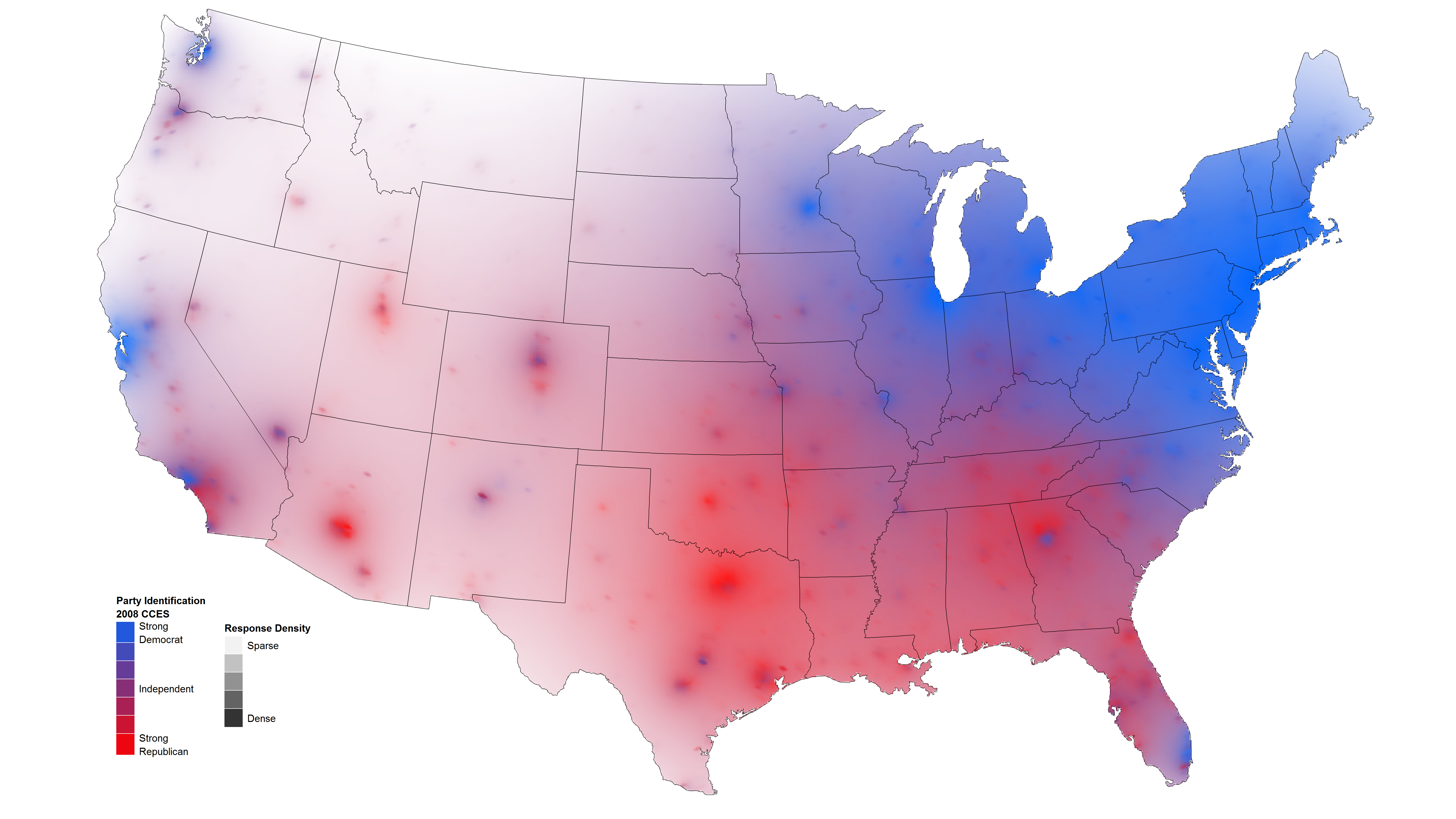
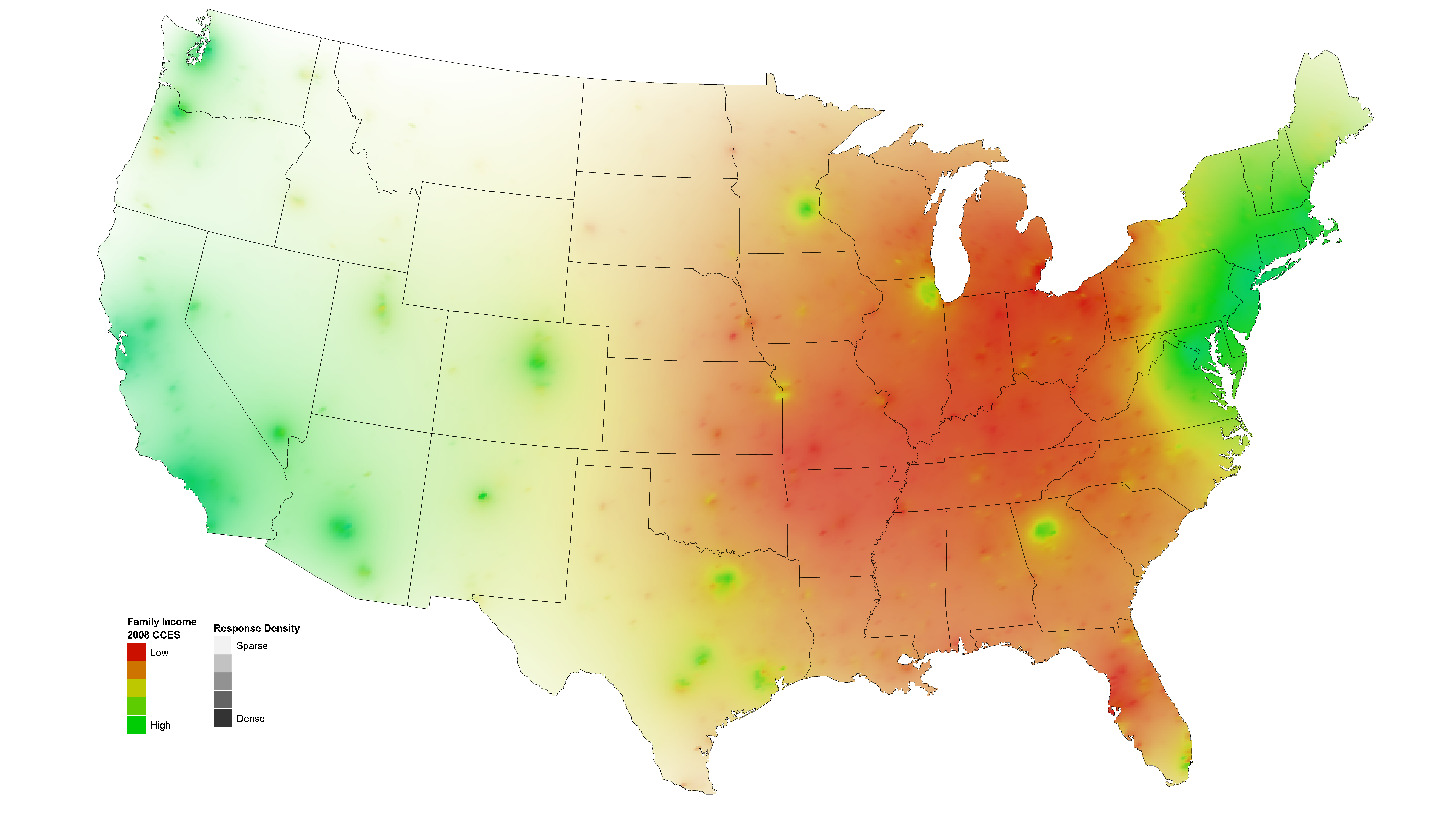
I like these maps because they use a smoothing technique currently being developed by David Sparks, a doctoral candidate in political science at Duke University. He uses data with the same kind of granularity – county or census-tract – but then smooths over the harsh (and probably unrealistic) edges that can occur where one county or census block abuts another with a different value for the variable of interest.
Here’s an example of a typical, non-smoothed map visualization using a map made by sociology students at Queens College that I posted about last week:
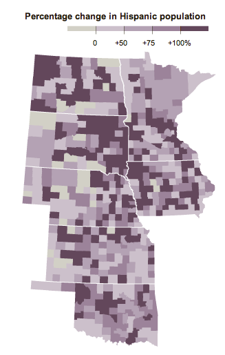
As you can see in this map, each county boundary is stark and it appears that there are cases in which counties with no growth in the Hispanic population are right next to counties with sizable increases in Hispanic people. While this is technically true, there are many cases in which it is more useful to give viewers a clearer impressionistic image that depicts where population concentrations are the highest overall backed up by the granular data without displaying all of the granularity itself.
When it is important to portray an impressionistic point – there are more Democrats on the coasts than in the middle of the country – a smoothed map is a much more effective tool.
Sparks was able not only to achieve a better impressionistic glance by smoothing, he also varied the transparency based on the population density. For instance, because the population density in Montana is much lower than the population density in New York, he made Montana a much more ‘transparent’ state so that it would be easy to get an impressionistic sense of the cumulative spread of the variable. When looking at the purple map of Hispanic population increase in the middle states, no consideration was made for the population densities of cities versus rural areas. This visualization style tips the impressionistic balance away from the more densely populated areas.
What needs work
Since I am generally a fan of the smoothed maps for a clear visual depiction of a data story that is meant to be digested from the 30,000-foot view rather than the microscopic examination of differences between counties or even residential blocks, there is not much to dislike in Sparks’ new smoothed maps. However, I would not recommend the use of this kind of smoothed data for looking at micro-level trends. What Sparks offers is a great way to see patterns from 30,000 feet, one that improves on existing common practices in visualizing map data.
My one issue with the distribution of people’s political persuasion in 2008 is that the colors on the ends of the spectrum – blue and red – blend to form the color in the middle of the spectrum – purple. Therefore, places in which there are lots of independents look purplish. So do places where people living close together are evenly split between Republicans and Democrats. Color choice is essential. The color mix made by the colors at the ends of the spectrum should not mix to produce the color chosen to represent a third position. Small quibble and one that Sparks would have had a hard time satisfying. The colors associated with Republicans and Democrats have already been established.
References
Sparks, David B. (2011) Isarithmic maps of public opinion data [blog post and map graphics] dsparks.wordpress.com