What works
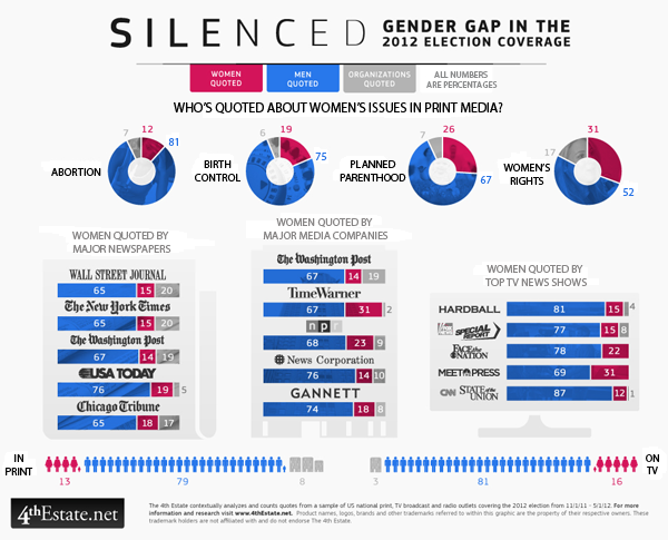
Election coverage dominates the American media in the months before any presidential election and the group (of unnamed people) over at the 4thestate.net are covering the coverage of the election. They tend to share their findings as graphics. The graphic above came from a special report on gender that looked at the gender of the experts who are called upon to comment on women’s issues like abortion, birth control, planned parenthood, and women’s rights. I can already tell that the first criticism is going to be that these issues are not just women’s issues. Fair enough. The point that they are trying to make, though, is that even in a media system that some say has a “liberal bias” women are significantly under-represented as expert voices. Or any kind of voices.
The graphic does a good job of showing THREE categories of commentators – men, women, and institutions.
In terms of color, the graphic resorts to a men-are-blue, women-are-red division which is fairly stereotypical. I am glad that women are not pink (see this post for an example of what happens when light blue and pink are used to represent gender). While I feel a lot of pressure to escape traditional gender binaries, in graphic design, harnessing people’s existing stereotypes is often a powerful way to make an instant impression. So while these designers could have used any two colors to represent men and women – purple and yellow, orange and green, teal and chartreuse – the fact that they leveraged the underlying American stereotypes associated with the gendering of colors gave them a way to tie together different graphical elements into one infographic. Personally, it does not bother me that women are represented as red and men are represented as blue, even if it is stereotypical. Some stereotypes hurt; this isn’t one of them as far as I am concerned. Pastel colors like light blue and light pink tend to infantilize the appearance of presumably adult behaviors and I would avoid using those to represent adults. But the red and blue used here are plenty grown up. Feel free to scold me about gender stereotypes in the comments if you disagree.
What needs work

I am on the fence about the donuts. Would the donut be easier to read as a bar graph? Perhaps. But turning the circle form into a bar form would eliminate a good deal of the natural division in the graphic between print media – all donuts – and specific media outlets – collections of bar graphs. Right now, without even bothering to read the titles, I can tell that the donuts are all comparable to one another but not necessarily directly comparable to the other elements of the graphic. This prompts me to read the titles to figure out how I ought to be making comparisons between the graphic elements. If the donuts were straightened out into bar graphs, I’m not sure I would instantly sense that they were unlike the rest of the graphic because they would look the same even if they had different titles. The graphical forms should emphasize the text of the headings and the designers here got that right.
My question about what needs work is that I am not sure any comparisons between donuts and bar graphs are easy to make because it seems like some members of the 4th estate team wanted to see the data broken down by issue, others wanted to see it broken down by specific publication, and instead of choosing one or the other, they compromised and showed both. Rather than thinking of this as a comparison issue, I guess I will think of it as simply two different sets of data that both deal with the question of how women are denied roles as expert commenters when it comes to women’s issues.
Acknowledgements
Thanks to Letta Wren Page for sending me the graphic and to the 4thestate for their decidedly graphic coverage of the 2012 election.
References
4th Estate. (2012) Silenced: Gender gap in 2012 election coverage [infographic] 4thestate.net
