
CNN’s Racial Voting Bloc Calculator is a perfect vehicle for demonstrating how to critically evaluate interactive graphical displays of data and 2) how ideological assumptions can be embedded in and reified by data, graphics and data analysis tools.
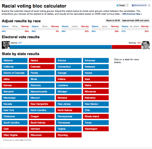
The calculator is designed to show how different patterns of racial voting might affect the upcoming election. At the top of the page five slider bars allow the user to set the level of White, Black. Latino, Asian and “Other” support for each candidate. So one can look at electoral college outcomes if say 56% of Whites, 10% of Blacks and 50% of everyone else votes for Romney.
The problem with this approach is that racial voting blocs don’t exist in the way this tool presents them. There are three ways to demonstrate this using data from the calculator and its associated data.
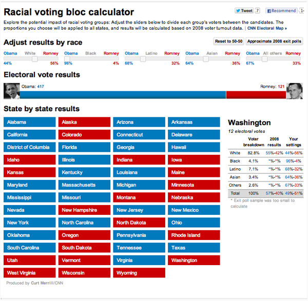
1) We can observe the absence of racial voting blocks directly by looking closely at the secondary data provided by the calculator. If you click on one of the state buttons a table appears at the right which lists (among other things) the vote by race for that state in 2008 based on exit poll data. The Washington state data look like this:
Close up of the important chart:
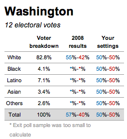
The “2008 results” column shows that in 2008 55% of white voters in Washington state voted for Obama. If you look at every state, you will find that the proportion of whites that voted for Obama varied from 10% in Alabama to 86% in the District of Columbia and 70% in Hawaii. Even if we exclude the most extreme cases the middle thirty states range from 33% (Idaho and Alaska) to 53% (Minnesota and Delaware). This is nothing like the cross state racial uniformity imposed by the calculator. The implicit assumption of the racial bloc voting calculator is that racial proportions are consistent across states and this is clearly untrue.
2) The data imply that race is not very important in elections. Look again at the table for Washington and note the absence of data for Blacks, Latinos, Asians, or “Others” in 2008 despite the fact that these groups make up 17% of the Washington electorate. Washington is not unique, missing data are endemic in these results. Data for Asians and Others are missing for 48 states, data for Latinos are missing in 37 states and for Blacks in 22 states.
The great French sociologist Pierre Bourdieu once wrote that missing data are often the most important data. That is surely the case here. Media organizations spend vast sums to collect poll data on the electorate. If race isn’t important enough for data collection, then it probably isn’t very important for understanding elections. There is a general lesson here, the presence or absence of data is often an independent indicator of importance.
3) It is also possible to use the calculator to make an argument by contradiction. That is, by demonstrating that the calculator gives nonsensical results under sensible assumptions. One of the calculator’s default options is to use “approximate 2008 polls.” In this case, Obama wins with 417 electoral votes which is more than he actually won in 2008. Also interesting are the state level results under this baseline scenario. Assuming bloc voting at 2008 levels causes changes in the electoral outcomes of 23 states. Even more interesting are the specific states that change their colors. Under the kind of bloc voting that the CNN calculator allows, the south becomes very strong for Obama, who would win Alabama, Mississippi, Georgia, and Louisiana with more than 60% of the vote in each of those states. In fact, these were among the weakest states for Obama, which again, implies that bloc voting is not occurring. So, if bloc voting existed 2008 election results would have been radically different from the actual results which implies that bloc voting does not exist.
Does this mean that race does not affect politics or that political appeals to race never work? No. It means that appeals to race work – when they work at all – from a baseline that varies from place to place. A far more interesting tool would allow for increasing the vote of a particular racial group from its preexisting state baseline. With this imaginary tool, one could add some percentage of the vote to a candidate in each state without forcing racial uniformity across states. For example, if we added 5% of the White vote for Romney the white vote would rise from 88% to 93% in Alabama and from 42% to 47% in Washington.
As constituted, the racial voting bloc calculator is useless for thinking about actually existing American politics. It is useful for encouraging caste based racial fantasies. And so it is no surprise that as I write this, the top google result for the words racial voting bloc calculator link to discussion forums at the white supremacist website stormfront.org.
One such fantasy might involve setting support for Mitt Romney to 100% among whites and 0% among Blacks Latinos Asians and Others. This produces a Romney landslide with Obama collecting only 7 electoral votes. The difference between this hypothetical and reality tells me that racial voting blocs do not exist. What it tells the stormfront.org discussion participant, FunktionMann, who ran the same “simulation” is that:
We need to clean house. ALL of our problems in this nation have been delivered to us by white traitors. Until we have identified, villified and run them out of business, we will not make any progress.
I began this post saying that we would see how to critically evaluate graphic data tools and see how ideology is embedded in those tools. The racial ideology embedded in the calculator isn’t the supremacist ideology of stormfront but it is a racial essentialism that assumes and privileges racial identity while inscribing race into our understanding of politics in ways that make no sense if we but take a moment to consider them closely.
*Alec Campbell is a Visiting Associate Professor of Sociology at Reed College in Portland, Oregon. He blogs at Follow the Numbers where this post was originally published.
References
Campbell, Alec. (2012) “Racial voting bloc calculator fact or fiction” at Follow the numbers and reposted here with permission.
Merrill, Curt. (2012) CNN racial voting bloc calculator cnn.com