china

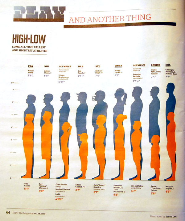
High-Low: All Time Tallest and Shortest Athletes | Jason Lee

What Works

Imagine looking at this information in a table. It would get the job done, but it wouldn’t have as much visual legibility as this graphic does. One thing I like about the graphic is that the illustrator was not impeded by the fact that sometimes there were ties for tallest or shortest. He just kept to the same paired down one tallest/one shortest depiction.

What needs work

I would have loved to see some indication of mean height. Does it fall in the middle, does the mean cluster towards the top? Does it cluster towards the bottom for some sports (like women’s gymnastics)? Even more interesting would have been changes over time. The human population has been getting taller on average so one would expect that athletes are also getting taller. But maybe some are not, like those in sports where the age of professionals is dropping (ahem, women’s gymnastics).

My apologies for the quality of the image – the scanner is refusing service this morning.

References

Lee, Jason. [illustration] (2010, 18 October) “High-Low: some all-time tallest and shortest athletes” in ESPN The Magazine. p. 64.

Macur, Juliet. (2008, 9 August) The Teeny Tiny Matter of Age for China’s Gymnasts in The New York Times: Olympics 2008 Supplement.

Comments Closed

Regular readers, I had to close the comments on this post because I was getting spam comments faster than I could delete them (online gambling, mostly). If you are keen on commenting, email me and I will find a way to make sure your comments are heard. Wonder what the key word was that made this particular post such a spam magnet? Athlete? ESPN? Who can say.

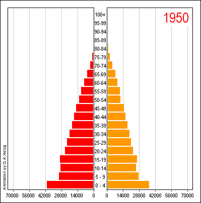
Population Growth Animation - China

First Thing’s First: Apologies

My apologies for failing to post for a few days. If you noticed, I’m flattered. I had some deadlines and limited access to the internet late last week. Unfortunately, March is a very busy month and I will likely have this problem again before the month is out. I’ll try to make up for it when I can.

What Works

I have always been a fan of the population by gender and age chart, even in the static form that you see before clicking through above. It is quite an achievement to clearly represent three different variables on a two dimensional graph. It helps immensely that gender here is a binary value. If it were tertiary or tertiary plus, this strategy would fall apart. Once you click through, you’ll see that the animation adds yet another variable, time. And time is a real kicker here. You can see how China’s population goes from having many young people and few old people to 2050 where the largest category is between 60 and 64 years old. Great way to take an old graphic technique – the static version – and animating it.
(I would love seeing this thing as population by age sticking married people on one side and unmarried people on the other as an animation.)

What Needs Work

The colors and overall treatment of the graphic as a designerly element. Red and orange makes it look a little like it’s yelling ‘Caution! Proceed at your own risk!” the whole time. But then, I guess we all have to worry about what is going to happen when the population pyramid becomes a slender pillar with an ionic capital.

Relevant Resources

United Nations (1999): World Population Prospects. The 1998 Revision. New York. Link to animation. [graphic credit to Heilig, G. 1999]