anthropology

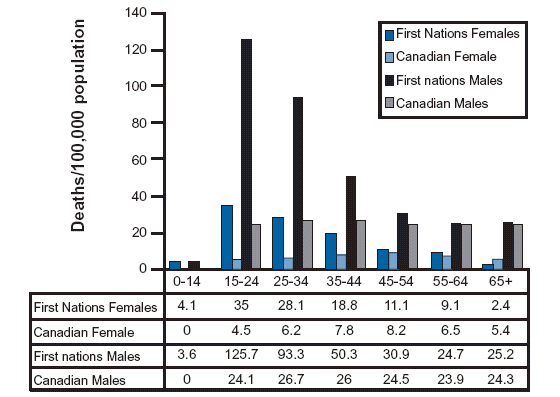
Crude Suicide Death Rate by Age Group - Canadian First Nations vs. All Canadians

What Works

I went looking for information about suicide and American Indian populations because I know that this is one indicator of the mental and physical health of a population. There is written work on American Indians out there, but this was the best information graphic on the subject and it happens to come from Canada where the population in question is referred to as First Nations. I like it because it respects that there has been (and continues to be) a difference in the rate of male and female suicide victims. Women tend to attempt suicide more often; men tend to be more successful in their attempts. I like it because it shows that the teen years are the most dangerous years for First Nations members by continuing the analysis across all age groups. They could have just truncated the graph at age 35 or so, since they are primarily concerned with the teen years, but instead they show the entire range of age cohorts. The viewer has to pick up on the fact that the difference between suicide rates of First Nations vs. all Canadian populations is most during the teen years and then falls off so dramatically that there is hardly any difference in old age. When viewers have to figure things out for themselves they are more likely to remember and trust those insights. I like that the tabular data is appended below the graph.

What Needs Work

Bar graphs are best when they are simple and this one is beginning to move away from simple. There are four bars for each cohort – it’s still legible, but it’s becoming hard to grasp the message at a glance with all those comparisons going on at once.

Relevant Resources

The North American Aboriginal Two Spirit Information Pages University of Calgary

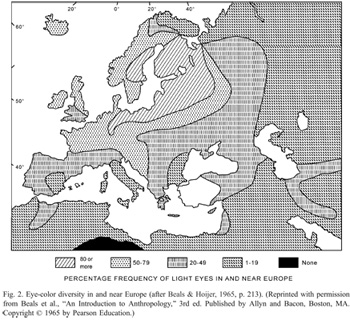
Eye Color Map from Peter Frost (2006) via Beals & Hoijer (1965) An Introduction to Anthropology
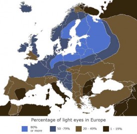
Eye Color Map of Europe - In color!

What Works

Color works. It helps that in this case, the characteristic being mapped is eye color, so it’s kind of a no-brainer to shade the areas where blue eyes are prevalent in blue and the areas where brown eyes are prevalent in brown. Even if this graph were to be printed in a grayscale journal (which is probably why the one on the left tries to use hatching to distinguish the areas), using degrees of full shading is easier to distinguish than using hatching patterns. Most printers can handle printing 10% gray, 50% gray, and so on.

What Needs Work

The areas that need some work, even in the color version, are the areas between blue and brown. Right now, those areas are lighter blue and lighter brown. The problem is that because the blue is mapping directly to the characteristic in question – blue eyes, blue area – it’s easy to think that the lighter blue areas represent areas where people have really light blue eyes. But, in fact, those areas are full of a mix of people, some with light eyes, some with dark eyes. I might have gone with a staggered blue/brown pattern or just chosen a color that doesn’t have anything to do with eye color, like purple.

Relevant Resources

Peter Frost (2006) Why Do Europeans Have So Many Hair and Eye Colors?

Western Paradigm blog (February 2008) The Blue Eye Map of Europe [Note to Readers: I couldn’t find the original version of the color map so I am linking to the blog where I found it rather than the original source.]