
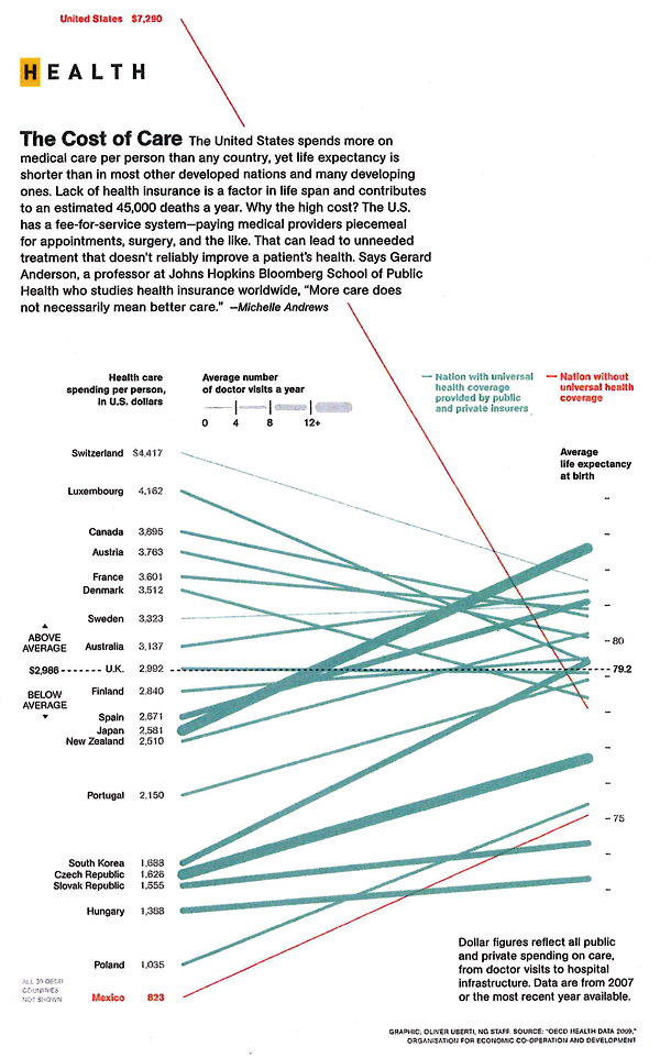
Explanation
This graphic is doing a lot of work compared to how simple it looks. Here’s an annotated list for review purposes:
- The colors of the lines show us which countries have universal health care (most of them) and which do not (the US, Mexico). Note that these colors do not differentiate between who, precisely, is paying for this health care – that’s complicated. In many nations the state pays for some people’s care or for some care for all people, but wealthier people or particular kinds of care are not covered by the state but are picked up by private insurers. It would get much more complicated if the graphic had to have a color for each – nearly every country would end up with its own color. Even in the US, the state pays for some of very poor people’s health care and for health care for those above 65 (though there are some limits on what the state’s willing to cover).
- The width of the lines show us how many trips people take to the doctor. The Japanese and people in the Czech Republic appear to see their doctor more often than I see my mom. Sorry, mom. However, even though people are always at the doctor in these places, their overall health care expenditures per person are not sky high. This could lead you to conclude that going to the doctor more often means that people are getting better preventative care. Preventative care is generally cheaper than ‘fix-it’ care. It could also lead you to conclude that people who are obsessed with their health are both more invested in taking care of themselves at home and more likely to run to the doctor at the sign of any little problem (On the one hand, if they are obsessed they will recognize any little problem sooner than those who are a bit more oblivious and it would seem that they might be less likely to try ‘quackery’, preferring to go to the doctor for the official treatment. No gingko biloba or St. John’s Wart from the Vitamin Shoppe unless the doctor says so.)
- The length of the line means nothing. These are not time lines.
- The slope of the line means…well…it implies that there ought to be a relationship between health care expenditures per person and average life expectancy. The implication goes like this: a country’s ranking in terms of per capita health care expenditures ought to match their ranking in life expectancy. Granted, I think anyone who has created this kind of graph before knows that the person who made it probably spent some time trying to come up with which measure of health would be the best one to use as the proxy for success – should it be life expectancy? Should it be some conglomerate variable that combines life expectancy, infant mortality, and something else? If you play this game with yourself, you probably end up just deciding that life expectancy is the cleanest comparison. But you may admit that it is imperfect. And it is. There are so many other things that get between health care expenditures and life expectancy. There’s environment, there’s the value of a given health care dollar which is not the same from one country to the next, there are cultural attitudes supporting relatively healthier and unhealthier lifestyles that vary from country to country, and so forth. This graph ignores those issues. It has to, but you don’t. Keep all that in mind, especially when thinking about how to allocate health care dollars. Maybe those Japanese people are on to something – they go to the doctor all the time, live long lives, and don’t spend inordinate amounts on health care. I know that if I had to stand on a scale in front of my doctor once a month or even once every 6 weeks I would think twice before eating things I shouldn’t eat or chickening out on my exercise regimen. There’s just something about getting an authority figure involved in processes like these to make us accountable for our own actions.
- The graph implies that there is a kind of sweet-spot for per capita spending that appears to fall between $2,000 and $4,000 [2007 dollars]. The US, of course, looks ridiculously over zealous when it comes to how much we spend and dismally stupid when it comes to where we put these dollars because we spend more on health care and get less in terms of life expectancy.
Rankings to rankings comparisons
I am not a fan of these rankings to rankings comparisons overall. Yes, this particular graphic packs a bunch of information in, but I still wonder how legitimate it is to compare national rankings in per capita expenditures on health care to national rankings in life expectancy. Forgive me for being an academic who *wants* the complex story. This is over-simplified. There is absolutely nothing in this graphic that would suggest what can be done about improving a nation’s average life expectancy whatsoever. Mexico seems to be doing OK – it spends relatively little compared to where it stands in the life expectancy rankings. So, clearly, if this graphic were all that we had to base decisions on, we might not decide that universal health care would give us a bump in life expectancy. If this were all we had, we’d probably just gut spending right away because the clearest point here is that the US is spending far too much compared to other countries in absolute terms as well as in relative terms when measured by life expectancy.
The other thing the graphic does not show – something I’m always curious about – is how much of the money we spend on health care goes to administer the system both in the US and in other places. In our fair union, with all the insurance companies requiring different claims processes, we have to hire experts at the hospitals and clinics to submit claims and experts at the insurance companies to decide what to do about the claims. We hire other experts to negotiate the terms of groups plans in the first place – and where someone gets a special deal that requires a more complicated claims process. All of the complexity of health care meets the additional complexity of administering health care the way we’re doing it now and leaves space for lawsuits. So…lawyers sue various parties for a wide variety of reasons and doctors have to buy more malpractice insurance. The system increases the costs of keeping itself going without actually adding much of anything to the quality or quantity of patient care.
Reference
Uberti, Oliver. (2011) “The Cost of Care” [Information graphic] in National Geographic using OECD Health Data 2009 which draws on data gathered in 2007.
Comments 6
j — April 26, 2011
life expectancy at birth e(0) accounts for infant mortality, so I'm not sure what type of conglomerate measure you would be looking for.
Kyle — April 26, 2011
You seem to be dismissing increases in life expectancy as something small or insignifcant, when clearly the graph Mexico is certainly not "doing OK" in that regard, considering that for an additional $170 billion a year (putting them right around the Spain's level) they could possibly tack on 5-6 years of extra life for *every one of their citizens.*
When the range for all first-world countries is 73-83, a 5 year swing would be *huge*.
Mark @ Israel — April 27, 2011
I definitely agree with Michelle Andrews. "More care doesn't necessarily mean better care." I believe that the Japanese are just so wise that they make sure they are in good health so they see the doctor regularly. I also guess that the Japanese government or the individuals make sure they have health insurance to cover any medical expenses. This is something we can emulate.
dianess — April 30, 2011
I wish I'd seen this a week or so ago! (I just covered the topic in my med soc class.) Knowing how some of these countries structure their health care systems, I think the graphic illustrates some of their complexities. (Yes, the y-axes and the line slopes are arbitrary. What I especially like is the line thickness for # dr visits.)
Japan is a good example. Every one is insured (universal coverage) but through different public (or public/private) social insurance (not a single payer system). It's a fee-for-service system where patients pay for some of their medical services (20%-40%). What they pay and what doctors can charge is highly regulated by a national price control system. All medical services (e.g., stitches, pap smear, EKG) are subject to price control. So it's cheap to go to the doctor (and doctors earn more by providing more services) because doctor's fees are limited.
Contrast Japan with Switzerland, which has the next highest life exp @ birth (e0) and very low # dr visits per year. Switzerland recently reorganized their health care system by eliminating for-profit in health insurance. They have universal coverage, but through many private non-profit insurance companies. No centralized price controls as in Japan. They spend more than most countries, but still spend about half what we spend per capita in the US.
I think instead of using the line color for only universal coverage or not, the graphic could vary the line color and style more based on other features of the system.
Turnstyle » Infographic: Health Care Spending Before And After Affordable Care Act — May 13, 2011
[...] and Medicare programs increased by 6.19% over the 12-months ending February 2011. But the per capita spending as of 2011, is $7,290. [Compared to $7,500 in 2007 as seen below.] ++ Click to Enlarge Image ++ Via:MPH [...]