Trick or Treat
This post has nothing to do with sociology. It offers proof that I should probably learn to leave things alone sometimes.
Recipes
I have long had this hunch that recipes would be better depicted not as lists of ingredients stacked upon lists of instructions but as something more well-integrated. I have many times forgotten an ingredient or messed up an instruction, and I like to think that better graphic design might be able to get me out of this problem. Professional cooks already tend to know which ingredients require what kind of process within certain recipes. For instance, when making cookies, the first step almost always involves creaming the sugars and fats together. But if you didn’t know this and you were used to making cakes (in which the wet and dry ingredients are kept separate from one another), you might absentmindedly tally up all the dry ingredients with your fats when making cookies. That would be a mistake.
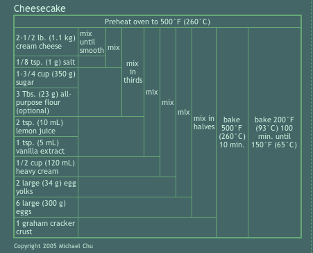
So I found the recipe diagram above which is based on the Nassi-Shneiderman structured flowchart and thought it was worthy of consideration.
But…
I wasn’t thrilled with it. In particular, I couldn’t figure out why there were so many separate ‘mix’ steps when some of those ingredients could clearly be mixed in all at the same time. I also wasn’t all that keen with the way the heating instructions were handled. I was also perplexed at the way in which the graham cracker crust was just thrown out there as an ingredient – most people make this from scratch (but I don’t have the ratios for that on hand so I didn’t try to rough them in lest someone actually use this as real recipe).
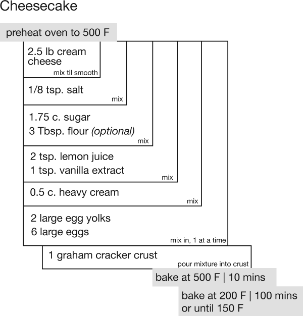
Here is my modification of the diagram, in grayscale even though I know it would look snazzy in color.

I still have difficulties with this diagram – where are the instructions? “Mix” is too broad a term. The other problem is that I still need to incorporate mention of tools into the diagram. This is related to the lack of instructions generally – if it said ‘hand mixer’ and ‘medium speed mix’ that would be clear enough for me. There has to be a good way to list ‘spring form pan’ in the graham cracker crust box, too. I could have just tools into the text, but that seemed to be cheating on the graphic sensibilities of the diagram. If there is a reason to be listing tools, one should have a place to put them outside the mention of instructions. That’s my biggest problem with recipes – all of the tools, times, temperatures, techniques, and ingredients are mashed together.
What needs work
I am not convinced that further modifications to the Nassi-Shneiderman flowchart are going to solve my problems. There has to be a better way to depict recipes that can provide the overview at a glance – including tools – but that doesn’t sacrifice all of the necessary details.
References
John. (2005) Key’s Corner Blog
Shneiderman, Ben. (2003, May) A Short History of Structured Flowcharts (Nassi-Shneiderman Diagrams) Department of Computer Science, University of Maryland.

Comments 3
Beth — November 6, 2010
I think the original is actually from here:
http://www.cookingforengineers.com/recipe/89/Cheesecake-Plain-New-York-Style
I agree that it's a little simplistic, particularly for those who might not be familiar with regular cooking techniques. I think my ideal recipe layout is a combination of regular cookbook entries and Joy of Cooking style. So, list all the ingredients at the beginning like the usual layout, in order of their usage, so I can easily see if I have everything I need. Then, list the instructions, with indented lists (Joy of Cooking style) for each step.
Michael — January 6, 2011
The intention of the recipe summary tables at the end of the recipes on Cooking For Engineers is not to replace the recipe text itself but to provide a minimalist reference card that summarizes the steps to be used as a memory aid / reminder once the recipe has been read. This way, while preparing the recipes, one need only glance at the table which should fit on an index card without difficulty and not have to search and sift through a bunch of sentences to find the next step.
For this particular recipe, each of the ingredient sets should be mixed into the batter separately. To mix them all at once results in a denser cheesecake and is no longer the recipe described in the text. That is why there are multiple mix actions.
Also, the diagram above is incomplete. The article presents the summary table for the graham cracker crust immediately preceding the table for the cheesecake, so there would normally not be confusion over the final ingredient used in the cheesecake.
Lastly, the lines in the table are not being rendered properly. There are too many vertical lines - none of the horizontal blank spaces should have vertical lines on the right side; the space should flow into the action.
Please keep in mind that the intention was not to revolutionize recipe presentation, but to present a small summary that could be printed to fit on a card which fulfilled two technical requirements: (a) it had to be a text table so the text could be cut and pasted if needed (not an image) and (b) it had to render more or less properly on browsers available in 2004 when the website was started.