Archive: Jun 2009

Stanley Lieberson’s “A Matter of Taste” looked at the way trends spread by examining baby names. He wanted to avoid the impact of marketing and advertising – the point was not to figure out how to create, perpetuate, or stop a trend, but to see if there is such a thing as a trend in the first place. Nobody is in the business of promoting baby names, and yet there are patterns. Lieberson looked for these patterns in the US. French sociologist Baptiste Coulmont has also looked at the way baby naming trends move across space and change in popularity over time.

The graph below shows how the final syllable of female names has changed over time. The -ette ending waned in popularity while the -ine and -a or -ah endings have increased in popularity. Graphically, I love that this diagram looks like sound intensity diagrams.

Female name endings in France - courtesy of Baptiste Coulmont

More interesting yet, Coulmont also animated a map to show how the name Loic spread from Brittany across the entire country over the course of about 60 years. I like this because it takes a static map and makes it dynamic. Sure, you could have lined up maps to march across a page at five or ten year intervals and cognitively filled in the blank spots. But here, his animations do the cognitive heavy lifting for you, revealing the pattern instantly.

Here’s what Coulmont had to say about the map graphic:

“As to my animation : there is no yet an accompanying sociological argument. I was struck by the spatial mobility of “Loic” from 1945 until 2005 : it seems to be a steady eastward shift [nowadays, Loic is one of the 20 top names for boys in francophone Switzerland : the eastward movement jumped the frontier!

How to explain this movement ? It seems that “Loic” moved from one district to another by means of personal interactions : some people knew some “Loic” living in the west, chose this name for their baby boy, and the movement continued eastward. “Loic” is not alone : especially during the nineties and now, names from Brittany are somewhat fashionable (“Celtic names”) : it could be the unforseen consequence of a strong nationalist movement in Brittany during the seventies. Those independantists fought for the right to name their children with “real” Celtic names… and the names spread in other regions.”

French provinces (note where Brittany/Bretagne is way to the west)
French provinces (note where Brittany is way to the west)

Relevant Resources

Coulmont, Baptiste. (2009) Prénoms typiques.

A Matter of Taste - Stanley Lieberson

Lieberson, Stanley. (2000) A Matter of Taste: How Names, Fashions, and Culture Change New Haven: Yale University Press.

Food Pyramids, the backstory

The United States Department of Agriculture has been in the business of creating one particularly important information graphic: the food pyramid. This graphic has not always been a pyramid. Back in the 1980’s it was still a square made up of four equal sized squares. (Because the 1980’s were not digitized I have had a difficult time finding a representation of this early four-square diagram. The basic gist was that there was a dairy/milk/cheese group, a meat group, a fruit/vegetable group, and a beans/breads/starches group. I will look for this diagram and repost here when I finally find it.)

The USDA’s dietary recommendations are consequential. School lunches are crafted to comply with them, young children learn the ‘science’ of eating in school with the diagrams as a guide (presumably they would have already started learning the culture of eating at home), and the nutrition guidelines on food packaging are based on these recommendations as well. Marion Nestle’s work (Food Politics) exhaustively shows that these recommendations are often influenced by lobbying groups like the National Pork Producers Council, Archer Daniels Midland, Conagra, the National Dairy Council, and the National Cattleman’s Beef Association. That is not meant to be an exhaustive list or to point fingers, just to remind you that food is a business and like any other business, interested stakeholders go to Washington to lobby for themselves. So, for example, the dairy council is quite interested in suggesting that people should be getting 3 servings of dairy every day even though the majority of people over the age of five are at least mildly lactose intolerant. Furthermore, there is conflicting research evidence on the “milk builds strong bones” claim that often gets parents pouring glass after glass for their children. Calcium from milk may not, in fact, make bones any stronger. Regular exercise is a more reliable solution (along with good genes).

From a graphics perspective, then, there is a lot of summarizing that has to happen in the production of a definitive picture of a healthy diet. Like I mentioned, we started with a square made up of four squares. But that diagram emphasized foods relatively high in saturated fat — meat and dairy. Saturated fat was, and is, deemed to be bad for health. However, there was some debate at the time about whether or not the public would be able to tell the difference between saturated and unsaturated fat. They could get confused. They might eat the wrong things and avoid the right things. So, to simplify, it was easier to just promote a low fat diet all around and skip the distinction between saturated and unsaturated fats (see Walter Willett, Eat Drink and Be Healthy for more on this debate). After a fairly rigorous study, it has been deemed that low fat diets are not a panacea and do not lower risks of heart disease or cancer.

The food pyramid: Round I

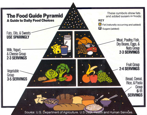
The first food pyramid emphasized the consumption of starches above all else: 6-11 servings per day. No distinction was made between whole grains and processed grains that are less nutritious. Cereal and pasta are specifically listed in this group. Fruits and vegetables stack on top of this base, on top of them are protein sources – meat, dairy, nuts, legumes. At the very top is the eat “sparingly” category containing sugar and fats. It’s unclear just how often sparingly is. Nestle talks about how recommendation language is often massaged so that it seems no foods are bad as long as they are eaten in moderation. From a nutritional perspective, this is only half true. What’s the point of eating something that has no positive nutritional value and might come with negative side effects like tooth decay, weight gain, and worse? There is no point; those things should be avoided.

So why not just come out and tell people not to eat candy, soda, chips, cake and ice cream? Promoters of those particular food commodities don’t want the government telling people that ice cream is bad for us. They’d prefer that it be ‘eaten sparingly’. This is the difference between schools on the federal lunch plan serving ice cream once or twice a week or never at all. It’s a lot of money. Quite frankly, this pyramid’s cap is so vague – “fats naturally occurring and added” and “sugars” – that it would be hard to know how to follow this advice. Many foods are not primarily fat or sugar. Take, for example, a chocolate covered strawberry. Is that a fatty, sugary food to be avoided or a piece of nutritious fruit to be eaten for three servings a day? Frosted mini wheats? Good because of the fiber or bad because of the frosting? Sweetened packets of instant oatmeal? Good or bad? It’s much easier to tell what is in all the other categories of this graphic than the cap on top where all the fat and sugar are quarantined, somehow stripped out of the food products where they occur in real life.

USDA Food Pyramid: 1995-2005

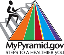
mypyramid.gov

For all it’s shortcomings, this pyramid was targeted for a redesign. Some were upset that it’s only in English, others that it seems to encourage people to eat too many carbohydrates (rates of obesity and diabetes have continued to rise even amidst a lower fat intake, see Nestle). People who view the world holistically wanted to see some mention of lifestyle – isn’t exercise part of the consumption cycle? In 2005, the pyramid below came out as an interactive graphic which you can play around with at mypyramid.gov.

mypyramid.gov static graphic from the USDA

As a stand alone graphic this is ridiculously awful. The one good thing it did was to have a stick figure running up the side, indicating that exercise is part of the program. The rest has almost no instructive value as a static graphic. If there were concerns before that some people wouldn’t be able to use the chart properly because they couldn’t read English, this chart has far greater problems to surmount. It can only be used in an interactive setting. The color coded bars aren’t even labeled, they all appear to be more or less even. So the idea it’s offering seems to be: eat everything in equal amounts and then go running. If you make it over to the mypyramid site you’ll see that it asks you questions about your height, weight and gender to help suggest a pyramid just for you. But the graphic gets left behind in the process in favor of tables.

Next?

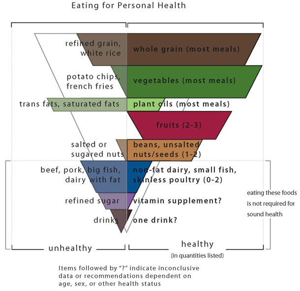
For a project I was working on last summer, I took my own stab at redesigning the food pyramid by literally standing it on its head. Walter Willett’s book “Eat, Drink and Be Healthy” served as the nutritional guide. In addition to telling people what TO eat, the graphic tells people what NOT TO eat. Down at the bottom there is also a grey area representing foods in which the evidence has gone both ways. Some studies suggest that a glass of red wine every day is good but we also know that too much drinking is bad. And at least one study suggested that one daily serving of any alcoholic beverage was therapeutic, not just red wine. Vitamin supplements are another hot area with recent studies showing that they don’t do much.

I welcome comments on this particular pyramid.

Based on data from Walter Willett's Eat Drink and Be Healthy

Relevant Resources

Kolata, Gina. (2006, 8 February) Low-Fat Diet Does Not Cut Health Risks, Study Finds The New York Times online.

Kolata, Gina. (1994, 14 April) Vitamin Supplements Are Seen As No Guard Against Diseases New York Times.

mypyramid.gov

Nestle, Marion. (2007) Food Politics: How the food industry influences nutrition and health, 2nd ed. Berkeley: University of California Press.

Parker-Pope, Tara. (2009, 16 February) Vitamin Pills: A False Hope? Well Blog: The New York Times online.

Rabin, R.C. (2009, June 15) Alcohol is good for you? Some scientists doubt it” New York Times online.

Willett WC. Eat, Drink, and Be Healthy. New York: Simon and Schuster, 2001.