
What Works
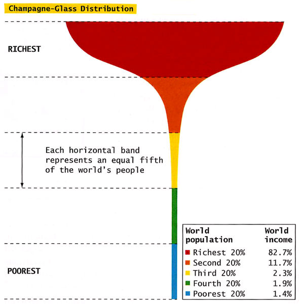
This graphic works as well as it does in part because it evokes the too-delicate feel of a champagne glass in hand. All that wealth resting on so little. The shape does what a data table alone cannot – it subtly suggests that the wealthy are resting on the poor and that the balance is quite precarious.
Relevant Sources
Conley, D. (2008) You may ask yourself: An introduction to thinking like a sociologist. New York: W.W. Norton and Company. p.392.
Chandler, David. L curve [another graphic depicting wealth distribution by a mathematician/educator – it’s interactive.]
Update
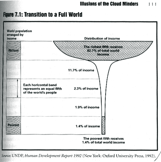
I found a much earlier 1992 version of the champagne glass distribution of wealth graphic and wanted to give credit where credit is due. It came from the UNDP 1992 “Human Development Report” and was republished in chapter 7 of When Corporations Rule the World by David Korten.
Comments 31
ASDFASDF — June 13, 2009
Wait, when was it NOT expected that the richest people have the most income?
no — June 16, 2009
Couldn't you just flip the graph upside down. sure it would ruin the image your trying to portray and then the poor would be resting on the rich, but i mean at least it would be stable. right?
oyez — June 16, 2009
This is a joke right? The "subtle suggestion" rests entirely on how the graph is organized, and not on how the data plays out sociologically. How about a little research and a lovely image regarding how the top earners are taxed versus how the low earners are taxed? Maybe then it will be more clear who is resting on who.
Kevin — June 16, 2009
I can't believe some of the responses to this graph. Tax rates? Bullshit.
The financial system is set up in such a way so as to funnel wealth to those who already have a lot of it. Therefore, the top fifth of humanity receive over 80% of global income. How can one not have moral qualms about this? Of course, the overwhelming majority of those seeing this page will have been suckled of the teat of the capitalist paradigm, raised within the towers and parks of the West, and are, therefore, numb to the cold and harsh reality that most of humanity lives in.
WAKE UP!
Laura Norén — June 16, 2009
I am mildly alarmed at the feminine gendering of the capitalist paradigm, especially because it seems to be a female whereas women still receive more than their fair share of poverty, especially if we're looking globally.
I'm putting the fiscal status of women on my list of things to post in the future, along with tax rates.
In the meantime, if you're wondering about the impact of tax rates on measures of inequality, have a look at a recent article in the New York Times Sunday Magazine by Russell Shorto about his experience moving from a capitalist economic system in the US to a more socialist system in the Netherlands. It is a narrative account, not a social scientific one, but it does walk through a comparison of how taxes are collected and distributed under two different economic systems.
Shorto, R. (2009, 29 April) "Going Dutch" New York Times Sunday Magazine.
Jeff — June 16, 2009
I find this chart misleading.
It's entirely true, of course, but there's more to the story, I think.
The richest fifth of the world receives 80% of the global income because it is producing about 80% of the world's wealth. And they don't keep that wealth; they keep the income. They give the wealth to the world, and we as the world give them capital.
Think about this. Maybe I don't make a lot of money, but I'm typing on a computer developed by people who are in that richest bracket. I'm using Windows--an operating system developed by a man who is one of the most notoriously wealthy persons alive. Even if I make a good living, the fortune he has accumulated will forever dwarf mine. But in return, I can use his software on this computer at a very, very reasonable price. And this is true for millions of people. So I think he has earned that extravagant income of his for enriching the lives of the masses.
I think Paul Graham, one of the developers of the Yahoo! Stores online web-building software, says it best in his collection of essays called Hackers and Painters:
"You need rich people in your society not so much because in spending their money they create jobs, but because of what they have to do to get rich. I'm not talking about the trickle-down effect here. I'm not saying that if you let Henry Ford get rich, he'll hire you as a waiter at his next party. I'm saying that he'll make you a tractor to replace your horse."
carlos — June 17, 2009
Thx for the point Kevin
I can tell that most of you are americans by your statements.
Please go out of your country, see and meet the real world, and your political talk will be transformed into true consciousness of the world your country and leaders (among others) have built.
Laura Norén — June 18, 2009
To Jeff's point about Bill Gates giving us Microsoft. Bill is a talented man and gives away lots of money through the Gates Foundation. However, Bill did not single-handedly build Microsoft into what it is. Like any large company, Microsoft employs lots of people and pays them the prevailing wage. In America, the prevailing compensation package for the typical worker at any corporation is far, far less than the prevailing compensation for the CEO (and other C-level employees) of those same corporations. See CEO Compensation 1970-2000 for a graphic presentation of CEO salary growth from examples across a variety of industries. Unfortunately, it isn't comparative - we don't see what the workers are getting paid.
From a 2000 report that looked at the growth of CEO pay published by the Institute for Policy Studies in Washington, DC:
"CEO pay jumped 535 percent in the 1990s, dwarfing the 297% rise in the S&P 500, 116 percent rise in corporate profits and 32 percent increase in average worker pay. If average pay for production workers had grown at the same rate, instead of barely outpacing inflation, their 1999 annual earnings would have been $114,035 instead of $23,753, and minimum wage would now be $24.13 an hour, instead of $5.15."
It's fine to appreciate the good fortune that technological advances like the personal computer and word processing have brought. It's a bit naive to celebrate those advances without recognizing that the costs and benefits are not equally distributed.
Applying Pareto's principle to the distribution of goods in society is morally questionable.
Dusan Vrban — June 19, 2009
Important points, all. Now anyone has a real "solution"? How to really help the poorest and maintain stability (no wars, no pollution, no crime,...) that we all desire?
IMHO, what we often forget in such debates, is the experiences some very brave and most probably good people had in the past with creating good societies.
We must continue such debates with open minds and not just stand on our individual standpoints (in any way) saying the opposite is all bad. And create a solution, that will be sustainable and we will feel good about (no matter what we say, this glass makes us sad every day I belive).
Raina Bedford — June 19, 2009
@ASDFASDF
It's not that they're just making more money... they're making such a ridiculous proportion of the worlds wealth. 20% of the worlds population makes 82.7% of its income. If you don't see something wrong with this system then vote republican.. lol
Rational Jim — June 19, 2009
You scientologists are fools. There is barely a valid point being made on this page as a whole. Your "graphic" is grossly flawed, and obviously deliberately vague.
Nobody "rests" upon anybody, and to suggest such a thing is a blatant sign of ignorance as to how either localized economy works, and even more ignorant as to how global economy works. There is a perpetual interaction amongst all people in economic cycles. And obviously so, since everybody contributes to an economy in one way or another.
Your graphic highlights nothing that is accurate. You can not rationally divide the global economy into 5 perfectly even percentages, because that is not the reality. The reality, is that only an approximate 5% of the worlds people, control over 90% of the worlds wealth. Which alone negates your foolish graphic.
But the again, you are scientologists, a title which alone proves you are delusional and ignorant.
HAIL LORD XENU!
drop — June 19, 2009
please see zeitgeist addendum => http://www.youtube.com/watch?v=NT-2fenmLnc
it'll explain things to those who don't understand the setback that is economic system to our whole civilisation. the movie is free, i watched it 3 days ago and can't stop thinking about this opressive sh*t of a system we're living in.
paul — June 19, 2009
The richest of the world are rich in varying degrees -- from say, a well-off physician, to Bill Gates and beyond. As for the poor, there isn't much distribution at the bottom levels because one can only be so poor, which is the same as flat broke. No wonder the graph doesn't change very much for the last 2 or 3 quartiles. Really the only unique aspect of this graph is where the "rich" increase begins. For about 1/4 of the population to be in this zone is pretty impressive in a good way.
JR — June 20, 2009
@Jeff: "Maybe I don’t make a lot of money, but I’m typing on a computer developed by people who are in that richest bracket." Actually, although you don't consider yourself wealthy, YOU are part of the top fifth in the above chart. So am I, a middle-income American. Therefore your specific example makes no sense.
"And they don’t keep that wealth; they keep the income." This statement also is non-sensical. I suggest a basic theoretical understanding of how wealth is produced.
Beyond that, of course society can't exist without some income disparity. As you suggest, we need producers and consumers. But how much disparity between richest and poorest is necessary to make the systems work? Ten to one? One thousand to one? Ten million to one?
Another point you're probably not aware of is that consumption at the level we enjoy here in the US requires the existence of the Third World. They really do "support" us, and it really isn't stable.
Sol — June 20, 2009
Capitalism depends on the pooling of capital. That is the way the system works. Indeed, the nonsense about taxes and how the rich are giving their work "to the world" are sad Americanisms to make certain "to-the-far-right" people feel better about social injustice and their own affluence. The poor in the world get up every day to hard labor. That labor produces very little. The market realities are obvious that high levels of wealth do not come from reward for work but from manipulating the system to gain wealth through the work and income of others. Madoff and others are proof of that at the multi-billion-dollar level. The life those of us with computers and internet connections and education have is based on a system that assures poverty for most....and, hey, that is the way it works. 500 years ago over 95% of humanity would have been in the poverty colors. Now only 80% are according to this chart. It is an excelent display of statistical values with a slightly ironic/comic format. If that upsets some right-wing Americans, then the effectiveness and impact of the chart is proven.
Dorothy — June 21, 2009
Basically, the trickle-down economy is a fairy tale. Also, climbing the social ladder is also another fallacy. The only sane thing to do is actually to tip the glass over. But unfortunately, humans are not rational people at all!
vilfredo — June 21, 2009
learn to Pareto
Jeff — June 25, 2009
To JR:
You bring up some good points. You're right; on a global scale, I probably am in the top fifth, or at least in the second bracket.
I was making my point in the context of the US economy and society, in which case it is feasible for someone outside the upper brackets to own a computer, or a car or house, lead a reasonably comfortable lifestyle, et cetera.
But this graphic does refer to the global population, so I'm obliged to adhere to that. But on that note, I have another point I'd like to make.
It is true that the poorest of the world are exploited, but I don't think it's something we can solve by negotiations or simply "being nice" to each other. What we are witnessing in this day and age is our species reaching the boundaries of its environment. Through our own ingenuity, we have been expanding the carrying capacity of our environment to an incredible degree. But infinite growth in a finite system is impossible. Global poverty is largely inevitable because of this; we refuse to "check" our population, so nature does that for us through disease and famine.
It's grim, but it's the truth. We are a species of this planet, and as ingenious as we are, our population WILL be checked, whether we like it or not.
mark — November 15, 2009
I don't recall the actual source, but if memory serves, the top 5% of society owns about 36% of the wealth and gets taxed at a rate of around 38% in the US. So, while there is a progressive tax, these folks still make insane amounts of money. I assure you that they have access to amenities those of us in the lower rungs of society couldn't really imagine. Oh darn, they only get 620k of every mil they earn. Obviously, even at this tax rate, the motivation for profit is still significant enough to drive the economy.
Honestly, some of you really need to put down your Ayn Rand. Her positions were arguably sociopathic and it's ironic how many 'good christians' follow her philosophy when it is more akin to something LaVey would propose than Christ.
mark — November 15, 2009
Jeff,
That operating system you are using was developed by a huge corporation that has engaged pushed the limits of our anti-trust laws in this country and arguably broke them on multiple occasions:
http://en.wikipedia.org/wiki/United_States_v._Microsoft
Rational Jim,
Umm, did you misread the title? It says 'Sociology,' not 'Scientology.' Might I suggest a tall mug of delicious coffee?
Drew — December 17, 2009
The graph is from 1992.
This is only income. Nothing about assets or debts.
Steve — April 23, 2010
About 2 years ago I read a Russian article predicting the Return of Surfdom to America. Place the majority of the population in a financial situation that guarantees corporations a fixed and stable work force. Sounded a bit far out at the time. I would like to see a visual with 5 - 20% glasses in a row.
Global wealth distribution « Make Wealth History — August 16, 2010
[...] HT The Society Pages Posted in: equality, wealth ← What we learned this week Be the first to start a conversation [...]
Americans estimate our wealth distribution and fail. horribly. » Graphic Sociology — October 7, 2010
[...] Laura via Dalton Conley’s Intro to Soc text book: Champagne Glass Distribution of Wealth Leave a Comment Tags: inequality, poverty, wealth distribution Poverty in America | US [...]
Global Wealth and Income–follow the money « Dregs of the Future — October 31, 2010
[...] (Source: Conley, D., 2008) [...]
Visualizing the World’s Injustice | u4Ya.ca - Rational Reasons for Hope and Optimism — January 18, 2011
[...] start, here is a lovely picture of a Champagne-Glass portraying the distribution of [...]
Tuesday Reading Roundup « The Taser's Edge — January 25, 2011
[...] One nit I have to pick thus far, and we will see how it goes, is that Keller seems to be skittish about using the p-word, namely politics. Yet unless something major shifts in how rich and poor relate to each other (by definition, this is a political happening), the champagne glass will stay beautiful. [...]