economics

The recent federal bailouts have drawn attention to CEO compensation. The screenshots below, taken from the New York Times, show what that compensation looks like for specific CEOs and the change in compensation between 2007 and 2008. Click over to the source for many more examples, company performance data, and methodology.

1

3

4

5

6

—————————

Lisa Wade is a professor of sociology at Occidental College. You can follow her on Twitter and Facebook.

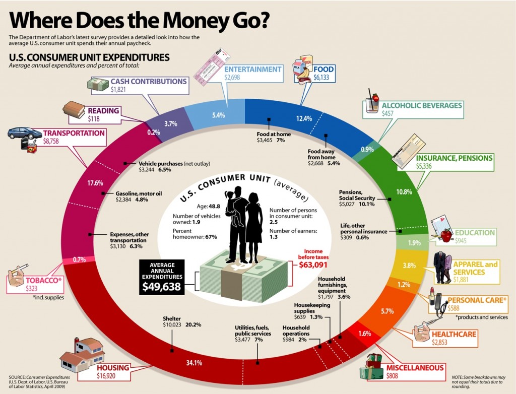
Via Visual Economics. Though often presented as the domain of economists, sociologists have a lot to say about patterns of consumption and their effects. Though patterns of consumption and their effects are often presented as the domain of economists, sociologists have have a lot of interesting things to say about this topic.

wheredidthemoneygo1

Of course, some have wondered, if sociology sucks, why do economists keep on doing it?

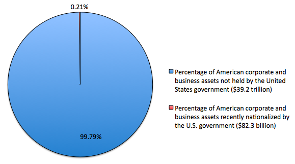
Conor Clarke, at the Atlantic, offered up a graphic to call into question those who accuse Obama of being a socialist (Jonah Goldberg, Alabama Senator Richard Shelby, Phyllis Schlafly, Richard Viguerie, and The Republican National Committee, for example):

socialism20chart1

According to the graphic, Obama has nationalized 0.21% of the corporate and business assets since taking office.

Clarke says:

Socialism, like farenheit, comes in degrees. Sure, a government that nationalizes GM is “more socialist” than one that does not, even if it doesn’t mean we’re living “under socialism.” But differences of degree shouldn’t obscure differences of kind, and as Tim Fernholz says, “it’s clear that putting the government in charge of private production is not the Obama administration’s guiding philosophy.”

He adds:

If it were, 99.79% of the American corporate assets that existed at the start of the Obama administration would not remain in private hands. The differences of degree are so small that they aren’t worth mentioning. And yet, somehow, they keep getting mentioned.

The fact that whether Obama is a socialist “keep[s] getting mentioned” is an example of agenda setting.   Those who control media content have the ability to set the agenda.  That is, they can tell us what to think about (though not necessarily what to think).   By constantly asking questions or making accusations about Obama’s socialist inclinations, high-profile individuals encourage us to engage with the idea… even if only to refute it (as Clarke does).  Obama’s supposed socialism is on the agenda, even though there is little rationale (as Clarke shows) for such a heightened degree of concern.

For more examples of agenda setting, see these posts on Janet Jackson’s “wardrobe malfunction” and the New Yorker cover scandal.

—————————

Lisa Wade is a professor of sociology at Occidental College. You can follow her on Twitter and Facebook.

Toban B. sent us a link to these two images illustrating the global spread of Starbucks and McDonalds (put together by Princeton):

captureaa

captureaaa

UPDATE: Toban offered these great insights in the comment thread:

When I sent this in, I was looking at the images as indicators of who is and isn’t part of certain aspects of ‘globalization.’

While there has been increased homogenization, some people also have exaggerated the extent to which we all are part of One world (which some people call a “global village” — a term that I find downright ridiculous, to be frank.) I think that people talk like the world is all One because they are ignoring most of the world — i.e. the spots on the above maps that don’t have many coloured dots on them. Obviously the ‘North’ ‘Western’ areas also are very different in some respects (e.g. linguistically), but there’s more consistency in those areas of the world in terms of McDonaldization, digitization, and other features of the ‘North’ ‘Western’ ends of ‘globalization’ — that is, the sides of ‘globalization’ that people tend to highlight (whereas people don’t pay much attention to international waste trade dumping grounds, for instance).

If the world is all One, it is One in a way that entails different positions (e.g. as producers vs. consumers), and a lot of inequality (e.g. in terms of where the money is). If (for instance) Columbia is part of some sort of globalization, the place of Latin America is a lot different from France (for instance).

—————————

Lisa Wade is a professor of sociology at Occidental College. You can follow her on Twitter and Facebook.

Stephen W. sent us a photograph of a billboard in Rock Valley, IA.  It suggests that keeping your baby, instead of having an abortion, is good for the economy:

cimg3590xxx

Sociologists talk about how nations are invested in reproduction.  Without babies, nations literally disappear; too many babies and nations collapse under the strain of a population they cannot support.  Because nations need babies (but not too many babies), states adopt pro- and anti-natal policies (e.g., the one child rule or medals for mothers) that encourage or discourage childbearing.  This billboard is an interesting example of a call to women to have children so as to help the nation (though it is sponsored by a pro-life organization, not the state).  Women, in this argument, have a responsibility to the nation (perhaps equivalent to military service?) that transcends their individual reproductive preferences.

(See this related post on making babies for the military.)

—————————

Lisa Wade is a professor of sociology at Occidental College. You can follow her on Twitter and Facebook.

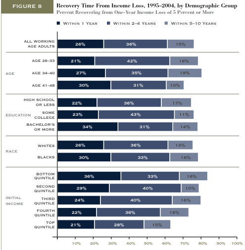
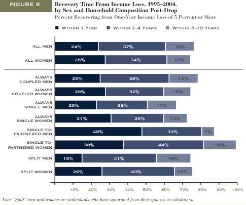
Matthew Yglesias featured two figures from the Pew Economic Mobility project.  They show how long different types of people tend to take to recover from income loss (within 1 year, 2-4 years, or 5-10 years).

This figure shows that people who are older, have more education, or are poor, working, or middle class have a harder time recovering from tough economic times:

recovery

This figure shows how marital status is related to recovery.  Most dramatically, people who get married before recovering financially (especially men), women who split with a partner, and women who are single have a more difficult time recovering.

recoverygender

Something to consider: As several commenters noted, I’m not sure how they defined “recovery” from income loss.  If you never made a lot of money to begin with, does recovery simply mean returning to a state of low income?  Then, does the income for an initially high income person need to return to its high state for it be counted as a “recovery”?

(Just FYI: I revised my interpretation of these figures.  Thanks to the early commenters who noticed I’d misinterpreted.  It was really late at night when I wrote this post!)

—————————

Lisa Wade is a professor of sociology at Occidental College. You can follow her on Twitter and Facebook.

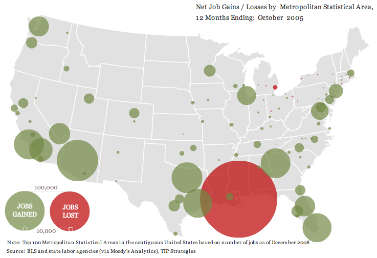
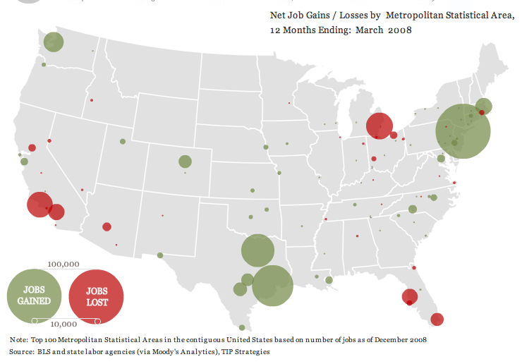
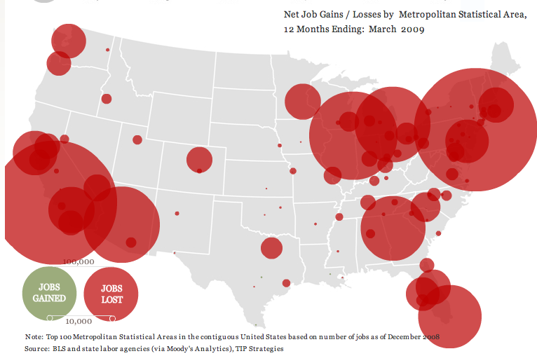
thewhatifgirl let us know about a really interesting interactive website that shows job gains and losses for the 100 largest metropolitan areas in the U.S. from the beginning of 2004 until March 2009, based on Bureau of Labor Statistics data. I took a few screenshots.

Right after Hurricane Katrina:

picture-4

From April 2006 to March 2007, the economy’s looking good for everybody but beleaguered Detroit:

picture-3

We start seeing a few more problem areas and a lot less job growth from April 2007 to March 2008:

picture-2

And then things go really badly. Notice the job loss circle in L.A. is so big that it got cut off on the website, and there’s not a single job growth circle [Note: eagle-eyed commenter Ali points out there are a few teensy job-gain circles, one in Louisiana, one around Austin, TX, and one way down at the tip of Texas along the border, and it’s possible there are some other small ones covered by the red]:

picture-11

UPDATE: Commenter Miss Prism cautions,

The maps could be straight out of “How to Lie with Statistics”, though.  The diameter (rather than the area) of the circles increases linearly with jobs lost, so a ten times bigger job loss gives the visual impression of being 100 times worse.

So just be aware that it’s how wide the circles are that indicates job loss.

Other posts on the economic meltdown: a county-level map, duplexes and home foreclosures, state budget shortfalls, who feels the recession?, Michigan’s economy, where stimulus money is going, U.S. household income and debt, defending private jet travel, all kinds of data from The Guardian, average stimulus dollars per person by state, unemployment rates by county, video on the credit crisis, framing the stimulus package, beer consumption, the New York Post monkey cartoon, a graph of job losses, gender and job loss, unsold cars, Hyundai’s job-loss insurance program, the economic downturn at the mall, employment/population ratio, home equity as a percent of net worth, advice to the rich: be discreet during a recession, different measures of joblessness, and changes in wages.

This image, found at International Networks, depicts the globe at night.  The areas bathed in electricity reveal “the global spread of industrialization, as evidenced by the lights of human civilization”:

lights_earth

I think it’s interesting to compare this image with a world population map (link):

g-gpw-population-map

At first the two maps seem to overlap pretty nicely, but if you look closely there are plenty of interesting discrepancies, especially in Africa.

Thanks to Toban B. for the link that got me to the graphic that inspired this post.

NEW (Apr. ’10)!  In the comments, Brendon linked to this great image of the Korean peninsula at night that reveals an amazing difference between North and South Korea:

—————————

Lisa Wade is a professor of sociology at Occidental College. You can follow her on Twitter and Facebook.