
The following graphs all show how much of American’s wealth is (or, um, was) in the form of home equity. They are all based on 2002 data, several years before housing prices hit their peaks, which means by the time the housing bubble burst, home equity was an even larger proportion of all net worth.
It’s not that I didn’t already know the economy was in trouble. That’s obvious–I live in Vegas, all I have to do is drive around a little and see all the houses sitting empty. But looking at these images I kept thinking, “a good portion of that home equity wealth is just gone.” On paper, we had all this wealth, and people borrowed based on it…and a lot of it is simply gone. Just…poof. Gone!
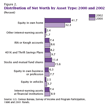
This one shows what percent of all net worth in the U.S. falls into various categories.
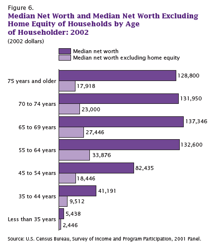
Here we have median net worth in 2002 for different age groups…and then the lighter purple bar, which is median net worth if you took out home equity:
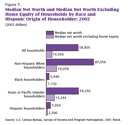
A similar breakdown, except by race, not age this time. Notice how much Blacks and Hispanics lag behind Asians, and how much they lag behind non-Hispanic Whites in terms of net worth:
On the up side, if the stock market keeps going down, then home equity as a percent of our net worth will go up again because we’ll have lost so much in stocks. So, you know, look on the bright side!
All of these graphs came from “Net Worth and the Assets of Households: 2002,” written by Alfred O. Gottschalck and published by the U.S. Census Bureau in April 2008.
Comments 5
OP Minded — October 24, 2008
Not sure I agree with you. Most of the equity folks had in their homes in 2002 is still there. Equity definately been lost from the peak to the (soon to be) valley, but I think most of the US will settle at about 2002 prices and then begin climbing back slowly from there. So, if you use 2002 as your base, I'd say we haven't lost equity at all.
If you want to talk about lost equity and capital destruction, talk about owning two cars that each lose 15% of their worth EACH year, EVERY year, for your entire life.
mordicai — October 24, 2008
Not gone so much as never there, really.
Gwen Sharp, PhD — October 24, 2008
That's a great point, OP--thanks for the insight.
My sense of this might be somewhat skewed by being in Las Vegas, and particularly living in a working-class neighborhood that has been very negatively affected by the housing problems; the general sense is that houses will return to values from a period in the 1990s or so.
Two of my neighbors have also lost their jobs in the last 3 days. It's rough.
John — September 18, 2024
"Net Worth: You Weren’t Counting on Your Equity" means that many people often overlook the value of their financial assets, like their home or investments, when calculating their net worth. However, your equity—the difference between your assets and liabilities—plays a crucial role in understanding your true financial position. Therefore, it’s essential to consider equity in your financial planning, not just your savings. Using tools like mygreenbucks can help you track your equity and work towards your financial goals. This approach provides a comprehensive view, enabling you to make better decisions for your future.
ch talha yaseen — January 14, 2025
Families don’t know what to do about children returning to school. Stress levels are high. It causes illness, depression, and death.