economics

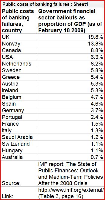
The Guardian is now making all of the data it uses in its stories available for free online. You can browse their data on subjects as wide ranging as imports and exports of plastic bags, reported amounts of exercise, and the best selling singles of 2008 at their Data Store. As one example, I’ve pasted in 20 government financial bail outs as a percentage of their GDP:


capture10

In this 7 1/2 minute video Hans Rosling maps the relationship between life expectancy, GDP, and sexual health and rights over 300 years of Swedish history:

Found at GapMinder.

Larry H. (of the L.A. TimesDaily Mirror blog) sent in a link to an interactive map at the NYT that shows December 2008 unemployment rates by county. Here’s a screenshot:

picture-11

If you go to the link you can hover over counties and get their individual unemployment rates.You can also filter by manufacturing counties, rural counties, and counties that experienced a housing boom, as well as the 1-year change in unemployment rate.

Of course, you might want to combine this with a discussion of how unemployment is calculated–the 7.6% is most likely what is called the U3 rate, which is always lower than the more comprehensive U6. If we look not just at unemployment but at underemployment–people who can’t get enough hours to support themselves–and people who have given up looking for work, the rate would be higher.

The New York Times features an interactive graphic about the wage gap between men and women. It shows how different types of professions are distributed along the wage gap.  At the website, you can see click on each dot to see wage gaps for specific professions (e.g., female professors make 22% less than male professors).

capture31

Also about the wage gap, see posts herehere, here, and here.

The Environmental Working Group’s interactive database lets you look up farm subsidies paid by the USDA. You can get all kinds of information–subsidy payments by county or congressional district, top 100 recipients of subsidies, breakdowns into particular types of payments (conservation, crops, disaster, etc.), and so on. It’s an interesting source of information, given that the Obama administration wants to drastically reduce farm subsidies and we’re likely to see a big argument over what the impact will be on farmers. Some groups argue that mid-sized family farms will be devastated by the loss of price supports. Others point out that subsidy payments are highly concentrated, with the top 20% of recipients getting the overwhelming majority of payments, and that if large industrial operations were forced to compete with family farms on an even playing-field without welfare payments, many of them would go out of business, leading to lower production and higher prices for other producers.

This was a big debate among rural sociologists when I was in grad school, and I guess we may be about to see.

Burk and Paul I.-M. both sent me this video that sums up the current credit crisis:

[youtube]https://www.youtube.com/watch?v=w4gcdQA33aI[/youtube]

It’s helpful for understanding the situation, but I can’t help pointing out a few issues, like the gendering–almost all the bankers, investors, brokers, and other members of the financial systems are male (I believe one of the investors was female). Also, I found the image of families interesting: “responsible” families are thin and have one kid while irresponsible ones smoke, drink, get fat, and have tons of kids.

Also, it didn’t explain too much about the types of loans made available to the subprime market, particularly the fact that monthly payments often went up significantly after a couple of years, so you might want to throw that in if you show the video–it wasn’t always that people got loans they couldn’t afford at the initial rate, it’s that when the interest rate changed and their payments increased, they couldn’t afford the higher rates. And of course many perfectly “responsible” families took subprime loans, planning on flipping the property for a nice profit, driving real estate prices up for everyone…and now often going into foreclosure along with everybody else.

Those caveats aside, it’s a pretty useful video for boiling down some basic causes behind the credit crisis.

NEW! (Mar. ’10): Caity sent in this video by Westpac, an Australian bank, in which they attempt to explain the credit crisis in a way that some have felt was self-serving and condescending. Caity explains,

Nearly all Australian home loans are on variable interest rates. Our reserve bank recently put up the national rate by 0.25%. Usually, the banks raise (or lower) their rates about in line with the reserve bank’s changes, but this time Westpac (one of our biggest banks) put theirs up by 0.45% – and then emailed this video to all of their home loan customers to explain why.


Gwen Sharp is an associate professor of sociology at Nevada State College. You can follow her on Twitter at @gwensharpnv.

Considering the graph below comparing the percent of GDP spent for economic stimulus during The Great Depression (1940s) and today (from the Tax Policy Center), Ezra Klein concludes:

We’re spending a lot right now, but this is hardly the most aggressive fiscal experiment in history.

federalspendingovertime

Contrast that summation with this ad from the American Issues Project:

[youtube]https://www.youtube.com/watch?v=eZ_Chroi4oc[/youtube]

This is what sociologists call a framing war.  Is the economic stimulus big or small?  You can make arguments either way, and people will.  The question is: Which frame will resonate more with (which members of) the American public?  We’ll have to wait and see.

(Via Alas A Blog.)

Lisa Wade, PhD is an Associate Professor at Tulane University. She is the author of American Hookup, a book about college sexual culture; a textbook about gender; and a forthcoming introductory text: Terrible Magnificent Sociology. You can follow her on Twitter and Instagram.

Nate Silver, over at FiveThirtyEight.com, points out that whereas sales of beer have generally been relatively unaffected by economic conditions, the current financial situation led to a rather dramatic decrease in beer sales in late 2008:

beer4

I don’t have any sociological point here. I just think it’s interesting, and since I thought so, I thought I’d make you look at it too. Nate Silver (who I have a bit of a geek crush on) hazards a few theories (in particular, perhaps people are substituting cheaper beers for more expensive ones, meaning they’re drinking as much or more, but spending less); it’s worth checking his post out.

As I said, absolutely no point to this post other than “Huh. Look at that.”