economics

Companies donate to political campaigns in order to gain some leverage over policy making processes.  This fun interactive graphic (via) allows you to see which companies donate primarily to Republican and Democratic campaigns, and which straddle the political fence.  These are the companies with the largest total contribution:

Capture

The most Republican leaning:

Capturerep

The most Democratic leaning:

Capturedem

You can also search by type of company.  For example, media and entertainment:

Captureent

Transportation:

Capturetrans

Pharmaceuticals:

Capturepharm

UPDATE: Comments on this thread have been closed.

—————————

Lisa Wade is a professor of sociology at Occidental College. You can follow her on Twitter and Facebook.

Behold “a visualization of the contiguous United States, colored by distance to the nearest [of the about 13,000] domestic McDonald’s” developed by Stephen Von Worley at Weather Sealed:

mcd_us_high

Von Worley writes:

As expected, McDonald’s cluster at the population centers and hug the highway grid.  East of the Mississippi, there’s wall-to-wall coverage, except for a handful of meager gaps centered on the Adirondacks, inland Maine, the Everglades, and outlying West Virginia.

For maximum McSparseness, we look westward, towards the deepest, darkest holes in our map: the barren deserts of central Nevada, the arid hills of southeastern Oregon, the rugged wilderness of Idaho’s Salmon River Mountains, and the conspicuous well of blackness on the high plains of northwestern South Dakota.  There, in a patch of rolling grassland, loosely hemmed in by Bismarck, Dickinson, Pierre, and the greater Rapid City-Spearfish-Sturgis metropolitan area, we find our answer.

Between the tiny Dakotan hamlets of Meadow and Glad Valley lies the McFarthest Spot: 107 miles distant from the nearest McDonald’s, as the crow flies, and 145 miles by car!

Suffer a Big Mac Attack out there, and you’re hurtin’ for certain!

Via a blog I’ve been borrowing a lot from lately, Chart Porn.

—————————

Lisa Wade is a professor of sociology at Occidental College. You can follow her on Twitter and Facebook.

This Associated Press interactive graphic (via) displays the number of uninsured by state and provides state-specific details on the rise of health insurance costs (for employers and employees) for each state.  The number of uninsured (darker = larger #s; note that this data is highly tied to the number of residents in each state):

Capture

Some data for Illinois:

Capture2

To interpret:  In Illinois, the amount of money an employer pays each year, on average, for a family has increased 65.3% over the last ten years, and the amount the employee pays has increased 88.4%.  Employees with families now spend, on average, $2,743 a year for their health insurance.  That translates into 7% of the family income (assuming a single breadwinner), up from 4% in 1996.  Over a million workers in Illinois are not so lucky; they have no health insurance at all.

This data reminds us that, in addition to many uninsured, many of us are already paying for health insurance, so the use of taxes to pay for government provided health care would not necessarily cost those who are already insured and may actually save them money.

—————————

Lisa Wade is a professor of sociology at Occidental College. You can follow her on Twitter and Facebook.

index
Vintage Ads.

—————————

Lisa Wade is a professor of sociology at Occidental College. You can follow her on Twitter and Facebook.

You might think that during an economic crisis that leads to job loss, workers might begin to think more positively about unions, seeing them as a possible buffer that would keep each individual worker from being completely on his or her own. But Nate Silver, over at FiveThirtyEight, posted a graph showing the relationship between the unemployment rate and public support for labor unions, based on historical data that goes back as far as 1948, and it’s distinctly negative:

laborsup

Of course, support for unions has been decreasing in general since World War II, so some of the trend is likely due to that. But Silver says that even after controlling for the overall downward trend in support for organized labor, we see:

…a decrease in approval of 2.1 points for unions for every point increase in unemployment. Both relationships [this one, and the model without taking the overall downward trend into account] are highly statistically significant.

So what would explain this? The obvious answer would be that people must in some way blame unions for job loss–perhaps believing that they have negotiated pay and benefits that are too high and as a result have driven companies out of the U.S., causing people to lose jobs.

Or maybe some workers who were in unions blame them for not negotiating hard enough to keep their jobs–perhaps as people lose jobs, or see those around them losing theirs, they feel that their unions didn’t do everything possible to save their jobs, that union leaders got scared and gave in to corporate demands to allow layoffs. That might explain the decrease in support for some, though today unionization is low enough that it’s not enough to have a large impact on overall levels of support.

Another possible explanation is that during a time of rising unemployment, people simply feel they can’t afford to support unions–that they need a job now, and they’ll oppose unions and collective bargaining if they think that makes it less likely that employers will be hiring. In that case, they may not be blaming unions for unemployment directly, but may think that unions are a luxury that just have to be discarded when you’re desperate, individually or as a nation.

Thoughts?

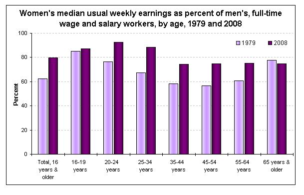
The figure below, borrowed from U.S. News and World Report, shows that the wage gap between women and men, for nearly all age groups, has narrowed significantly between 1979 and 2008.  It also shows that the wage gap is smallest for men and women aged 20-24, grows for men and women aged 25-34, grows even further for men and women aged 35-44, and remains steady after that.

wagegap

These data are for men and women in the same jobs working full time.  So what would explain this change?  Sociologists have found that much of the growth in the wage gap over the life course is due to the fact that women are held disproportionately responsible for childcare and housework (see some data here).  As men and women start to have children, women (whether by choice or necessity) find themselves sacrificing their careers more so than men.  On the flip side, mothers are discriminated against by employers more often than fathers and women without children. (See, for example, this clip of Gov. Rendell commenting that Janet Napolitano is a good candidate for secretary of Homeland Security because she has no family.) That’s why you see the wage gap increasing during prime childbearing years (25-44), but not afterward.

For more on the wage gap, see our posts on the wage gap for college grads, comparing different kinds of wage gaps, the role of job segregation, gender and the wage gap in different professions.

—————————

Lisa Wade is a professor of sociology at Occidental College. You can follow her on Twitter and Facebook.

Nate Silver at FiveThirtyEight discusses the “Cash for Clunkers” program. There has been a fair amount of criticism of the fact that the program, which is supposed to stimulate the economy partly by providing a boost to the auto industry, has been used by consumers to buy a large number of non-U.S.-made cars (which, of course, is a slippy definition–there are Toyota and Honda plants in the U.S. and Ford plants in Mexico, but by “U.S.-made,” people generally refer to Ford, GM, and I guess Chrysler).

But the other point of the Cash for Clunkers program was to increase the gas mileage of the U.S. auto fleet overall.  The new car you can apply the federal aid to has to get at least 22 mpg. And because of choices the U.S. auto companies have made in the past about what kinds of cars and trucks to emphasize, a smaller proportion of the models Ford, GM, and Chrysler offer qualify for the program:

clunk

Of course, this graph doesn’t tell us how popular each of the models are–if GM only had one model that got more than 22 mpg, but that one model was incredibly popular, the company might have an average fleet fuel efficiency that was relatively good. And if Chrysler had a lot more models available than Honda, it might have more 22+ mpg models total even though they’re a lower percentage of all Chrysler cars.

Still, I found the graph shocking; 22 mpg seems like such a low benchmark, I never would have guess than less than 1 in 5 U.S. models manages to meet it. Hopefully the Cash for Clunkers will have a longer-term effect of encouraging the U.S. automakers to emphasize fuel efficiency to a much greater degree than they’ve been doing (and U.S. consumers to buy their fuel efficient models).

Jerry F. sent us a link to a neat interactive website where you can look at global GDP per capita by country, region, predominance of Buddhism/Islam/Christianity, language spoken, and so on. The data come from the 2008 CIA World Factbook.

The country with the highest GDP per capita? That would be itsy-bitsy Liechtenstein:

Picture 1

Much of Liechtenstein’s economy is linked to its popularity as a place to register holding companies because of low business taxes, so the exceedingly high GDP is probably a result of that. With a GDP of $103,500, Qatar is the second wealthiest nation.

Compare that snapshot of part of the Europe graph to this one for countries in the Horn of Africa:

Picture 2

From what I could tell, the lowest per capita GDP is in Zimbabwe: $200. Only one country on the entire African continent (Equatorial Guinea) breaks $20,000. The shockingly low GDPs in Africa, which indicate a continued lack of industrial (or any other) development, is the most striking pattern. Poor countries in Asia and South America seem downright wealthy by comparison.

As with any international database, I’m sure there are weaknesses with the Factbook–if nothing else, the difficulty of collecting meaningful, comparable data for all countries. I’d pay attention to the overall pattern rather than the specific dollar amount for any one country. If any of you have specific knowledge of the strengths and weaknesses of the CIA Factbook, let us know in the comments.

And also, of course, these numbers tell us nothing about how national wealth is distributed within each country. The average standard of living might be better in a country with a lower GDP where wealth is more evenly distributed across the population than in a “richer” country where a small group controls a highly disproportionate amount of wealth.

Related posts: military spending as a % of GDP, map of global use of electric lights after dark, carbon dioxide emissions per country, questioning the developed/undeveloped binary, international disproportions, and inequality in affluent nations.