economics

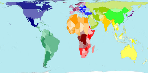
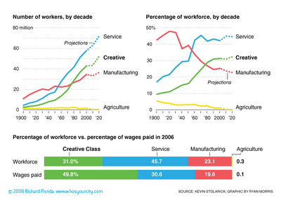
Worldmapper offers maps in which the actual land area is morphed to represent various disproportionalities across the globe. The website has over 300 maps! Thanks 73man for the tip!

I borrowed a few examples and pasted them in below. The first map is an actual land area map for reference.

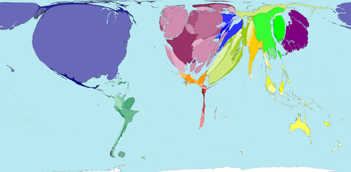
Territory size shows the proportion of worldwide net exports of toys (in US$) that come from there. Net exports are exports minus imports. When imports are larger than exports the territory is not shown.

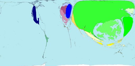
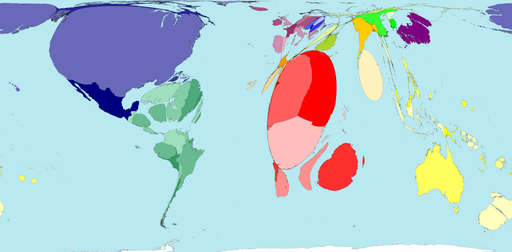
Territory size shows the proportion of worldwide net imports of toys (in US$) that are received there. Net imports are imports minus exports. When exports are larger than imports the territory is not shown.

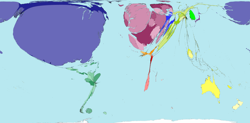
Territory size shows the proportion of carbon dioxide emissions in 1980 that were directly from there.

Territory size shows the proportion of all territory level decreases in carbon dioxide emissions between 1980 and 2000, that occurred there.

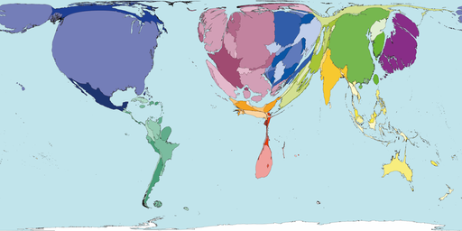
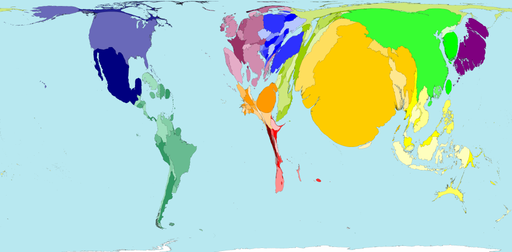
Territory size shows the proportion of state military spending worldwide that was spent by that territory in 2002.

Territory size shows the proportion of species worldwide that became extinct between 1500 current era and 2004, that became extinct there.

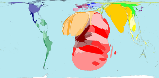
Territory size shows the proportion of all people over 15 in the world living with diabetes who live there.

Territory size shows the proportion of all people aged 15-49 with HIV (Human Immunodeficiency Virus) worldwide, living there.

See more alternative maps here.

.

This figure demonstrates the shift from an economy dominated by manufacturing, to one dominated by information and services. As I understand it, it is this shift that is driving the shrinking of the middle class.


Image borrowed from http://www.whosyourcity.com/.


This is an ad for Allstate’s retirement programs; it appeared on the back cover page of The New Yorker. What struck me is that the ad is using the fact that women leave the workforce to care for children as a tactic to scare families into buying their product:

The average woman spends 11 years out of the workforce taking care of family. Leaving her without enough retirement money to take care of herself. Those 11 years are spent doing important work, caring for children or elderly parents. But then can also hurt her ability to retire. Fact is, women are still earning less than men do, and they live longer…Women care for America. It’s time we showed that America cares about their future.

Notice the picture: it’s a woman with a small child and a stroller, all about to fall off into the large crevice in the $20 bill.

I’m really not sure quite what to make of this or what my take on it is.

The graph below shows the different results when using two different measures of joblessness (notice how the use of two different scales on these graphs–10% and 15%–visually interrupts a fair comparison). Visit the New York Times story that accompanied this image for a historically-grounded discussion of the problematics and politics of measuring joblessness.

This bar chart puts the United States as the dubious front runner with the highest income inequality among 20 wealthy nations. With the exception of Japan, all the countries have European heritage. In 2000 the United States’ inequality stood well above all other rich nations. At the other end of the scale the Nordic countries plus the Netherlands had very low inequality ratios. Most Western European nations, as well as Australia and Canada fell in between.

These data come from the Luxembourg Income Study, the most rigorous data source for cross-national income and wealth. The chart’s income gap indicator in each country is the disposable (after tax) annual income of the top 10% divided by the disposable income of the bottom 10%. In other words, the income gap is the ratio of the 10% of persons with the highest income to the 10% with the lowest. For instance, in the USA the income of the top-earning 10% was 5.5 times that of the bottom 10%.

The statistics in this chart can be found on page 4 of a document on the Contexts website: http://www.contextsmagazine.org/resources_vol6-3.php That document is a supplement to an article by Peter Dreier, “The United States in Comparative Perspective,” in the Summer 2007 issue of Contexts.

Some may read these statistics and say “inequality in the US is overblown” because the bottom 10% live better off than most people in the rest of the world. That is true if Americans are compared to countries where the average income is less than a dollar a day. But if the American poor are compared to the poor in other wealthy countries, American poor are far worse off.

One of my favorite questions to ask in (especially) Introduction to Sociology classes is: In an ideal world, for what reason does the U.S. government exist? That is, what is a state for? For protection from other states? To protect private property? To maximize happiness? To pool and then redistribute resources for the collective good? It’s something most of them have never thought about. After a discussion, I show them this:

This is where our federal tax dollars go. Students are horrified by the military spending, but completely stumped by the interest on the debt. Most of them have no idea that our debt has any consequences at all.

The pie chart is from http://www.nationalpriorities.org/. You can go every year and update your chart here.