economics

Jerry F. sent us a link to a neat interactive website where you can look at global GDP per capita by country, region, predominance of Buddhism/Islam/Christianity, language spoken, and so on. The data come from the 2008 CIA World Factbook.

The country with the highest GDP per capita? That would be itsy-bitsy Liechtenstein:

Picture 1

Much of Liechtenstein’s economy is linked to its popularity as a place to register holding companies because of low business taxes, so the exceedingly high GDP is probably a result of that. With a GDP of $103,500, Qatar is the second wealthiest nation.

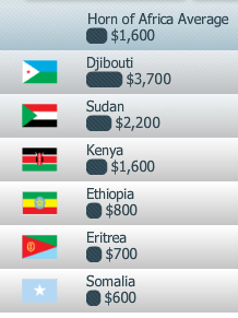
Compare that snapshot of part of the Europe graph to this one for countries in the Horn of Africa:

Picture 2

From what I could tell, the lowest per capita GDP is in Zimbabwe: $200. Only one country on the entire African continent (Equatorial Guinea) breaks $20,000. The shockingly low GDPs in Africa, which indicate a continued lack of industrial (or any other) development, is the most striking pattern. Poor countries in Asia and South America seem downright wealthy by comparison.

As with any international database, I’m sure there are weaknesses with the Factbook–if nothing else, the difficulty of collecting meaningful, comparable data for all countries. I’d pay attention to the overall pattern rather than the specific dollar amount for any one country. If any of you have specific knowledge of the strengths and weaknesses of the CIA Factbook, let us know in the comments.

And also, of course, these numbers tell us nothing about how national wealth is distributed within each country. The average standard of living might be better in a country with a lower GDP where wealth is more evenly distributed across the population than in a “richer” country where a small group controls a highly disproportionate amount of wealth.

Related posts: military spending as a % of GDP, map of global use of electric lights after dark, carbon dioxide emissions per country, questioning the developed/undeveloped binary, international disproportions, and inequality in affluent nations.

Hans Rosling illustrates the change in the percentage, but not the number, of people living in extreme poverty:

Found at GapMinder.

Lisa Wade, PhD is an Associate Professor at Tulane University. She is the author of American Hookup, a book about college sexual culture; a textbook about gender; and a forthcoming introductory text: Terrible Magnificent Sociology. You can follow her on Twitter and Instagram.

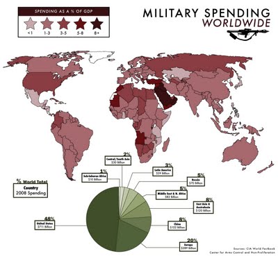
Jessica H.S. sent in a link to this map showing global military spending as a % of GDP as as a % of total world military spending (much larger version available here):

ve-military-spending2

I knew the U.S. spent a ginormous total amount on the military, but I didn’t know we account for right at half of all military spending. And I would have thought China would have more than 8%.

Commenter George has a good point that I really should have thought of:

Saying we account for half of all military spending is misleading. It costs a great deal more to construct military equipment in the U.S. so, of course we spend a larger number of dollars than China would. In China a submarine costs many fewer dollars to build. Of these illustrations the percent of GDP is by far the most informative.

Thanks for pointing that out!


In this video clip, Naomi Klein, author of The Shock Doctrine and other works on globalization and economic change, discusses what she calls “disaster capitalism,” or the use of disasters or “shocks” (whether natural or human-caused) as an opportunity to impose a certain type of global free-market capitalism that often would be impossible during “normal” times. At the beginning she’s discussing the specific example of the Iraq War, but that’s just one of many examples you could use.

Klein’s argument is that globalized free-market capitalism didn’t spread around the world by some natural process, or by simply winning in a “battle of ideas,” but rather was often opportunistically extended by companies in the wake of disasters, when nations and citizens were often in no position to debate or resist economic change in the face of more immediately pressing matters.

If you are very interested in the topic, here’s a lecture by Klein:

[youtube]http://www.youtube.com/watch?v=hA736oK9FPg[/youtube]

See also our post on The Story of Stuff, Mickey Mouse Monopoly, and old pro-capitalism propaganda.

Gwen Sharp is an associate professor of sociology at Nevada State College. You can follow her on Twitter at @gwensharpnv.

Many of us live in consumption economies unlike any in human history.   Consuming is a daily chore.  Acquiring is easier than ever.

What do you have?  How much of it do you need?  Do you have things that you don’t want?  How do you manage the stuff that enters your home?  Does it go?  Or does it stay?  Do you dispose of the disposable and semi-disposable goods?  Or do you try to recycle them, even if only within the boundaries of your home?  How do the shelves and drawers, the nooks and crannies of your living space, obscure our answers to these questions?  What would it look like if we had to look at it all, all at once?

Chinese artist Song Dong convinced his mother to allow him to display every item of her home as an art exhibit (article here).  She had lived in the same house for nearly 60 years.  He arranged her belongings, in a museum, around a dismantled piece of the house.  The result raises questions about consumption, economy, and the things in our lives.

—————————

Lisa Wade is a professor of sociology at Occidental College. You can follow her on Twitter and Facebook.

Lisa Wade, PhD is an Associate Professor at Tulane University. She is the author of American Hookup, a book about college sexual culture; a textbook about gender; and a forthcoming introductory text: Terrible Magnificent Sociology. You can follow her on Twitter and Instagram.

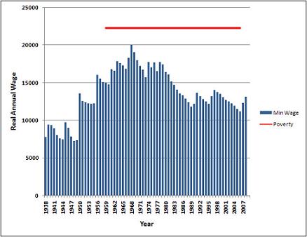
Ed at Gin and Tacos offered up the figure below comparing the minimum wage (adjusted to inflation) and the poverty line for a family (he doesn’t specify how many children).  It reveals that, as Ed puts it: “not once in its 80-year history has the minimum wage, if earned 40 hours weekly, hit the Federal poverty line for a family.”  That is, a dedicated full time worker earning minimum wage does not earn, and has never earned, enough to keep a family out of poverty.

minpov

So, if you are a single parent, you’re screwed.  (And, frankly, if you aren’t, you’re still screwed because child care will likely wipe out, if not exceed one person’s entire income.  Subsidized day care only serves a fraction of the children that are qualified.)

Ed notes that, given this, the rational choice for a parent is to go on welfare.  Welfare doesn’t get you above the poverty line either, and you’re still likely to be miserable, but at least you’ll be miserable while parenting your children instead of miserable while flipping burgers.

Some argue that, if people choose to go on welfare instead of work, then welfare must be too generous.  Lower welfare payments and people will choose to work.  Ed, however, suggests that the real problem revealed by this figure is the insufficiency of the minimum wage.  Raise the minimum wage and people will choose to work.  Only one of these solutions actually mitigates human suffering.

—————————

Lisa Wade is a professor of sociology at Occidental College. You can follow her on Twitter and Facebook.

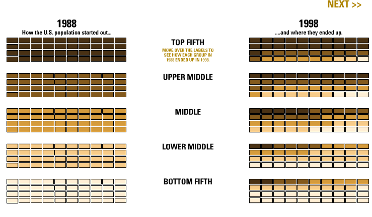
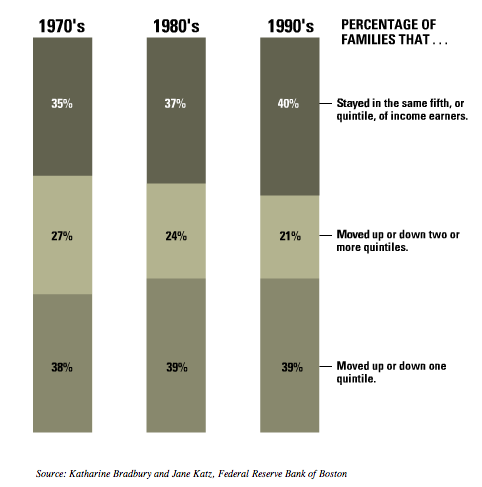
The New York Times has some interactive graphics showing various types of data about social class and class mobility. You can see where you fall in terms of four characteristics often used to measure class status, see the overall class breakdown for various occupations, and so on. This graph shows social class mobility by depicting which social class (divided into quintiles) the U.S. population fell into in 1998 based on the social class they started out in from 1988:

Picture 1

You can hover over a particular group, such as “lower middle,” to see the outcome just for them.

Another graph of social mobility:

Picture 2

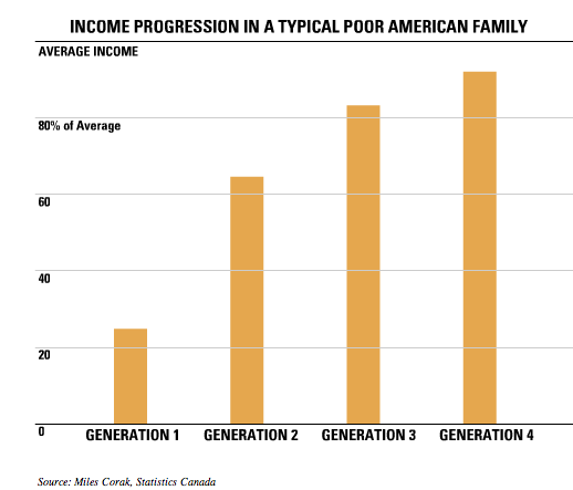
This next graph counters the idea that poor families remain poor forever (often explained by some version of the “culture of poverty” thesis) by showing that if you track a poor family over multiple generations, there is a general trend toward upward mobility:

Picture 3

That isn’t to ignore the fact that being poor leads to circumstances (poor schools, etc.) that make upward mobility difficult. But the idea that poor families stay poor for generation after generation, passing on poverty almost like a genetic characteristic, simplifies a more complex story about how families become poor, how long they remain poor, and the importance of looking at structural factors as opposed to a “cycle of poverty” explanation.

Since Lisa shared an embarrassing story today, I’ll share one too: for some reason, I think because he had the album Purple Rain and was famous for wearing purple a lot, for the longest time I thought the book The Color Purple must be a biography about Prince.

Mark Thoma at Economist’s View posted the following graphical representation of changes in the age distribution of the population of the U.S. between 1950 and today, and projected to 2050:

agedist_9_19_05

The bump, slowly moving off to the right, is the baby boom generation. The downward slope in the lines as you move to the right represents a population with a larger percentage of older people or, in other words, an older average age. If the forecast is correct, about 10 percent of the U.S. population will be over 75 by 2050.

Mark observes that many examinations of historical trends likely need to take into account this changing age distribution. For example, he asks:

…with a larger and larger fraction of the population moving into the asset liquidation phase of their life-cycle, how is the saving rate affected? How much of the change in the saving rate in recent years is attributable solely to changes in the age-distribution of the population?

—————————

Lisa Wade is a professor of sociology at Occidental College. You can follow her on Twitter and Facebook.