This Course Guide is in progress and will be updated as I have time.
Disclaimer: If you’re thinking about writing a course guide. I totally overdid it on this one! It doesn’t have to be nearly this extensive.
Course Guide for
INTRODUCTION TO SOCIOLOGY
(last updated 5/2012)
Developed by Gwen Sharp
Nevada State College
C. Wright Mills and the Sociological Imagination
Intersection of biography and history as illustrated by:
- Year of birth and life success
- Kids’ exposure to technology
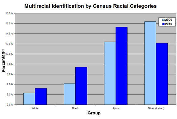
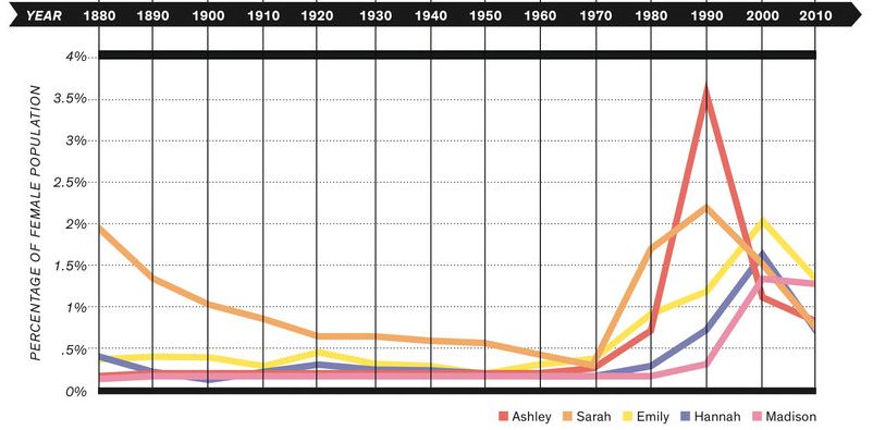
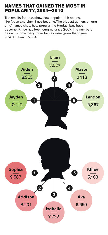
- Baby naming practices and media trends
- Other historical trends in baby names
“the capacity for astonishment is made lively again”
Karl Marx/Marxist analysis
Emile Durkheim
[Because the course guide has gotten to be so long, I’m putting the rest of it after the jump.]